
The art of the desk setup
21 min read Feb 23, 2021 Updated Dec 1, 2022
Desk setup
I have invested heavily in my desk setup over my professional life, but I have always felt some guilt. It felt like overkill. I used it only on the off days when I stayed home for personal errands.

Before COVID, setting up a home office or desk setup was an interest of remote workers and tech enthusiasts. Now, with most knowledge workers going remote because of the pandemic, the desk setup has become essential.
For me, my desk is both a place for work and play. I spend most of my waking hours working on Carrot, writing this blog, processing photos, and more. It’s part of a larger studio space that invites me in every morning and inspires me to do my best work.
Creative space as a component of the creative process
In my visit to Mallorca a few years back, I had the fortune of visiting the studio of artist Joan Miró. Josep Lluís Sert, an accomplished architect in his own right, envisioned it for his friend. I could just feel the creativity flowing in the air.
 Palma de Mallorca · Leica Q · f/7.1 ·
1/60 · ISO 320
That inspiration isn’t merely a result of an aesthetic veneer applied to the buildings. It comes from deep inside — from the values and principles used in its design, the materials, the textures, and the orientation with the surrounding landscape.
Our desks are our artist’s studios. Visit @macsetups on Instagram or /r/macsetups on Reddit, and you’ll be met with an endless stream of beautiful photographs of people’s desks.
While I appreciate the effort put into the presentation of the photographs, I can’t help feeling like something is missing. I don’t just want to know a list of the exact products used. What are the principles underlying the choices? What’s the story behind that particular desk? How about that color scheme?
We have the opportunity not just to create something worthy of sharing on social media. Why not do more? The ideal desk setup has the potential to immediately transport us to a frame of mind that leads to the best work. It’s just like how being dressed to the nines can give us a jolt of confidence when meeting strangers.
As Marie Kondō writes in The Life-Changing Magic of Tidying Up, “The space in which we live should be for the person we are becoming now, not for the person we were in the past.”[1] Said another way, the environment we work in should reflect the creative work we aspire to create.
Two principles to find great design
So how exactly do we create a space like that? To build the right creative environment for myself, I look to a set of principles. The first two of these, applies broadly to finding well-designed object, regardless of the use.
Principle 1: Objects must form an emotional bond with the user
I have to admit that I love material objects. I’ve written at length about Dieter Rams, Apple products, cameras, and industrial design. The things I’ve carefully chosen to live my life with remind me of my job as a designer — bringing order to the chaos. However, this love of physical items isn’t innate.
After saving up money from my first high school job, I decided to buy an MP3 player. It’s then that I discovered the world of gadget blogs and review sites. I pored over them. The sites I was reading all pointed me to the Creative Nomad Jukebox Zen. Reviews touted its class-leading 30GB storage as its primary selling point.
I, however, wasn’t convinced. Besides the fact that some independent reviews mentioned that the headphone jack was prone to breaking, I thought it looked ugly.
There I was, about to spend 20% of my net worth on the first independent purchase of my life. I wasn’t going to squander it on some plasticky monstrosity. On a chance visit to the mall, I walked into the Apple store and played with an iPod. That moment changed my life.
 One is now forgotten, the other a
classic
I came away not only intending to buy an iPod, but with a new dimension of my taste. I already had a side of me that read the reviews, did the research, and tried to find the “best” of something, but this new side didn’t compare numbers or stats. Instead, it cared about how something felt in hand, the sound it made when I pressed a button, the typeface used on the interface, the box it came in.
I realized that objects must not only fulfill their functional purpose, but they must also form an emotional bond with the user.
Principle 2: Prefer the preowned classic to the brand new, unproven product.
The democratization of information means that nearly everyone wants to have the best of everything. “A recent PricewaterhouseCoopers study found that eighty per cent of consumers look at online reviews before making major purchases, and a host of studies have logged the strong influence those reviews have on the decisions people make.”[2]
We want the best, from the restaurant for dinner tonight, to our next car, to something as mundane as a vacuum cleaner. It’s not new. For decades, Consumer Reports has tested and recommended the best of nearly anything someone could buy.

“Perhaps the most miraculous part of Consumer Reports is that its work is technically a public service: Its parent organization, which publishes the magazine (and is also called Consumer Reports), is a nonprofit. The operation launched in 1936, when consumer-protection laws were practically nonexistent, and for much of its history the magazine has shaped both consumer sentiment and government policy.”
[3]
Today, Consumer Reports is slowly fading away as newer replacements shine in an internet-first world.
Wirecutter is one of those spiritual successors. I used to be a huge fan. I was a tech reporter in a previous life and looked up to Wirecutter’s founder, Brian Lam when he was editor-in-chief of Gizmodo. I loved that Wirecutter takes the best of what made Consumer Reports great and mixed it with what makes Gizmodo great.

Now, however, I’m not so sure I like it. As Owen Williams writes:
“Review sites like Wirecutter are incentivized to pick products, even if they aren’t perfect, because they don’t make money unless you buy something. Instead of running advertising on their pages, Wirecutter relies on affiliate links, offered by sites like Amazon. When you click “buy” on something the site recommends and follow through with the purchase, Wirecutter gets a cut of the sale price, which is higher the more expensive the product is.”
[4]
That’s a fundamental difference with Consumer Reports and its customer-protection mentality. I’ve never seen Wirecutter simply recommend that someone look on Craigslist or eBay for something even when that’s probably the best option.
Phones, computers, or cars are constantly changing and there are clear advantages with newer ones. Furniture, clothing, or household appliances, on the other hand, have changed very little in half a century. It’s silly to constrain ourselves to the world of what’s available new on a shelf, ready to ship to your home in two days.
You tell me. If you are looking for an orange juicer, are you going to buy Wirecutter’s recommendation? Or, would you rather own a piece from the 70s designed by legendary designers at Braun for the same price?

Sure, you would have to buy it used, but it’s also proven. It has survived half a century and likely will survive yet another. And, obviously, it’s not ugly.
As Dieter Rams says in the fifth of his ten principles for good design, “Good design is unobtrusive. Products fulfilling a purpose are like tools. They are neither decorative objects nor works of art. Their design should therefore be both neutral and restrained, to leave room for the user’s self-expression.”
By constraining themselves to what’s still made today, sites like Wirecutter completely miss the attractive, affordable options out there on the used market, some of which are part of museum collections. The result is more ugliness. If I’m going to see something every day, it better fit in with its surroundings.
Therefore when possible, I prefer the preowned classic to the brand new, unproven product.
How I hunt for good design
If we are to ignore the review sites, where do we go? I’m not going to pretend that I’m an expert, but I’ve learned a few things over the years.
The first is that museum collections are your friend. I regularly search the MoMA, MAAS, and Cooper Hewitt collections when I need an appliance or furniture. Often, I find something from one of these museum collections for cheap on the used market. They are so obscure that there isn’t much demand.

Some of these classic objects of design may seem expensive to buy. However, their prices when used are usually quite stable. Buy one with cash. If you ever decide that you no longer want it, you can sell it back for the same price. That’s a big contrast to buying something new from Amazon, where there will be some depreciation.
When buying office furniture and accessories, look where the big buyers go. Most office furniture is sold by furniture companies like Herman Miller, Steelcase, and Haworth directly to businesses, hospitals, etc. The selection you’ll find is vastly different from consumer-oriented retailers. You’ll find beautiful options that you’ll never see on Amazon. As an added benefit, these business customers often upgrade or go out-of-business, so items like chairs, lamps, and monitor arms hit the used market for great prices in large quantities.
When buying used, patience is vital. I have found that it can take more than a year of waiting to find the ideal piece. I’ve spent four years continuously building my current desk setup.
My desk setup
That brings me to my creative space. I’m fortunate enough to have a light and airy loft that I can call my studio. Perhaps in a future post, I’ll do a proper tour of the whole space. For now, let’s focus on my desk setup.
In addition to the two principles that I listed previously, I’ve added three more that are specific to my desk setup.
- Objects must not just fulfill their functional purpose; they must form an emotional bond.
- When possible, prefer the preowned classic to the brand new, unproven product.
- Minimize clutter and distractions. Part of this is picking a light, minimal color palette.
- Support as many different types of work as possible without needing rarely used specialized equipment.
- Change and iterate as my needs change.
Desk
The perfect desk is large, soft to touch, and made of natural materials. I previously had an IKEA Galant, but I found that the veneer surface was not durable enough, especially at the edges. The perfect desk is height-adjustable. I can move it up and down depending on if I am typing, writing, or standing.
After reviewing various options, including salvaging a desktop from a vintage desk, I settled on the IKEA Gerton for the top. It’s formed from blocks of wood that are adhered together much like a butcher block. It came unfinished, so I sanded it smooth and applied several coats of matte polyurethane.

If I were to do it all again, I might choose a solid piece of wood instead since the different pieces of wood warp differently through the seasons, causing slight cracks and bumps. I’d also avoid polyurethane since it doesn’t hold up to alcohol.
The base is the Jarvis standing desk from Fully. I’ve tried quite a few standing desks under $600, and the Jarvis is both quiet and sturdy. I purchased just the frame without a top and attached it to the IKEA Gerton myself.

Another option that I haven’t tried but would consider is the Steelcase Solo. All electrical components are integrated into a central spine under the desk, removing the need for cables between the components. What a smart trick!
Cable management
To minimize visual clutter while maintaining flexibility, I’ve built in a cable management system.
There is a single cord leading to a three-foot-long power strip with twelve outlets spread across its length. It’s attached to the underside of the desk with 3M Dual Lock fasteners, which is essentially industrial-strength Velcro. This configuration has two primary advantages:
- Items can be plugged in close to where they sit on the desk, avoiding the need to snake cables across the length of the desk.
- The outlets are spaced far enough away from each other that large power bricks don’t block adjacent ports.

In addition to the power strip, there are two Fully WireTamers hanging from the desk’s back edge. They hide all the power bricks, wires, and even a few storage drives.
Chair
I love ergonomic chairs but don’t love their prices when new. Fortunately, there is a large market for office furniture here in the Bay Area. For most of the last decade, I used a Steelcase Think that I bought used.
All the while, my dream has been to own a Herman Miller Embody someday. It has been a holy grail for me. The view of the white skeleton-like spine and ribs contrasting to the mesh back has etched itself into my memory over years of fawning over it.
Last year, I was lucky enough to find one used for an unbeatable price. The tomato and white combination adds some much-needed color to the rest of the setup.

As eye-catching as the Embody is, I stop noticing it within minutes of sitting down. The chair is unbelievably comfortable.


Sometimes, after years of desiring something, when I finally acquire it, it is unable to meet my inflated expectations. Fortunately, with the Herman Miller Embody, that’s not the case. Seeing it at my desk every morning gives me a little jolt of inspiration, and sitting on it does make everything else I do at the desk better.
Monitor
A monitor is like a portal to another world. It serves so many purposes for me during the day. Unsurprisingly, shopping for monitors is difficult.
Years ago, I used a 27” iMac. It had that brilliant 2560x1440 display panel that Apple charged $999 for when purchased separately. Viewing angles, resolution, pixel density, brightness, and color gamut were top-notch at the time. If you had the money, you couldn’t go wrong with picking up one of those displays and calling it a day.
Now however, with high refresh rates, a wider variety of aspect ratios, wide gamut, etc., buying a monitor is much more complicated.
I liked the pixel density of my iMac. As Steve Jobs first described when announcing the Retina Display on the iPhone 4, the pixels of a display become imperceptible at a certain distance. For the 27” iMac, this distance is 32 inches, just two inches more than the depth of my desk. So, most of the time, the pixels were never perceptible to me. Therefore, when my iMac finally kicked the bucket, I decided that I’d stick to a similar pixel density with its replacement.
Furthermore, I don’t care too much about color accuracy. Most of my time is spent in writing and productivity software. When I need color accuracy, such as when processing photos or designing graphics, I don’t mind using my laptop’s built-in display. The refresh rate doesn’t matter since I’m not going to be gaming on it. Importantly, I’d like as much screen space as possible since I regularly open a single Figma canvas or multiple documents side-by-side.
I looked around and found several 40” 4K UHD monitors. The pixel density of 3840 × 2160 at that size is just a tad higher than the 27” 2560 x 1440 display in the iMac. Perfect. I was about to order one when I doubted the viewing angles at the edges. I did some basic trigonometry and realized that the edges of that particular monitor would be outside the monitor’s viewing angles and would appear discolored.
So, I kept looking and at last found the AOC C4008VU8. It’s curved, so the edges remain within viewing angles.

It has been an indispensable tool for the last three years that I’ve owned it. Of course, it has a few rough edges like uneven bezel widths, mediocre build quality, and ghosting when viewing fast-moving content. I can live with most of that, though. The gigantic canvas it provides is a game-changer.

Wallpaper
For most of the last decade, I’ve been using the original wallpaper from Mac OS X 10.4 Tiger — most recently an upscaled version from 512pixels. It was the best and last in a line of abstract default wallpapers. For 10.5 Lion, Apple switched to a space-themed wallpaper.
Aqueux is a collection of dynamic wallpapers by Hector Simpson based on that original wallpaper.
Hector did a bang-up job redrawing and thoroughly updating what I thought couldn’t be improved. My favorite variations are the Sur and Solar dynamic wallpapers that change with the time of day. Simply brilliant and worth much more than the $3 that Hector is charging.
Screensaver
My screensaver of choice is called october 30. It cycles between 371 different variations of the Apple logo drawn by as many artists. The illustrations were initially used as part of unique invitations to Apple’s October 30, 2018 press event. Fortunately, Jonas Lekevicius didn’t let them go to waste.
Monitor arm
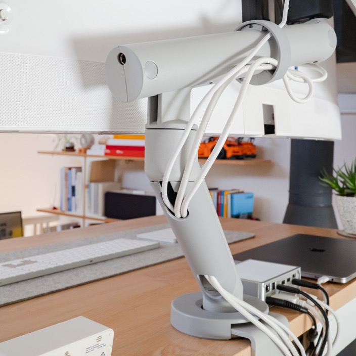
I love monitor arms since they free up desk space and enable tremendous flexibility in positioning. I’ve used arms from Erogotron, Humanscale, and Amazon. I didn’t love any of them. None have been sturdy, easily adjustable, and aesthetically pleasing at the same time. And then I found the Colebrook Bosson Saunders Flo.

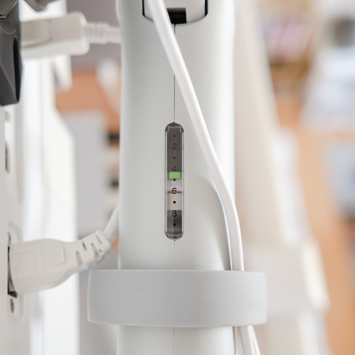
It, and another well-designed monitor arm, the Sapper XYZ, are challenging to find if you confine your search to e-commerce sites. I picked up my Flo Plus from a furniture supplier for less than 25% of the list price, including shipping. The elegant cylindrical shape fades into the background. It doesn’t command attention. Tension is easy to adjust because of the scale seen through a window.
Lamp
Previously I had a lamp from Xiaomi. I bought it in Shenzhen on my trip to China a few years back. It was both pretty and functional, with the ability to control the color temperature and the brightness. However, I found the build quality wanting.
When it comes to desk lamps, I have two favorites, both from Artemide.
The first is the Tizio. It’s now considered a classic of industrial design. Penned by the master Richard Sapper, the Tizio is a wonder both aesthetically and mechanically. At first glance, it is stark, black, angled, as if born from some science fiction world. It can be easily disassembled since it has no wires leading from the base to the bulb. This is possible because the frame carries the current — an innovation that seemingly no other lamp has used.
In my setup, the Tizio would command too much attention. So I turned to other favorite lamp, the Tolomeo.

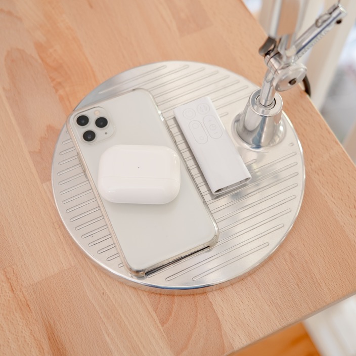
Mine is the Mini size. Its polished base functions as the perfect landing pad for keys, a wallet, or a phone. The arm of the lamp is architectural, portraying both elegance and strength. The reflector is simple. The circular cut-out at the top allows some light to go up, while most of it points towards the desk. Mechanically, the Tolomeo isn’t as ingenious as the Tizio. However, it is gorgeous.
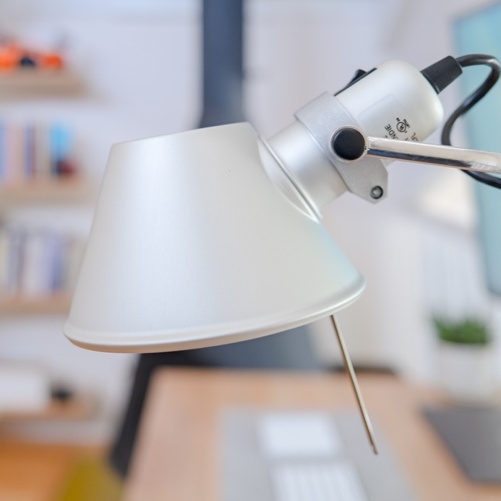

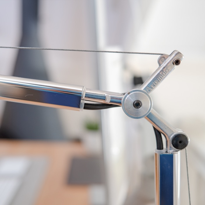
I have written before that the more aesthetically-pleasing and well-built an object, the more likely we will use it. That couldn’t be truer with the Artemide Tolomeo. I use this lamp at my desk more than I have ever used any other lamp in my life.
I bought my lamp used in excellent condition. It’s one of those objects that I could quickly sell again for the exact price I paid if I ever wanted to part with it.
Dock
The dock is the heart of this setup. A single Thunderbolt 3 connection to my Mac provides power and links to the monitor, two storage drives, the webcam, and any temporary storage like USB drives or SD cards. I tried a few different docks and had reliability problems with the others. This one from CalDigit is rock solid and not too ugly.

When I call into video conferences, I connect a pair of wired headphones (my wife’s Grado SR60e) using the 3.5mm jack at the front. I previously used wireless headphones from Sony and Bose but found the need to charge the devices and occasional disconnects too much of a nuisance. Wired headphones are far more reliable.
Desk mat
For the last ten years, I’ve arranged my peripherals very specifically — a full-size keyboard with a trackpad to the left and a mouse to the right. In design tools like Figma and Sketch, I can pan around the canvas with my left hand and click on things with my right hand.
They sit on a desk mat that I cut from 3mm felt.

There are many commercial mats available, but they either aren’t the right size or feature prominent logos. The desk mat serves three purposes.
- It provides a planted, cushioned surface for my keyboard.
- It reduces the visual clutter that the peripherals would otherwise create on the bare desk surface.
- It’s a coaster for when I bring a cold drink to the desk.
Trackpad
No one makes a better trackpad than Apple, so here there is no choice to be made. I have the Magic Trackpad 2 in silver.

Keyboard
On the keyboard front, I’ve tried quite a few. I previously used the Matias Tactile Pro and Mini Tactile Pro. I loved the switches’ feeling, but the keyboards and wires are unsightly, looking like puffed-up versions of the USB keyboard that Apple first shipped with the Bondi Blue iMac. Unfortunately, both broke and now live in a closet waiting to be fixed or given away.
I’ve reverted to using Apple’s Magic Keyboard. The keys are tactile enough for day-to-day use. Crucially, the keyboard is reliable.

I’m also currently getting up to speed with a ZSA Moonlander ergonomic mechanical keyboard but haven’t finished customizing it to my liking. Look out for a full review in the future.
Mouse
Mice are one class of peripheral that Apple seems to fail at completely. They do such a great job of making human-centered products in most cases, but their mice are painful to use. The Magic Mouse is beautiful, and the materials are durable. However, the flat design gives me hand cramps within a few weeks of use. So, I’ve been a loyal user of Logitech’s MX Master series.
I previously had an MX Master 2 in light gray, but that mouse eventually discolored from exposure to the sun and oils from my hand. Hopefully, this MX Master 3 holds up better over time.

Webcam
Webcams seem to have been utterly ignored till very recently. Most are both ugly and have terrible image quality. The Logitech Streamcam is undoubtedly good looking. The microphone is pretty good and I use it daily for video calls. However, I can’t say that its image quality is stellar. The software is also both hard to use and buggy. Let’s hope that some updates fix those issues. It’s good enough for now, but I’ll likely upgrade to a mirrorless camera setup down the road.

Clock
I, like most of you, spend a lot of time on video calls on my computer. I quickly lose track of time, so that’s why I have a dedicated clock that I can glance at. I picked this one up used since Muji seem to have discontinued it. You may be able to find it new at Amazon. I bought it because it was the best looking of various digital clocks I had seen. Only much later did I realize that it was designed by one of my idols, Naoto Fukasawa.

Plant
I didn’t want my whole desk to be covered in dead artificial objects, so I keep a plant. This one is a succulent my wife planted in a pot and saucer that she made at the local ceramics studio. It’s both art and a bit of greenery to brighten my days.

Computer
The choice of computer, in this case, isn’t that important. Most of my work only requires a moderately powerful computer. I currently switch between a 2018 15” MacBook Pro, that I use during weekdays for my work at Carrot, and a 2013 13” MacBook Air for this blog and other personal things.
I have a 2020 M1 MacBook Air en route to replace the 2013 Air. I plan to connect the Pro to the dock during the day and the M1 Air on nights and weekends.
In brief
My desk setup is the marriage of modern technology and minimal industrial design. It provides me both inspiration and utility. By combining my aesthetic taste with my interest in technology, I’ve created a space for creative expression.

This setup is also a creative work in itself. As my needs change, I remove or replace items. On rare occasions, I finally get my hands on a long-coveted piece of classic design. All the while, I continue to discover and refine the principles I hold myself to.
In the spirit of Marie Kondo’s quote from earlier, my desk encourages me to grow into my future self. It’s helping me embody the calm and considered quality that I hope to convey in my work.
- The Life-Changing Magic of Tidying Up · Marie Kondō ↩︎
- Twilight of the Brands · James Surowiecki ↩︎
- Consumer Reports in the Age of the Amazon Review · Paul Hiebert ↩︎
- The Problem With Relying on ‘Wirecutter’ Reviews · Owen Williams ↩︎
Thanks to Q for reading drafts of this.
All photographs taken on the Fujifilm X100V and iPhone 11 Pro
