
Introducing arun.is 3.0
8 min read Mar 6, 2026
This is part of an ongoing series of posts about how this site is made.
Inside arun.is
What’s a redesign? It’s certainly not a chance to start anew. Instead, it’s part of an everlasting feedback cycle, a pattern I see everywhere. In my house, we clean it or bring in new furniture, and then the way we use the house changes. Things start to pile up. We realize we’re not using certain things. We go back and subtract, edit, add.
Since the last redesign, I’ve been incrementally building upon the foundation I laid. Over time, I’ve had a growing feeling of what I need to remove, what is working, and what is in need of refurbishing.
Finding a direction
I started with a mini workshop, as if I was working with coworkers. I used focus prompts and stickies in FigJam to clarify my design philosophy and the vision for the site. Three themes emerged: the intersection of design and technology, which has become the focus of my work and my hobbies; clarity, in both navigation and ideas; and vibrance, balanced against that clarity.
From there, I spent time mining my inspirations and putting together three different idealized visions of the future. These were composed of found images taken from other creatives, along with typefaces, illustration styles, and even some manifestations in physical products.
From three different visions, I narrowed down into one that I really liked. I called it All Out Color. The basic idea is the celebration of color, typography, and illustration while maintaining a sense of minimalism.

I took that vision into Figma and started to diverge again. The goal was to create things I felt very strongly about — things I really hated or things I really loved. I wanted to push myself out of my comfort zone, knowing that when I came back to edit, I’d bring things back to earth.
Why color
A long time ago, when I was first getting started in the world of technology and design, I used to wear all black. Most of my furniture was light-colored or white. I thought that this stark, minimal way of living was the way forward.
Over time, my wife helped me realize that it didn’t represent who I am — a person of Indian descent who loves visiting Mexico. Both places are full of people wearing vibrant colors among a colorful built environment.
Since then,I wear a lot more color. I surround myself with a lot of color. And this blog has emerged with a set of color themes — each blog post is color-coded to suggest the general category it fits under.
Yet, I still value minimalism and restraint. I like the focus that comes from saying no to all but the essential. This is the central tension of this redesign: how do I honor vibrance while also bringing clarity and restraint?
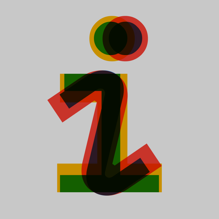
Visual language
The conflict between clarity and vibrance manifests strongest in the visual language.
I wanted to lean further into the color themes that already existed in each post. The table of contents is now tinted with the post’s color to set it apart from the content itself. Select any text and you’ll see it too — the selection color matches the theme.
At the same time, I wanted more clarity. I reduced all lines to one pixel in thickness — just enough to separate two items. I replaced subtle shadows with a minimal grain texture to set apart content from the background, taking more inspiration from print and removing any mimicry of materials.
And I unified a lot of components. Maps, navigation elements, illustrations — they used to have a mix of outlines and backgrounds, independently made over time. I brought them all together and standardized on one design language: those one-pixel lines, a simplified color palette, and a consistent gray background I’d already been using across the site for physical objects and scans of printed material.

Typography
The foundation of my site is Inter, made by Rasmus Andersson. I’ve admired his work and used Inter since he first released it as “Interface”.
But I had two problems. First, Inter doesn’t have a monospace version. I’d been pairing it with IBM Plex Mono for code, and it always felt hacked together. Second, my heading hierarchy was muddy — the weight was always just slightly higher than body copy, and at smaller sizes I couldn’t distinguish a heading from the text around it.
I looked into type families with multiple treatments. Suisse and Ritual stood out for their monospace versions, and Suisse has a condensed that looked great for headings. But I wanted to stick with Inter — it’s open source and I didn’t want to leave Rasmus’s work behind.
That’s when I remembered an piece in my archive. I went back and found Mono Space, the excellent type specimen by Colophon and Google for Space Mono.

Space Mono is unusual. Almost all monospace fonts are additions to a proportionally spaced font, or they’re based on a typewriter face. Space Mono started monospace-first, rooted not in typewriters but in speculative fiction:
“The idealized mono space that is closer to our hearts, and perhaps more aligned with our cultural touchstones are the displays, monitors, and screens of Speculative Fiction.”
[1]
After Space Mono’s release, the family was extended with Space Grotesk — a proportionally spaced version. I threw both into my Figma document alongside the other typefaces I was testing.
Space Mono and Grotesk are nothing like Inter, which is the epitome of neutral.
“In seeking to create this notional, future-fictive type, we created nothing of the sort. Instead, Space Mono conjureds such a plethora of disparate, misremembered source material that it inevitably sits outside of that genre’s familiar canon and becomes something unique unto itself — a monospace from another planet, a typeface from a distant galaxy, an everyday visitor from outer space.”
[2]


I felt uncomfortable, which is exactly how I want to feel when I’m onto something worth pursuing.
I have set code in Space Mono regular, while I’ve set headings in Space Grotesk medium. My problems are solved.

Layout and navigation
Previously, the main content was centered on the page, which wasn’t a good use of space considering that most blog post entries have a table of contents on the right.

In the new site, I’ve widened the whole page about fifty percent and left-aligned it so that blog posts take up two thirds and the table of contents the rest. Now, the table of contents can stay to the side in smaller widths before it has to dock to the top.

With hundreds of blog posts, navigating the back catalog became a priority. I have a chronological feed, sorting by popularity (via a cron job that pulls site analytics every hour), and genre categories that classify posts into one or two categories. I made a few minor tweaks, like renaming the top tabs to New, Hot, and Genre to keep them short and punchy.
For photo essays — which tend to be the most fun to create — I’d always been mulling using maps. Each category of photo essays now populates a map automatically, following the visual language I described earlier. It’s interactive: you can hover over the dots to reveal which posts they refer to, and hover over the posts to reveal the dots.

Under the hood
The largest change in terms of code is the framework. Gatsby had become bloated and was eventually abandoned after its acquisition by Netlify. I migrated to Astro, which was far closer to what I wanted when I originally started using Gatsby. Build times are way faster. I still have the issue of the sheer number of photos that need processing, but I’ve improved things by reducing the number of sizes I serve.
On tooling: thanks to my former teammates at Miter, I picked up Graphite for stacked PRs, which let me split the redesign into a chain of manageable pieces and go back to revisit fundamental assumptions as I discovered problems further down the chain. Claude Code let me work on many non-intersecting ideas in parallel and then bring them all together.
What’s next
I still have some open questions: “Am I going to end up hating Space Grotesk?”, “Did I strike the right balance between color and minimalism?”, “Do the maps take up too much space?” Yet, I’m more excited than ever about the world I’m building here on this site.
I’ve written previously how “the ideal desk setup has the potential to immediately transport us to a frame of mind that leads to the best work”. This site is already sparking new ideas and inspiring me to improve my creative practice.
Thanks to Q for reading drafts of this.