
Inside arun.is · camera illustrations
3 min read Mar 7, 2024
This post is part of an ongoing series about how this site is made.
Inside arun.is
As I have written before, my camera setup has changed over the years.
Concurrently, I have enjoyed drawing icons and illustrations, especially cameras.
 Camera icons I drew
previously
Camera icons I drew
previously
Months ago, I was pondering ways to improve my photoessays. My posts had focused almost purely on the photos and the stories. I felt that describing the gear used would be an improvement since gear is a small but integral factor.
I was considering listing out cameras and lenses at the end of each post. That’s when I remembered my previous drawings of cameras. I decided an illustration with a legend would be a welcome addition.
The design process
I began exploring an illustration system to suit a few different constraints
- Each image should fit the overall aesthetic of the site
- Each image should work both in light and dark mode
- Some images can have just a single camera
- Some images can have multiple cameras and lenses
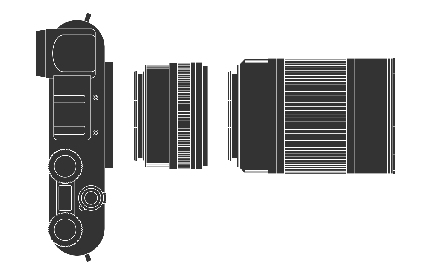
I started by drawing a line drawing on top of a high-resolution image of a lens. I used simple lines, squares and circles to match the image. I had to exercise some judgement when determining which features to depict and which to skip.
With a single base drawing done, I explored different color schemes to see which fit the aforementioned constraints best.
At the end, I chose a white outline and dark gray fill on a transparent background. The image would then be overlayed on a white background or dark gray background in light and dark mode, respectively. This allows for each component to stand out in both light and dark mode.
As seen in the live example below, I include a legend in addition to the image.
Camera setup
After I shipped the first version of the illustrations, Max Duval wrote me an email stating the following:
I was looking at your lens illustrations… and I was a little tickled by the spread of the markings, which I thought made the objects look a tad flat. I wonder if you used the cosine for the spread of the lines? It tickled me so I built a little visualisation for it. Maybe you’ll find it interesting.
I had drawn the knurled lens rings by hand and the spread of the lines was indeed off. Once Max pointed out the issue, I couldn’t unsee it. I used Max’s tool to generate the lines, which I then transposed into my illustrations.
Fortunately, I had used Figma components for each individual piece of gear. Additionally, the images were centralized in my code repository as well. That made changes a breeze.
The result
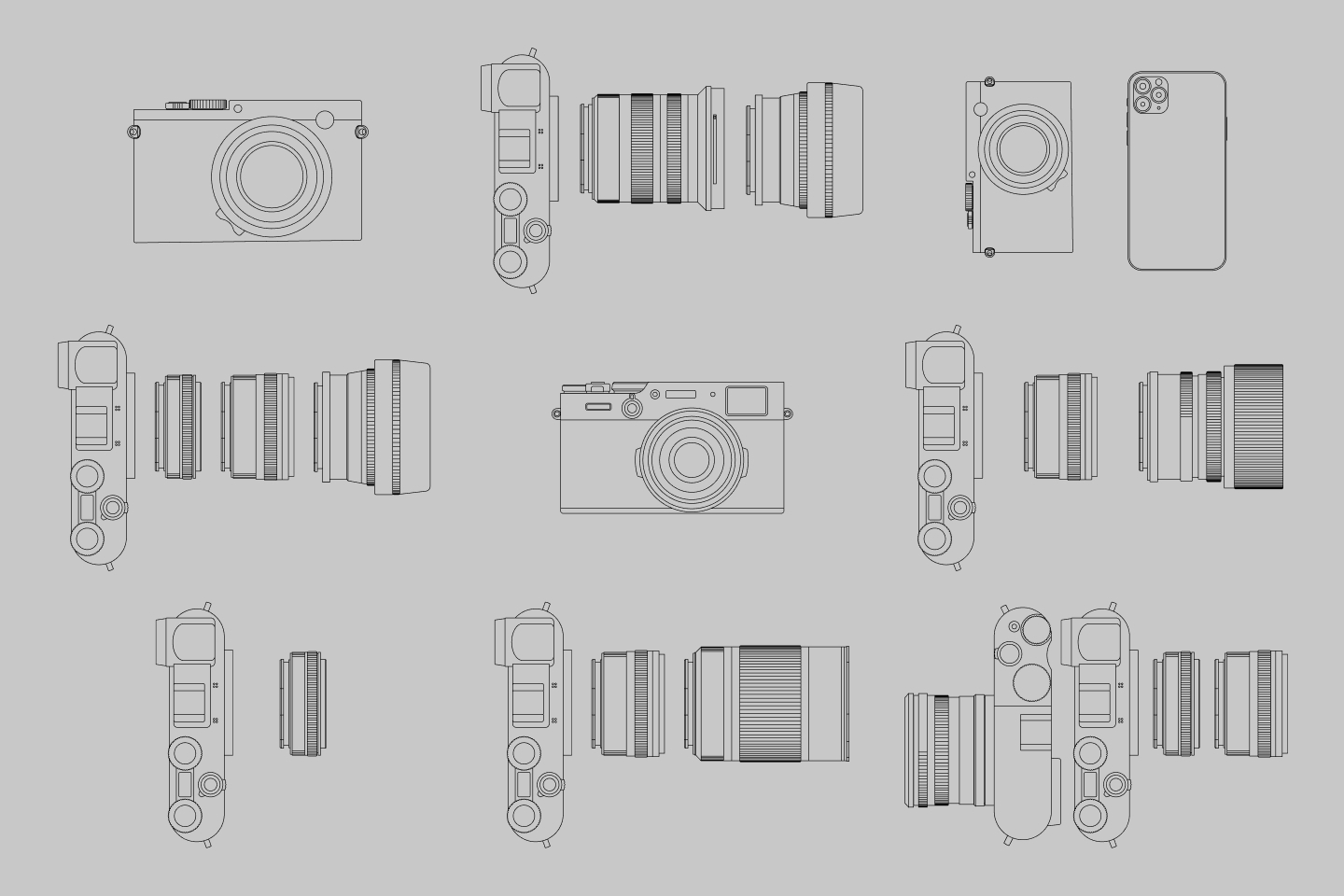
At the end, there are a variety of images. In some cases, such as when a fixed-lens camera is used, I use a forward-facing image. When a camera with detachable lenses is used, I show a top-down view.
Thanks to Q for reading drafts of this.