
Introducing arun.is 2.0
11 min read Apr 18, 2022 Updated Mar 7, 2024
This is part of an ongoing series of posts about how this site is made.
Inside arun.is
Today, I’m announcing the most significant set of improvements to this website since I started it in 2016.
History of arun.is
Before we dive into a tour, let’s look back at how we got here.
I started designing and developing arun.is in late 2016 when I was working as a freelance designer. It was a portfolio with some case studies I could show potential clients. By early 2017, my freelance gig with Carrot Fertility had turned into a founder role. So, I wound down the freelance business and removed the case studies.
During a trip to Shanghai that year, I noticed something at Disneyland that turned into my first blog post. At that time, there was no vision of what arun.is could become. It was simply a place for me to share my ideas.
In the five years since, I’ve written nearly 100 blog posts and started a newsletter, of which there are almost 40 issues. All the while, I’ve honed in on a set of topics I enjoy exploring and potential new subjects to explore.
The site architecture has changed quite a bit, going from Cactus to Gatsby (including many painful upgrades between Gatsby versions). The visual design has also changed substantially.
These changes happened incrementally on weekends and train rides home from work. There wasn’t a single unifying vision behind the site.
In the last few years, that lack of a unifying vision has become more and more troublesome. I realized that arun.is was ripe for foundational changes.
Deciding what to change
Then, the big question became, “where to start?”
In the world of product design, the longer we spend building the same product, the longer our backlog of tasks gets. Similarly, the list of ideas for arun.is has continuously expanded.
As part of my holiday giveaway this year, I sent out a survey to solicit ideas and feedback. The survey results flowed into a Google Sheet. Using the Google Sheets Plugin, I brought that feedback into Figma for some visual organization.
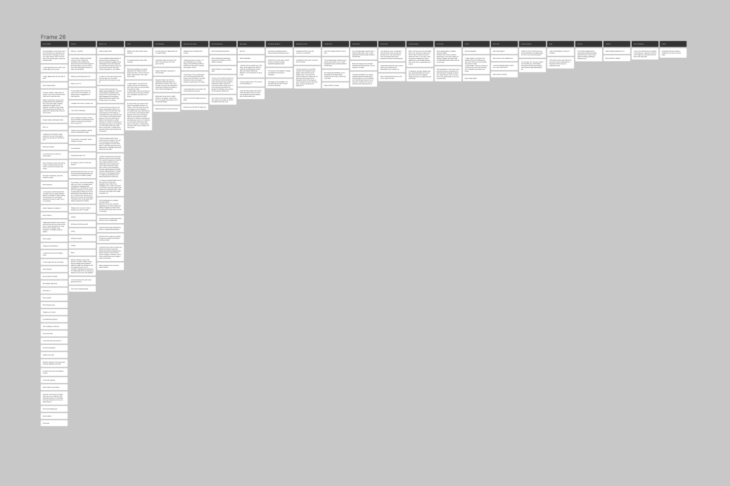
Again like with product design, the feedback was rarely something I had never thought about. Instead, counting repeating feedback and reading your thoughtful messages pointed me to the low-hanging fruit.
With a prioritized list of tasks, I turned to the next obstacle, focus. I never had the space and attention required to step back and reconsider this site. Fortunately, since I recently left Carrot to take a break, I carved out two weeks to design and develop arun.is 2.0.
I spent a day planning out the effort, sorting through ideas and feedback, and collecting inspiration. I then created projects and issues in Linear to make the rest of the process as smooth as possible.
A tour of arun.is 2.0
Let’s tour the changes I’ve made and the process and rationale behind them.
A New look
Perhaps one of the more noticeable changes is the new look. I had noticed how the site resembled a web app with shadows, rounded corners, and depth. I felt that style didn’t suit the design-focused and editorial nature of the site. Honestly, I didn’t like it. I wanted to return to my favorite design genre, modernist graphic design.
Collecting inspiration
I spent half a day collecting inspiration because everything is a remix. By taking just a little from each source of inspiration, I can create something that feels fresh yet rooted in sound design principles.
One of the first sources I delved into is Polestar. I’ve been watching the brand for some time. Stockholm Design Lab hit it out of the park with Polestar’s design language. They achieved a remarkable level of consistency. Print materials, websites, and even in-car UIs feel cut from the same cloth. I particularly appreciate their use of shades of gray and large, thin typography, something that I wanted to reflect in arun.is.
A second source I looked to is the IEEE Spectrum redesign by Pentagram. I’ve been reading IEEE Spectrum for decades since my father is a member. The site and magazine previously felt quite similar to other technical trade publications — in other words, entirely forgettable. Pentagram’s redesign leans in to the cutting-edge subject matter. I paid close attention to the use of lines, subtle rounded corners, and the occasional splash of color.
One last source I’ll highlight is a book. Roots and Wings: Peter Schreyer: Designer, Artist, and Visionary is a retrospective about the work of Peter Schreyer, one of the most influential German automotive designers of our time. The folks at Gestalten combined a simple grid with clever typography to craft a book that feels fresh yet suits Peter’s often utilitarian work.
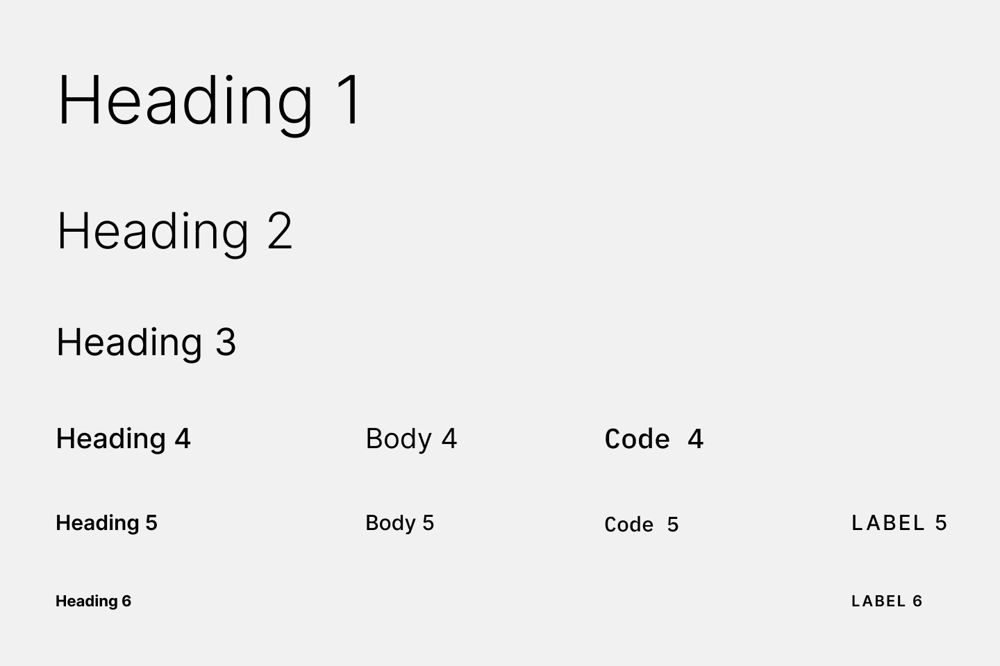
Playing with type
As the next step of my process, I created a new page in my design system Figma file, and played with typography on my existing pages. I even tried some serif typefaces to contrast with Inter used for the headings. Ultimately, I decided to stick with Inter but use varying weights for the headings.
This approach freshens up the entire site without the jarring effect of entirely changing the primary text typeface.
I also chose IBM Plex Mono to display code, keyboard shortcuts, and monospaced text. It feels distinct yet related to Inter.
Creating a unified design language
I found new opportunities to tighten the design language at every iteration of my Figma artboards. My goal was to balance flexibility and consistency. If the system is too constrained, it won’t offer enough options. On the opposite end, the elements won’t feel harmonious.
The final system uses monochrome shades, lines, and typestyles to offer differing hierarchy levels.
Dark mode
One of the most requested improvements is dark mode. If you remember, arun.is had a dark mode for some time. Yet, I didn’t like the color scheme. Also, the code was challenging to maintain.
This time around, I played with a spectrum of colors. Under the new scheme, every component can easily translate from light to dark and back.
There were some tricky bits. For example, while both white and black text can be legible in front of a color like blue, white text is hard to see in front of yellow.
Migrating to Tailwind
These visual transformations were possible only because of a behind-the-scenes effort from months ago.
For most of the last five years, I used Tachyons and, before that Basscss. Both are functional CSS toolkits.
I had fallen in love with functional CSS because it felt like designing, not coding. It gave me the fastest way to go from a mockup to a working prototype.
Unfortunately, Tachyons was a pain to customize. Given my particular widths, breakpoints, etc., I was fighting against all of the defaults of Tachyons. Additionally, the library had gone quite stale and lacked many of the newer features in CSS, including dark mode.
Fortunately, Tailwind CSS picked up where Tachyons left off. Its extensive customizability makes it ten times better than Tachyons. In my workflow, I note the colors, text styles, measurements, and other parameters I’m using in Figma. I then input those into my Tailwind config file. The result is a CSS library that perfectly mirrors my Figma design system.
Months ago, I finally bit the bullet and began a slow and arduous migration process from Tachyons to Tailwind. Most of you probably didn’t notice the change as I aimed to keep things as similar as possible. The idea was to set a new foundation to speed up the redesign process.
Improved navigation
Beyond the visual style, another prominent structural weakness was the information architecture and navigation. Initially, I kept the site minimal. The main page showed a list of blog posts, while an about page described a little about me and the site. It served me well for some time.
With nearly 100 blog posts and a newsletter, that model no longer worked. I reworked the site better to fit the sheer amount of content.
The new home page serves as the jumping-off point for every other corner of arun.is.
The main navigation also needed some work. The homepage was previously only accessible by clicking the arun.is logo. It’s not obvious. So, I added explicit links to the home page and blog.
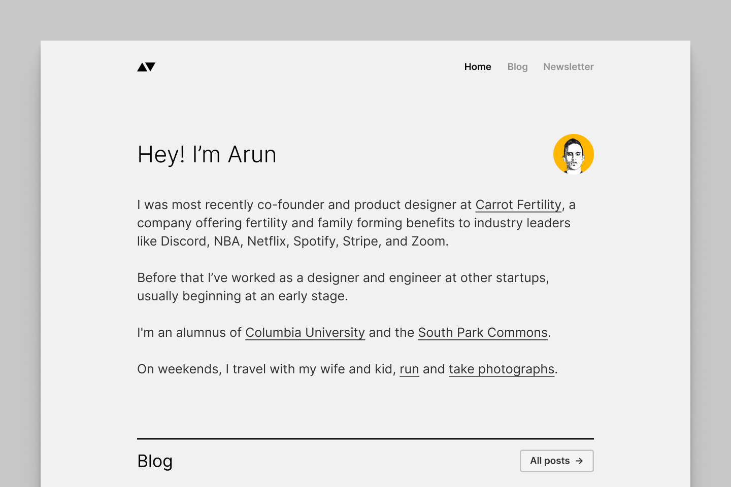
The new home page
The new home page squarely speaks to new visitors. Overall, the home page design serves as a comprehensive map for the current site while offering easy expansion when I want to add more content.
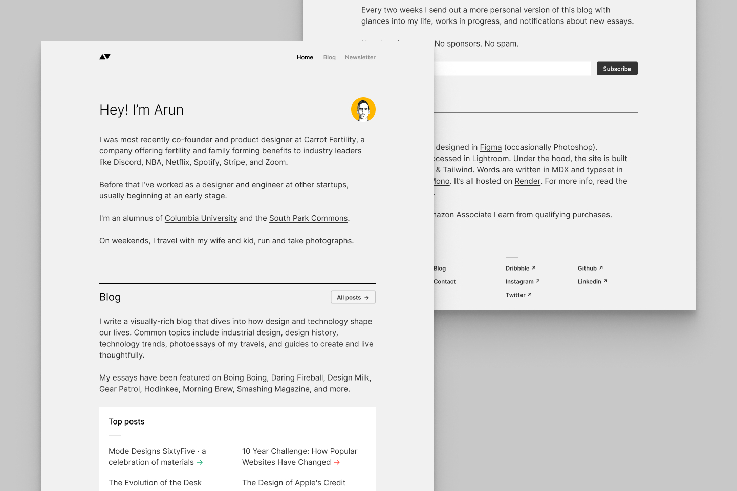
The bio describes who I am and what I like to do. It goes into more detail than I previously had on my about page. There are sections for the blog and newsletter that set expectations for each. I added a section for two wallpaper projects that easily get lost within the blog post listing. Finally, the section at the bottom describes how I crafted this site.
The new blog page
With the significant structural changes out of the way, I focused on the next level of the hierarchy, the blog. Previously, a single list of blog posts could be sorted in different ways and displayed either as text links or graphic cards. Surveying the full extent of the blog was difficult.
So, I tried out half a dozen different ways of organizing the blog posts. Gwern Branwen’s site heavily influences my solution. At the top, there is a list of recent posts and popular posts. Then follows a breakdown by topic.
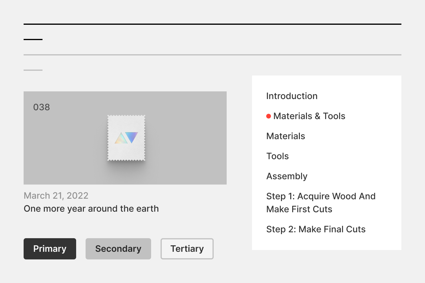
I borrowed the table of contents I use on the blog page to improve navigation further. I employed the rules in my design system to reduce the component’s visual prominence.
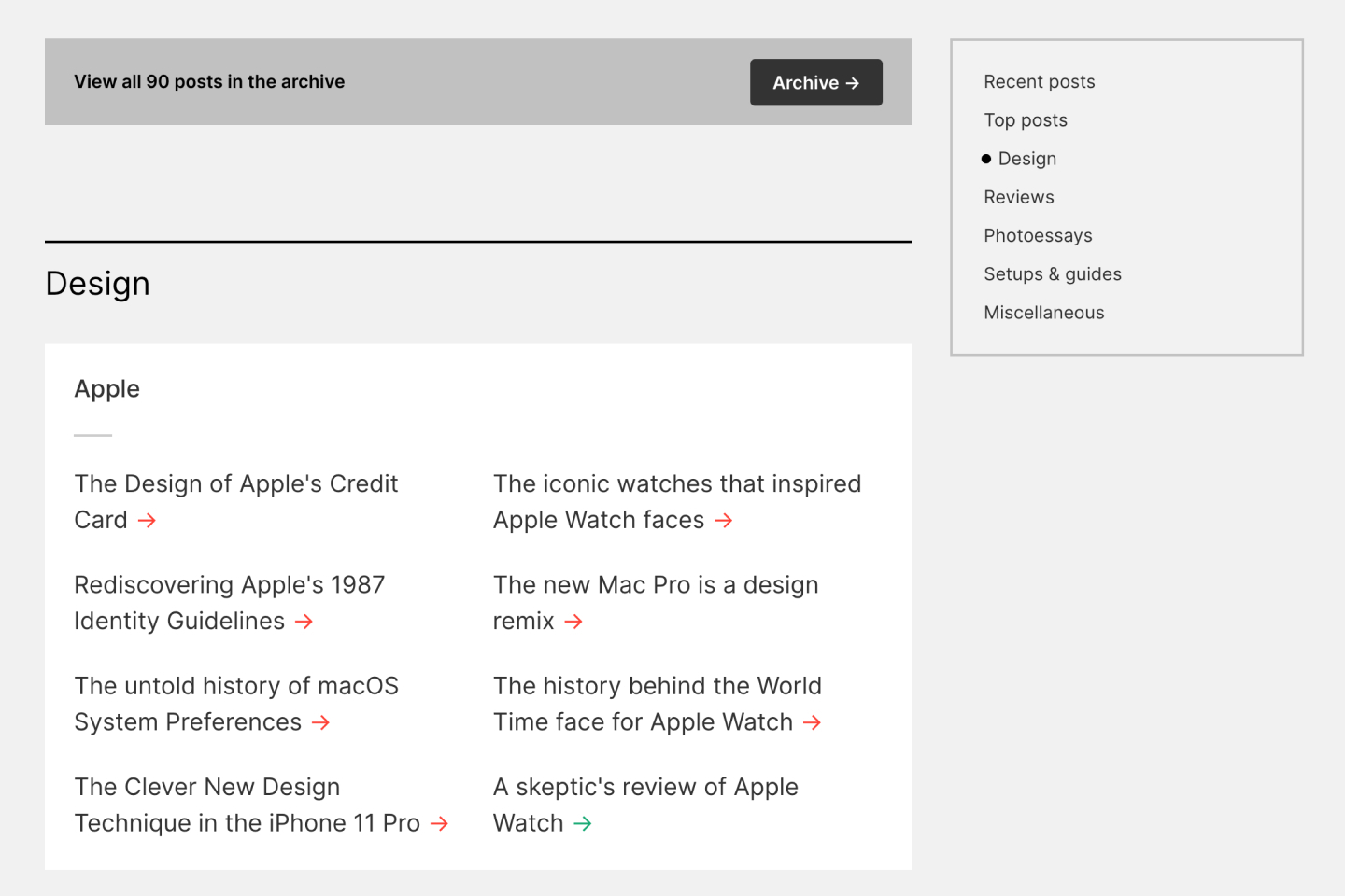
After landing on this solution, the hard part began. I had to sort all of my blog posts into topics. I again turned to Figma. While visually arranging them, I arrived at a system of topics and subtopics.
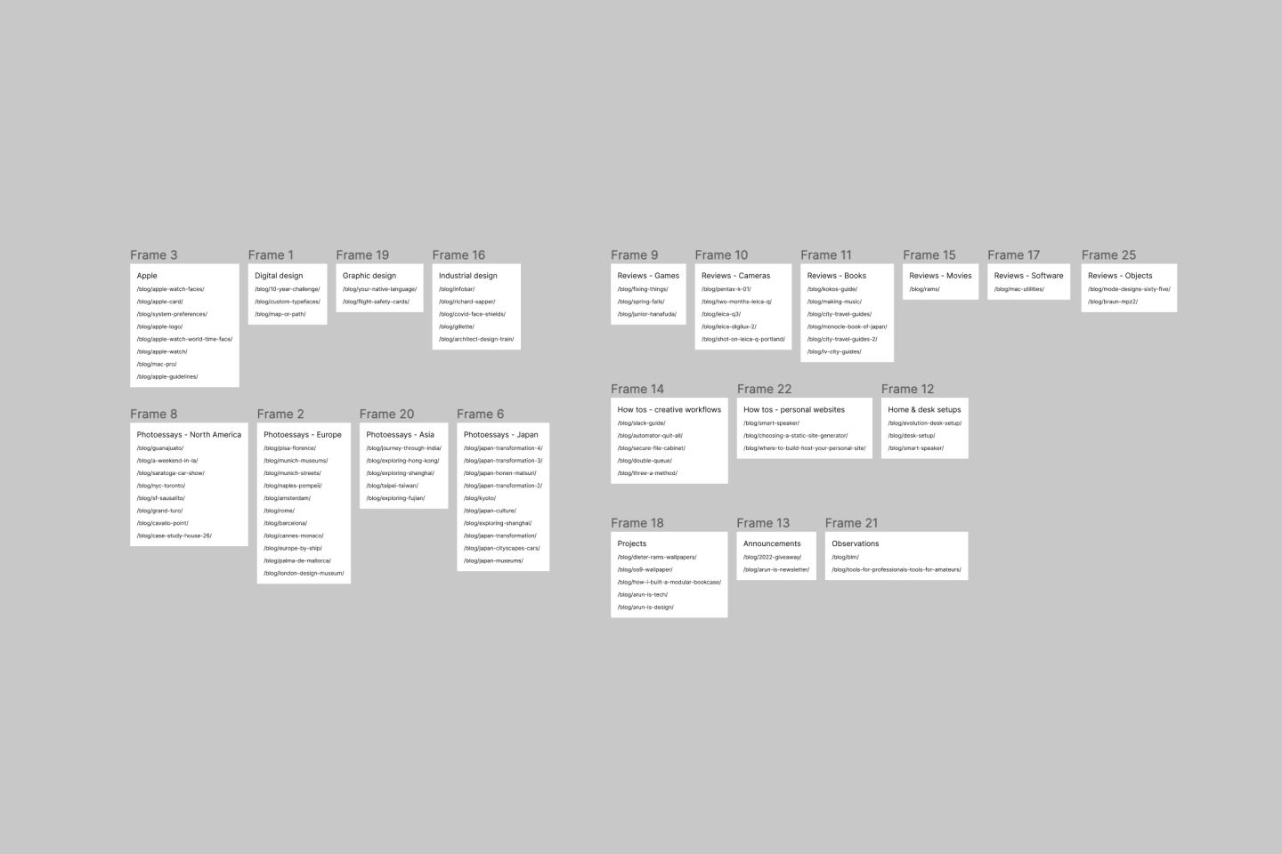
A relocated blog archive
I decided to keep the flat listing of blog posts as the blog archive. It’s a bit buried since I’m guessing it will pale in usefulness compared to the new blog page.
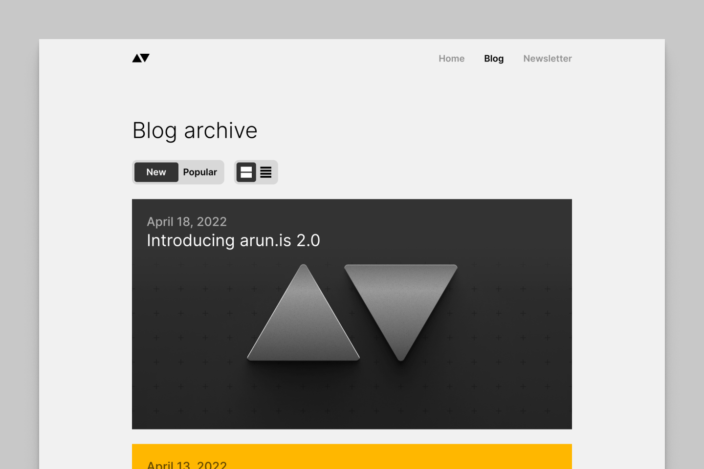
Aside from minor visual tweaks, I also simplified sorting. I previously had a “Hot” option modeled off the gravity-based systems used in Hacker News and Reddit. Given the low frequency of new content, “Hot” looked confusingly similar to “New.” So I removed it.
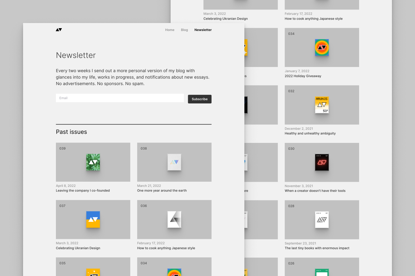
Newsletter archive
The newsletter page has stayed the same since I first announced it. As I sent out one issue after another, you all frequently requested an archive of past issues.
arun.is 2.0 finally introduces a complete listing with links to past issues precisely as they appeared. I decided to prominently feature the custom stamp illustration I do for every issue in addition to the issue number, date, and title.
Improved reading experience
No redesign of this site could be complete with changes to the blog-reading experience.
The easiest improvement is a reading time estimate. Gatsby provides reading estimates, and word counts out of the box. I added a few lines of code to optimize the number. Gatsby’s default numbers were a bit low.
I also brought the floating table of contents to nearly every blog post. An earlier hurdle preventing this was that I included every heading within a given post. Some posts have ten or more, making the table of contents too long. I reworked it to limit the depth of headings it includes while still correctly highlighting the active section.
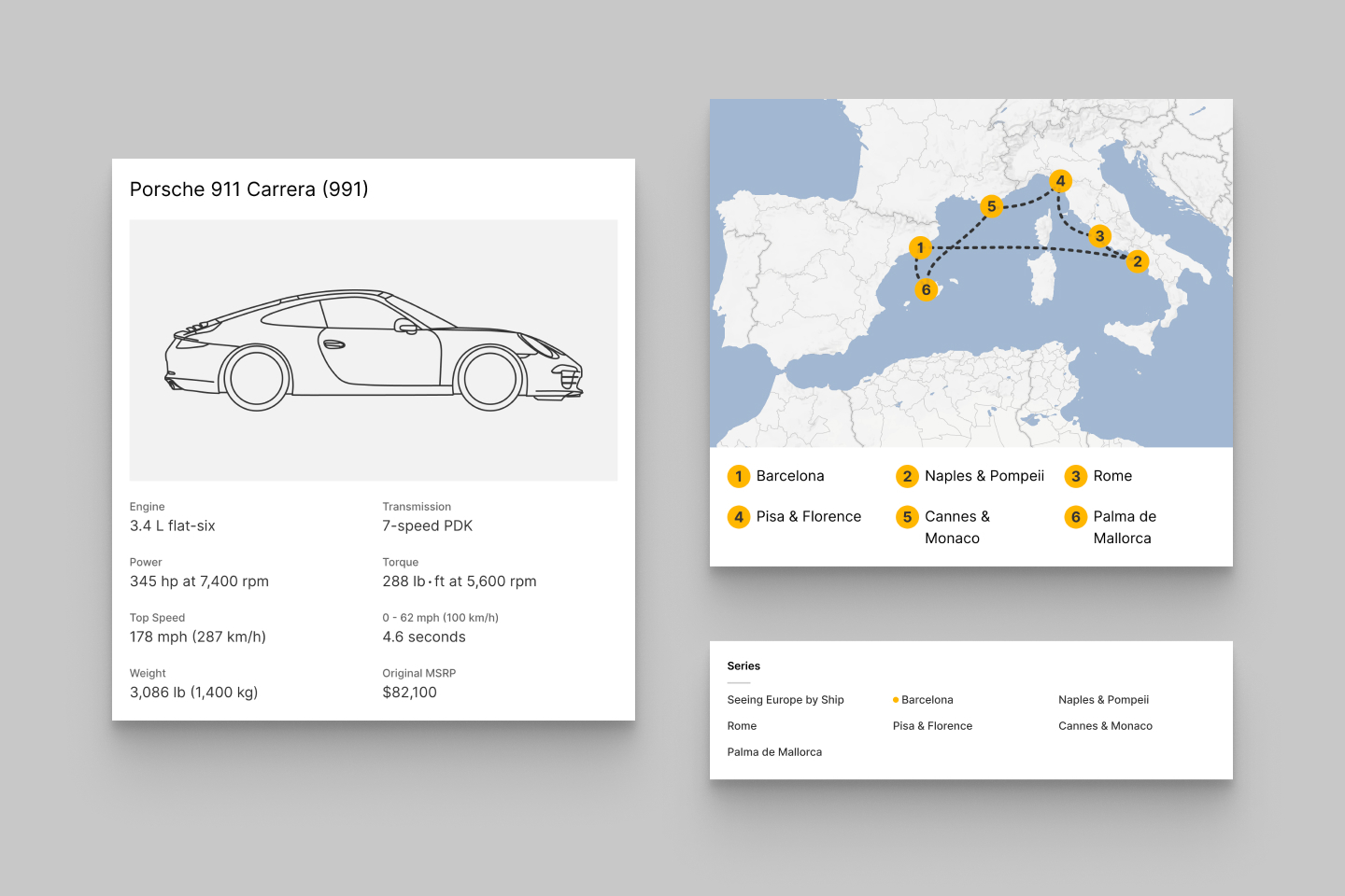
Some posts use custom cards in line with the text. Examples include post series lists, maps, and product details. I redesigned these individual components to conform to the design system.
Lastly, in the previous version of the blog, links would all be colored the theme color of the post. As I mentioned earlier, yellow links are hard to see on white or light gray backgrounds. Also, the links stood out too much and detracted from the rest of the content.
The solution was to use underlines colored in the post’s theme. I got it just right with tweaks to the underline weight and offset from the text.
Under the hood improvements
When I first opened up Figma at the start of this redesign, I had to grapple with a lot of design debt that had added up over the years. Similarly, when I opened up Visual Studio Code, I found a mountain of debt.
Some components that started small had grown to a messy mix of complex logic, markup, and styles. I split these files into one with logic and another with markup and styling.
In other cases, multiple files used very similar code blocks. One example is how I feed the output of a GraphQL query for posts into a display component. I turned the plumbing logic into common reusable utilities. Some are tiny, like one that removes typographic runts (single words on a final line) in titles by using a regular expression.
What’s next
I hope this redesign can serve me for another five years or more. If I succeed, I can incrementally add to the system without going to the drawing board again.
I still have a long list of potential improvements like search, performance gains, interactive components, etc. They’ll provide plenty of fodder for future weekends of hacking.
Thanks to Q for reading drafts of this.