
A desk setup for two
8 min read May 23, 2024
This continues the series of posts about my desk setup.
Desk setup
When I first moved in with my then-girlfriend, now wife (who I’ll refer to as Q), she commuted to her office while I worked from home once or twice a week. I began building my home desk setup around that time. I approached the task believing that a well-designed setup would inspire and support my creative work.
After a few iterations, I wrote about it in the first post of this series, following five principles:
- Objects must not just fulfill their functional purpose; they must form an emotional bond.
- When possible, prefer the preowned classic to the brand new, unproven product.
- Minimize clutter and distractions. Part of this is picking a light, minimal color palette.
- Support as many different types of work as possible without needing rarely used specialized equipment.
- Change and iterate as my needs change.
By following the last principle, I continued updating my setup and wrote an updated post a year later.
Q began working from home like most office workers. All the while, her setup moved around the house as the residents of our house changed (roommates moved out, we had kids). Keeping our setups separate made Zoom meetings easy.
After some time, we decided it would be better to share a work space and temporarily use other rooms for meetings. We hypothesized the change would make us more productive.
The problem was that my desk took up most of the space in our loft. Following these principles, we made extensive changes to fit two people. The final outcome is two setups that feel consistent, yet fit our unique ways of working.


In this post, you will see images with icons drawn by Q, representing two people:
- The red icon depicting a man represents A, which is me
- The blue icon depicting a woman represents Q
Disclosure
Jeff at Ugmonk sent over the Gather system for review. He didn’t review this post before publishing.
Furniture
Desk
The desk was the biggest item needing change. My previous 60” x 30” top took up too much space. I sold it in the local classifieds and picked up two narrower WOODCN 48 ”x 30” beech wood desk tops. They maintain the butcher-block style, with the added bonus of coming pre-finished. The smaller desks also meant retiring my Harman Kardon Sound Sticks.
Both tops are held up by Jarvis standing desk frames, which can adjust to different sizes. Q’s has newer electronics, but is the same size.
Underneath, the organization strategy from the first post continues in each desk. A long 12-outlet surge protector powers everything. Power bricks and cords live in one of two cable trays. Cables are clipped to the desk to avoid sagging. Cords leaving the desk are joined together and wrapped with white sleeving to give the appearance of a single cord. Wire wrap is employed for monitor wires.
Chair
I still use my Herman Miller Embody (in Balance Tomato fabric) with the arms removed. It has continued to be the most comfortable chair I have spent extended periods in.

While building out Q’s setup, I kept a lookout for used Embody chairs locally and found one with Balance fabric in Berry Blue. The only difference is the metal frame finish.

The contrasting colors of our chairs then became the theme colors for the rest of our setups.
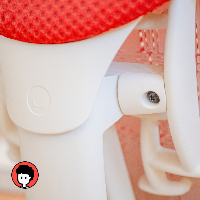
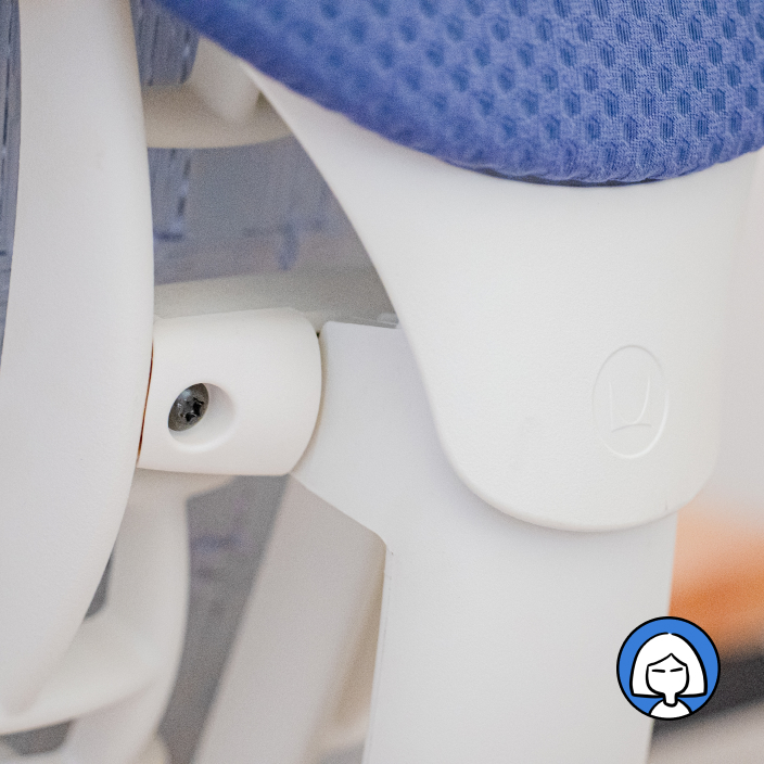
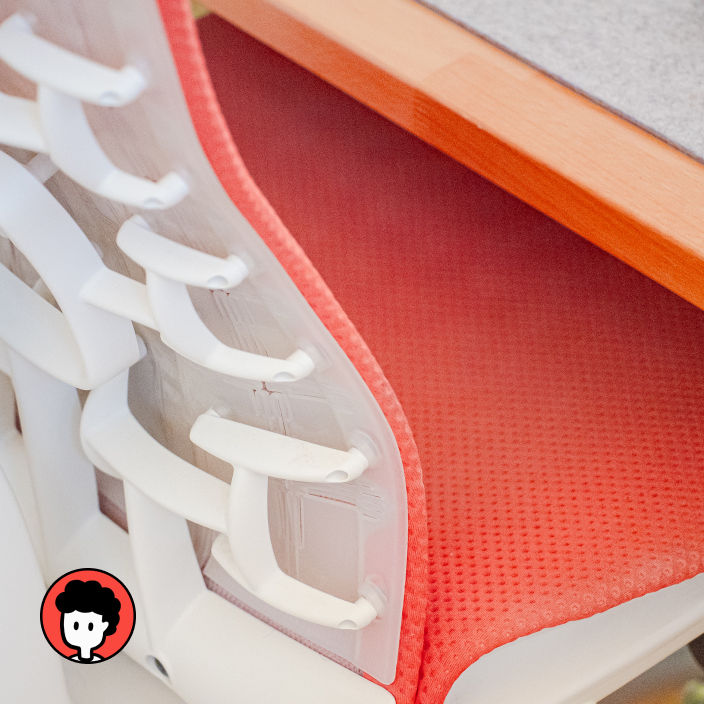
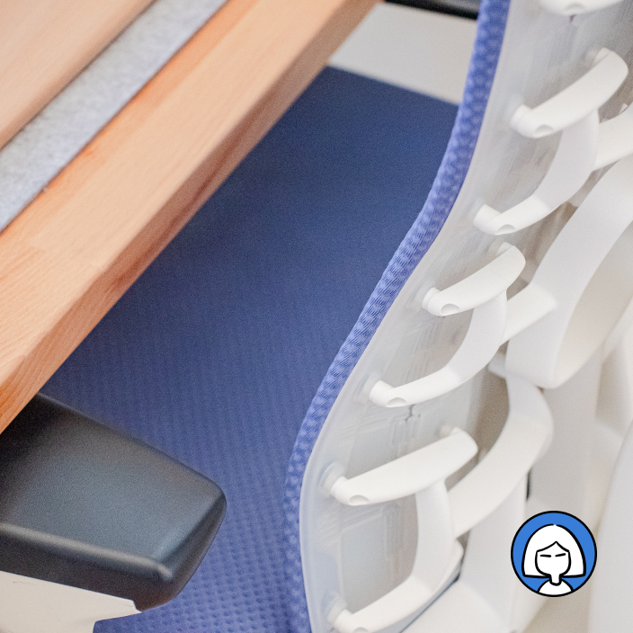
To minimize damage to our hardwood floor and improve rolling, I upgraded the casters to rollerblade-style rubber wheels.

Lamp
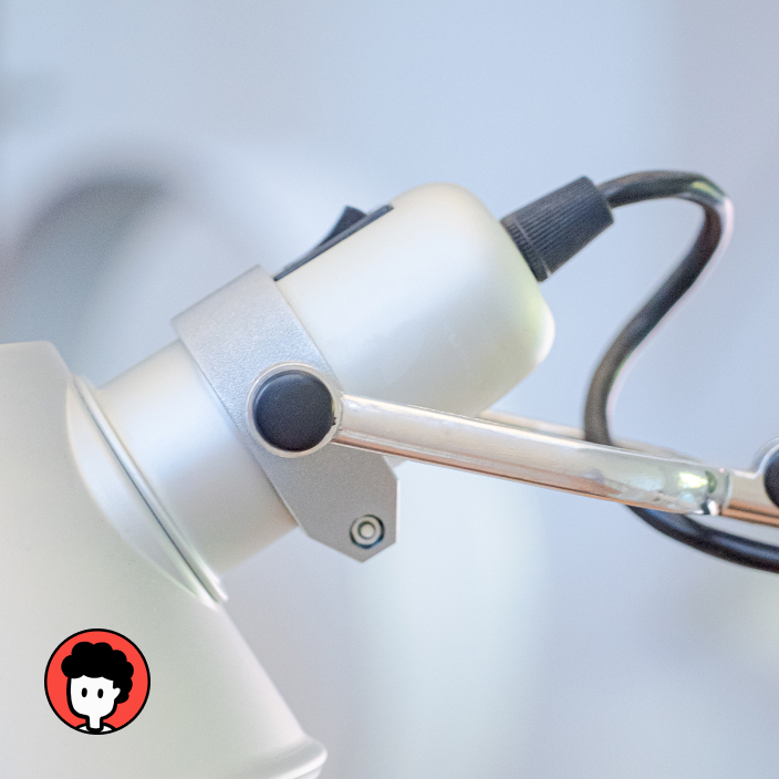
The Artemide Tolomeo Mini lamp suits my needs perfectly. It’s a beautiful visual object by day and provides a productive environment at night.

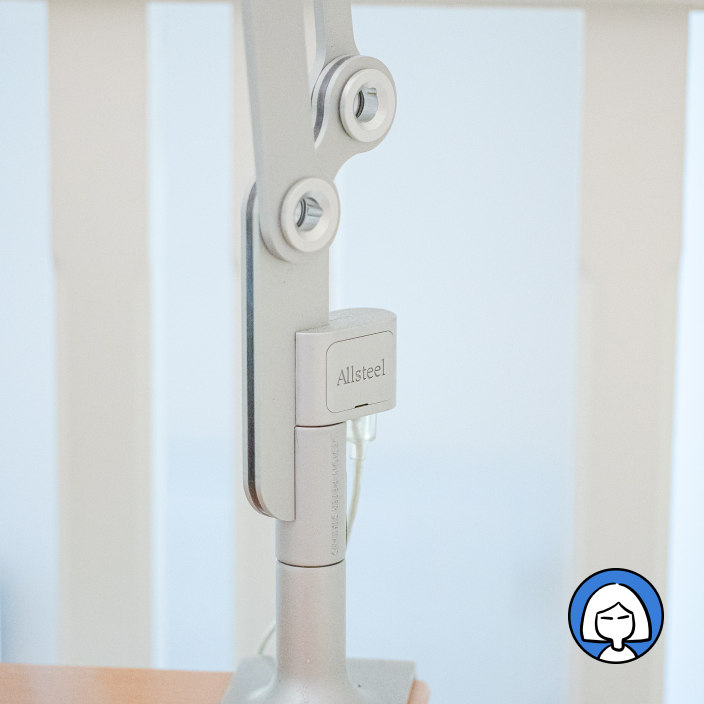
For Q, I looked for a lamp that would take up less space on her desk. The Tolomeo can be configured with a clamp, but I felt having the exact same lamp would be monotonous. That’s when I came across the Pablo Link with clamp base. Released in 2008, plenty are available on the used market. The shade is a flat donut-like disc — a motif continued to the hubless bearings.

The LED-based shade of the Link lamp doesn’t require a complex cable and spring system like the Tolomeo. The Link has a rocker switch with off at its center and low and high settings on either end. The only downside is the plastic cover on the shade has become sticky and attracted dust over time.
I love how both lamps share their industrial style while looking unique.
Computer & peripherals
Both of us power our setups with a MacBook Air. I upgraded to a 2022 Apple MacBook Air (M2) after running out of space on the M1. Q is using the 2020 Apple MacBook Air (M1). Both computers provide more than enough capability for us.

I took my computer out of the drawer it was in because it would get hot and thermal throttle and the smaller desk lacked space.
Docks
To minimize fussiness with wires, both of our setups feature a central dock. Mine is the CalDigit TS3 that I’ve had for six years. I mounted it under my desk to save space.

To compensate for the loss of access to the SD card slot and USB ports, I attached a Belkin USB-C 6-in-1 Multiport Hub behind my monitor. My mouse dongle lives in this hub.

Q wanted to use her laptop screen and an external monitor. To conserve space, she’s using the Brydge Stone II dock, which doubles as a laptop stand. An added bonus of keeping her laptop open is that she doesn’t need a separate webcam.

Monitor
My 40” 4k monitor didn’t fit our 48” desks, so I moved it to my Zwift biking setup. I replaced it with the Apple Studio Display with VESA mount. It has a webcam and built-in speakers.

In addition to her MacBook’s built-in display, Q is using an older 27” 4k display from LG, the 27UD68P-B. It suits her needs for now, but we’ll consider another if she needs better color accuracy.

The wallapers pictured are my vintage Mac wallpaper in different colors.
Keyboards
I’ve been using my ZSA Moonlander with NP PBT Blank Keycaps, the only change is the switches. I used Kailh Box Whites initially.

I decided on the Zealio V2 Switches (Tactile). After a week, I found them much faster and more comfortable than the Box Whites.

For Q, we followed the white and silver theme with a staggered QWERTY layout. We chose the silver anodized Sequence from Parallel, an anodized aluminum switch plate, and Parallel’s Pewter tactile switches. She is using a 32cm beech wood wrist rest from Etsy.

While shopping around for keycaps, we installed a set of generic Japanese PBT Cherry-profile keycaps because Q was studying Japanese at the time. She kept them because they look good and are cheap.

Both our keyboards are connected via the strong and flexible Belkin BoostCharge Braided USB-C Cable.
Mice
Q took my silver MX Master 3 mouse. She uses default settings, so no additional software is needed.

I switched to the Logitech Lift vertical mouse to relieve wrist pain. I thought I would miss the additional features of the MX like MagSpeed scrolling and thumb wheel. I quickly realized the Lift is more than enough.

I prefer my trackpad to work like a touchscreen, but the scroll wheel to move in the opposite direction (like old mice). For this, I use Mac Mouse Fix, which uses far fewer resources than the software that comes with the mouse (Logi Options+).
Both of us use a Magic Trackpad 2 on the left side of our keyboards. All of our peripherals sit on felt deskmats that I made.
Organization
The release of iOS StandBy mode provided an opportunity. We can charge our phones while using them as clocks.
I’m using the Ugmonk Gather 1x4 Premium Organizer Set (White/Maple). It holds my pens and stickies, and the phone stand.

The hand-built components complement my setup and remind me of quality craftsmanship.

Q is using the Courant MAG:2, which I reviewed on zen of things alongside the Ugmonk stand. Though it charges a little slower, it also has a second charging pad for AirPods or another device.

In terms of productivity, we both use Ugmonk Analog. It’s a simple system that allows us to plan without device distractions. Q uses the Analog stand.

I, on the other hand, find that the space in the middle of my keyboard perfectly fits two cards.

Was it worth it?
In the end, creating a two-person setup was the right decision. Not only is it a better use of space, sitting next to each other lets us collaborate and not feel alone.

We will keep updating as our needs change. Maybe we’ll need to carve out more space once my children need their own computer.
Until then, this setup is perfect for us.
Full List
Desk & cable management
Furniture
Item | Q | A |
|---|---|---|
| Herman Miller Embody chair | ● | ● |
| Rollerblade style casters | ● | ● |
| ● | ||
| Artemide Tolomeo Mini lamp | ● |
Computers & docks
Item | Q | A |
|---|---|---|
| Brydge Stone II USB-C dock/stand | ● | |
| 2020 Apple MacBook Air (M1) | ● | |
| Apple Thunderbolt 3 cable | ● | |
| 2022 Apple MacBook Air (M2) | ● | |
| CalDigit TS3 Plus Thunderbolt Dock | ● | |
| Belkin USB-C 6-in-1 Multiport Hub | ● | |
| ● |
Monitors
Item | Q | A |
|---|---|---|
| ● | ● | |
| LG 27UD68P-B 27” display | ● | |
| Apple Studio Display | ● |
Accessories
Item | Q | A |
|---|---|---|
| ● | ||
| Courant MAG:2 MagSafe dock | ● | |
| ● |
Mice
Item | Q | A |
|---|---|---|
| Magic Trackpad 2 | ● | ● |
| MX Master 3 | ● | |
| Logitech Lift | ● |
Keyboards
Item | Q | A |
|---|---|---|
| Belkin BoostCharge Braided USB-C Cable | ● | ● |
| ● | ||
| ● | ||
| ● | ||
| Japanese PBT Cherry Profile keycaps | ● | |
| ZSA Moonlander keyboard | ● | |
| ● | ||
| ● |
Camera setup
Thanks to Q for reading drafts of this.
