
The iconic watches that inspired Apple Watch faces
16 min read Jan 25, 2021
Apple watch Faces
The Apple Watch is more than merely a smartwatch. In my review of the Apple Watch Series 6, I described how it sits at the confluence of design, technology, lifestyle, and watchmaking. This perfect blend of so many different disciplines and constraints puts it in a category all by itself.
Apple did this not by taking an age-old wristwatch silhouette and cramming some electronics in it. Instead, they carefully reimagined every aspect, from the user interaction patterns to the mechanism securing the interchangeable bands, the digital crown, the variety of cases and bands, and the use of watch terms like “complication” in the user experience.
In particular, the analog faces reveal what Apple does so well — taking the familiar and making it their own. Over the years, they have released quite a few faces with roots in history. Each one started as an iconic watch archetype and was remade to take advantage of the Apple Watch platform.
Watch terminology
Before jumping into the Apple Watch, let’s review some useful watch terminology.
Some additional terms that were difficult to illustrate:
- Case: The case is the enclosure that houses the watch internals and around which everything else is attached.
- Movement: The movement is the heart of the watch. It is the mechanism in charge of keeping time and running any complications.
- Subdial: Subdials are smaller dials within the main dial. They are often used to track the seconds or power reserve.
- Complication: This term refers to any function aside from time-keeping, such as the date, or moonphase.
- Crystal: The crystal is the clear material that protects the watch dial. Crystals are usually made of plastic, mineral glass, or synthetic sapphire, which has a hardness only topped by diamond.
- Reference number: Similar to model numbers in other products, the reference number can be used to identify the model, material, dial, movement, and more. Often, collectors use reference numbers instead of names in order to be specific.
The main elements of an Apple Watch face
Continuing on, to appreciate what makes each of Apple’s historically-derived faces unique, let’s start by understanding what they have in common. They come in two primary shapes, rectangular and circular.

Some faces integrate both the dial and bezel on screen, which is likely why Apple decided to call them faces instead of dials.

Regardless of the shape, they employ the same hands in slightly different color combinations. Most have hour, minute, and second hands. Some hands are solid, while others are outlined with a contrasting color on the inside as if using luminous material.

The indices resemble pill shapes, echoing the hands, San Francisco Compact Rounded typeface, and other rounded elements of the Apple Watch UI.
Faces support the addition of complications. These include classics like the date or moon phase but can include the weather, fitness stats, and custom complications from third-party applications.

Lastly, the wearer can choose a color scheme for each face from an extensive set of pre-made color combinations.
Let’s dive into five Apple Watch faces — California, Chronograph, Chronograph Pro, Count Up, and GMT.
California
The history of the California dial
The California face is not a reference, as some may think, to Apple’s headquarters, but in fact, to a dial design originating during World War II.
Originally called the “error proof” or “high visibility” dial, it adorned the fronts of “bubble back” Rolexes — so-called because of the bubble-shaped back that gave the watches a thin appearance. Strikingly, the indices are set both in Roman and Arabic numerals where other watches would stick to one or the other. It’s thought that mixing numerals aids both the wearer and his brothers-in-arms in reading the watch in low visibility conditions.
 ads for Rolexes with the high
visibility dial · image credit Rolex Magazine
Unusually thick radium-based luminescent material[1] and differently-shaped hands (including the “mercedes” hand that would become a signature of future Rolexes) also aided in readability.
Rolex patented this design in the middle of the war, but this dial’s war history didn’t end there.
 Rolex’s Swiss patent
application · image credit Rolex Magazine
Panerai, which at the time was best-known as a supplier of technical equipment and precision instruments, was tasked with supplying German military divers with wristwatches[2]. Their solution was the reference 3646 manufactured for Panerai by Rolex. It was a large pocketwatch movement housed in a wristwatch with, as you may have guessed, Rolex’s “error proof” dial.
 Panerai ref. 3646 · image
credit Phillips
In the decades following the war, the “error proof” dial started to fade into history. Then, the Bubbleback Rolex made a comeback in Japan during the economic boom of the 80s[3]. They became so popular that demand quickly dwarfed supply. A dial finishing company in LA started refinishing dials on existing watches with half-Roman, half-Arabic indices to meet the tremendous demand. Legend says that they became known as California dials as these remakes from LA starting flooding the market. Then, as the boom became a bust, the popularity of the California dial waned again.
Since the 80s, the California dial was revived in some Tudors and Panerais, which are still made today and surprisingly officially referred to as California dials.
 a modern Panerai Radiomir
California
There are also a few more modern and accessible examples still. Swatch just unveiled a special edition System51 alongside watch magazine Hodinkee, the Generation 1990. Nomos makes the Club Campus, which flips the script with Arabic numerals on top and Roman numerals on the bottom. Timex also just introduced the Marlin Automatic California Dial.

Apple’s California face
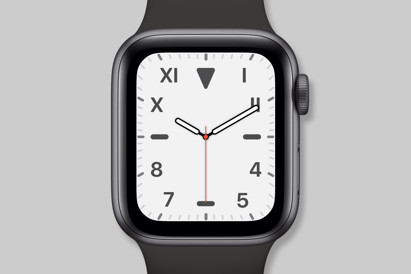
Apple Watch SE, Apple Watch Series 4, and later
On Apple’s California face, the numerals can be set in the classic mix of Roman and Arabic or all Roman, all Arabic, Arabic-Indic, Devanagari, or removed altogether. The face also offers the choice of a circular or square dial.
On the default California face, the numerals are set in a slightly rounded form of the San Francisco typeface. The various markings appear in three different shades of the same color, lending to a harmonious hierarchy.
One of my favorite features of the California face is its support of a custom monogram, which has allowed me to turn the “Pills” variant of the California face into a custom arun.is face.

Chronograph & Chronograph Pro
The history of chronographs
Not to be confused with chronometers, chronographs are watches that can be used as stopwatches. In other words, they can measure elapsed time. As tool watches, they sit at the top in popularity, finding use in various situations like car racing, horse racing, etc.
The word chronograph comes from the Greek words “khrónos” or time and “gráphō” or to write[4]. For most of history, it was accepted that the first chronograph was designed by Nicolas Mathieu Rieussec in 1822 for King Louis XVIII to time his horses[5]. This invention used a pen to mark an arc on the dial to visualized elapsed time.
 Nicolas Mathieu
Rieussec’s original invention · image credit Worn & Wound
The watch world was shocked in 2012. Christie’s auctioned the “compteur de tierces” made by Louis Moinet[6]. It looked very much like a modern stopwatch, and importantly, was created a full six years before Rieussec’s invention. Hence, the history books had to be rewritten.
Over the 19th and 20th centuries, watchmakers and inventors worldwide continued to improve upon the chronograph formula.
 Louis Moinet’s
invention · image credit watchonista.com
In 1889, Breitling introduced a chronograph with split time, which enabled the timing of multiple competitors in races[7]. In 1913, Longines introduced the Calibre 13.33Z, the first wristwatch chronograph movement[8].
 Longines Calibre 13.33Z · image
credit Christie’s
Even the first wristwatch on the moon was Buzz Aldrin’s Omega Speedmaster Professional chronograph, which is known as the “Moonwatch” in watch circles[9].
 Speedmaster ads
Today, there is a wide variety of chronographs available. Some are hand wound, some are automatic. Some have no subdials, while others have 2, 3, or 4.
There have been quite a few two-subdial chronograph movements over the years. One of the most notable and my favorite is the Calibre 11, which powered the Heuer Monaco 1133B famously worn by Steve McQueen in 1971’s Le Mans. Two pushers sit on the right side of the case, functioning as start/stop and reset buttons.
 A vintage Heuer Monaco 1133B ·
image credit Hodinkee
Two of the most sought-after three-subdial chronographs are the previously mentioned Omega Speedmaster Professional and Rolex Cosmograph Daytona. Both have the same subdial placement and a tachymeter in the bezel, which can be used to measure rates of change such as speed. They also feature the familiar pushers as in other chronographs.
 Omega Speedmaster
Professional and Rolex Cosmograph Daytona
Apple’s Chronograph face
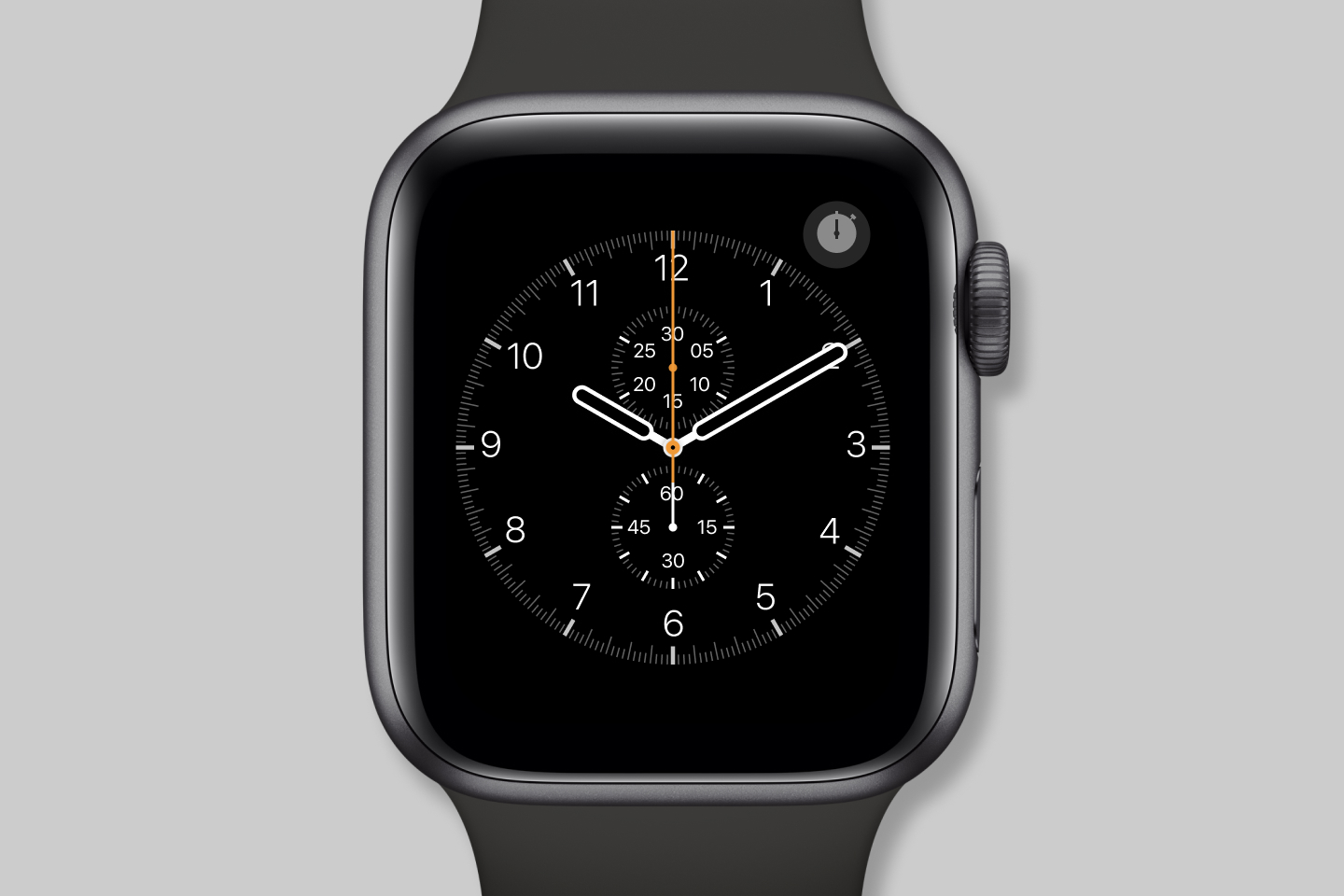
The Chronograph face mimics the simple two-subdial chronographs of the early 1900s. There are normal hour and minute hands while the second hand is moved into the subdial at 6 o’clock. In its place is the chronograph’s second counter hand which remains static when not in use.
While many real chronographs have both hour markers and a sixty-second scale on the dial, Apple takes a more modern and dynamic approach.
The top right corner is reserved for a stopwatch button. When pressed, the hour indices are replaced with the second scale. The scale can be customized to measure 60, 30, 6, or 3 seconds per revolution.
The second subdial at the 12 o’clock position houses the minute counter for the chronograph. It counts anywhere from 30 down to 2 minutes depending on the timescale chosen for the main dial.
The start/stop button at the top right stops the chronograph and switches it back into normal mode. The lap button on the bottom right either starts timing a new lap with a blue hand when in use (starting a second lap hand) or resets the timer when stopped.
What Apple has added to their digital interpretation of the chronograph is the precise digital time readouts alongside the analog timers.
Apple’s Chronograph Pro face
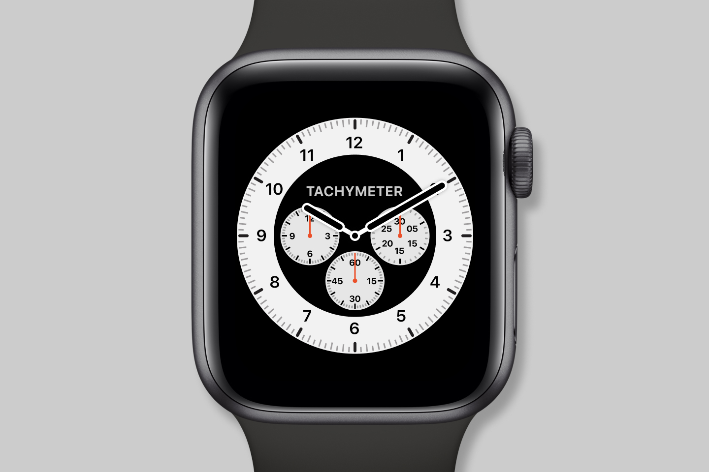
Apple Watch SE, Apple Watch Series 4, and later
The Chronograph Pro, is as expected, a more sophisticated version of the Chronograph face. It utilizes a bezel, unlike the standard face. The bezel can be set to the same four time scales, with the addition of a tachymeter option.
The subdials are arranged similarly to popular chronographs previously mentioned. The minutes subdial is at 6 o’clock. The chronograph function has an hour subdial at 9 o’clock and a minute subdial at 3 o’clock. Instead of a dedicated stopwatch button, a tap to the face engages the chronograph complication and reveals the “pusher” buttons at the bottom of the face.
When the scale is set to tachymeter, lap timing is unavailable, but a second blue hand is available in other scales.
Again, Apple’s digital interpretation of the chronograph pro offers digital readouts, something not possible on mechanical watches.
Count Up
The history of dive watches
Unlike the previous faces, the name Count Up, refers to a type of bezel, not a dial or complication. Also known as the diving bezel, this rotating bezel, when coupled with the minute hand, helps measure elapsed time in minutes.
The count up bezel can be traced back to a monumental year in the history of the dive watch — 1953.
By then, numerous advances had already been made. Three decades earlier, in 1926, “Rolex founder Hans Wilsdorf patented the Oyster case, featuring screwed-down crown and caseback which are as ubiquitous among dive watches today as the name Rolex is recognizable around the world”[10]. Omega released their own waterproof watch in 1932, the Marine[11]. Panerai had continued iterating on its dive watches and introduced the Radiomir[12], a name that still stands in the pantheon of collectible dive watches today.
 A modern re-release of the Omega
Marine
Then in 1953, Rolex set new records by strapping its Deep Sea watch to the outside of the Trieste submersible, which took it in the ocean to a depth of 3,150 meters and back unharmed[13].
Earlier, Captain Robert “Bob” Maloubier and Lieutenant Claude Riffaud of French Navy’s Combat Diving School approached Blancpain with a request for a new dive watch. Blancpain CEO Jean-Jacques Fiechter, an avid recreation diver, accepted the challenge and delivered a solution in 1953. The result was the Blancpain Fifty Fathoms, a watch design to operated at a depth of, you guessed it, 50 fathoms[14]. In addition to an automatic movement resistant to magnetic fields, it featured the now unmistakeable rotating count up dial to measure dive times.
 Blancpain Fifty Fathoms · image
credit Phillips
The very next year at the Basel Watch Fair, Rolex showcased the Submariner, easily the most famous of all dive watches. It features large indices, the high visibility hands we saw earlier in the Rolex “bubble back” watches, and an extendable bracelet that allowed wearing over a wetsuit[15]. The rest is history.
 An original Rolex Submariner ref.
6204 · image credit Christie’s
To learn about history of the Submariner, watch Hodinkee’s Reference Points episode.
Apple’s Count Up face
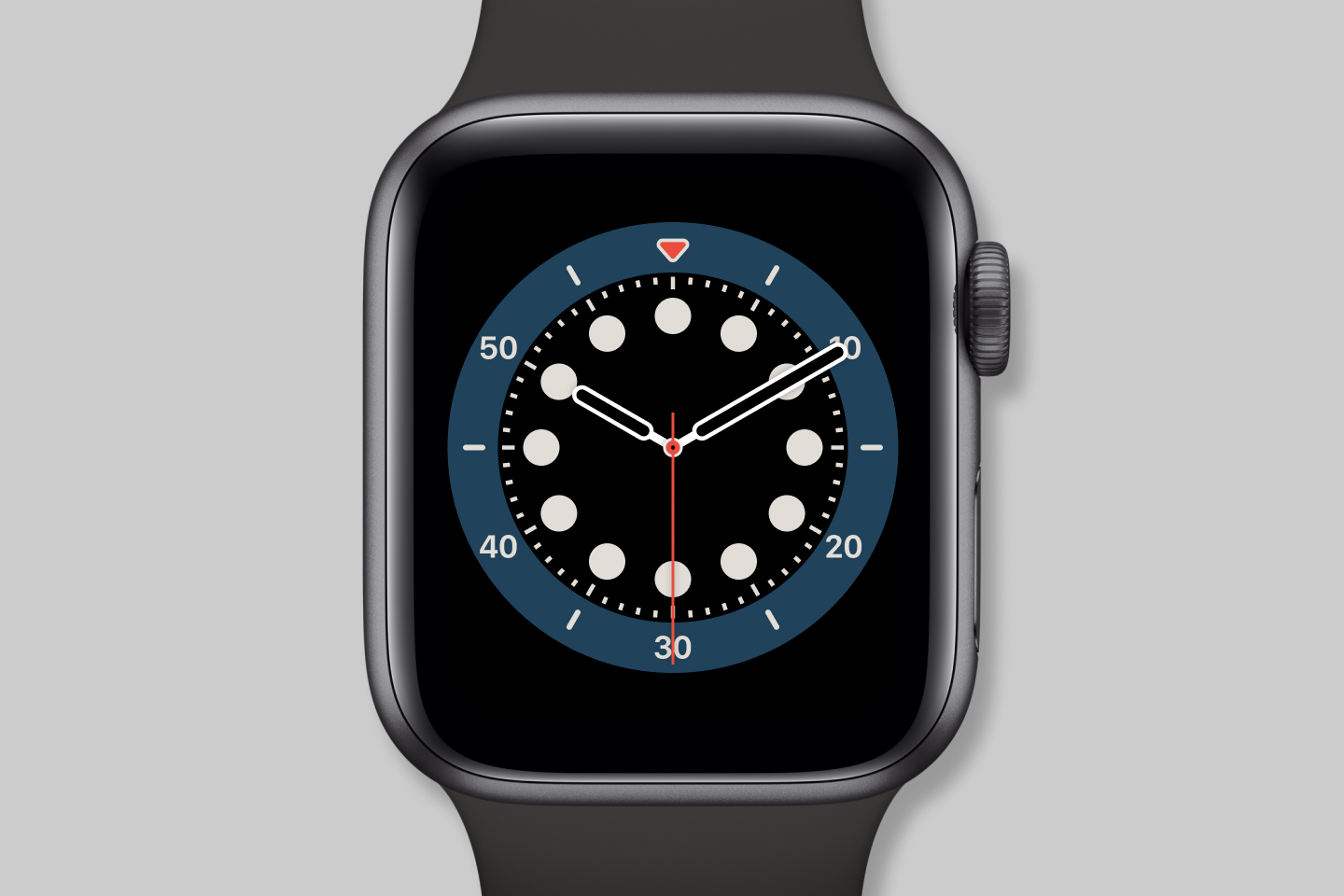
Apple Watch SE, Apple Watch Series 4, and later
The Count Up face is a descendant of great dive watches like the original Submariner. Its bezel is nearly identical. The dial is simplified with a uniform set of circular hour indices.
Tapping the watch face turns the bezel clockwise to meet the triangle with the minute hand, revealing a start button. Tapping the face again turns the bezel counterclockwise back to zero. This behavior is a little different than in the Submariner, where the bezel only turns counterclockwise. That constraint is a safety measure to ensure that the dive time only gets shorter if the bezel is bumped.
Tapping the start button starts a digital timer, which complements the less granular bezel timer.
GMT
The history of GMT watches
The name GMT is a direct reference to Greenwich Mean Time, the mean solar time at the Royal Observatory in Greenwich, London. Since the mid-1800s, it has been the standard by which most of the world measures its time zones.
The GMT, like the other tool watches in this essay, came into being in the mid 20th century[16]. The rise of the jet age saw with it a drastic increase in intercontinental travel. This boom created a new problem for travelers and pilots alike — adjusting to timezones.
Glycine was the first brand to introduce a watch capable of tracking two time zones with the Airman, which debuted in 1953[17]. It was nearly immediately overshadowed by a new watch from Rolex the next year.
Pan Am, which observed its pilots’ need to track multiple timezones, approached Rolex with the challenge of building a watch to do just that[18]. Thus was born the Rolex GMT Master. The GMT Master likely finds its roots in the Zerographe reference 3346 of 1937, a model with a rotating aluminum bezel for measuring elapsed time[19].
 An original Rolex GMT Master ref.
6542 · image credit Christie’s
The GMT Master looks rather simple at first. One may be forgiven for mistaking it as just a more colorful Submariner. At a closer glance, the differences begin to reveal themselves. There is a fourth hand, the GMT hand, which sweeps twice as slow as the hour hand, making one revolution every 24 hours. By default, it tracks the same time zone as the hour hand. However, you can turn the bezel to shift to a different time zone.
Speaking of the bezel, its colorful appearance isn’t purely an aesthetic choice. The blue and red refer to night and daylight hours, respectively, making it easy for the wearer to know what time of day it is in the second time zone they are tracking. That color scheme has led the watch community to affectionately name it the Rolex “Pepsi”. A similar red and black variant is nicknamed the Rolex “Coke” and a black and blue variant is called the Rolex “Batman”.
 Pepsi, Coke, and
Batman
The GMT Master was a hit. In the 60s, if you peeked in a Boeing 707, you would have seen it both on the wrists of commercial pilots in the cockpit and wealthy jet setters sitting in first class. It was even a star on the silver screen, appearing on actress Honor Blackman’s wrist in Goldfinger.
 vintage ads for the GMT Master
Rolex has continued to improve it to this day. Today’s GMT Master II bears a striking resemblance to the original from more than half a century ago. Of course, the movement inside is modern, featuring the latest Rolex technology. The hour hand on the GMT Master II can be set independently, allowing a third time zone to be tracked.
For more about the history and evolution of the GMT Master, watch Hodinkee’s excellent episode of Reference Points.
Apple’s GMT face
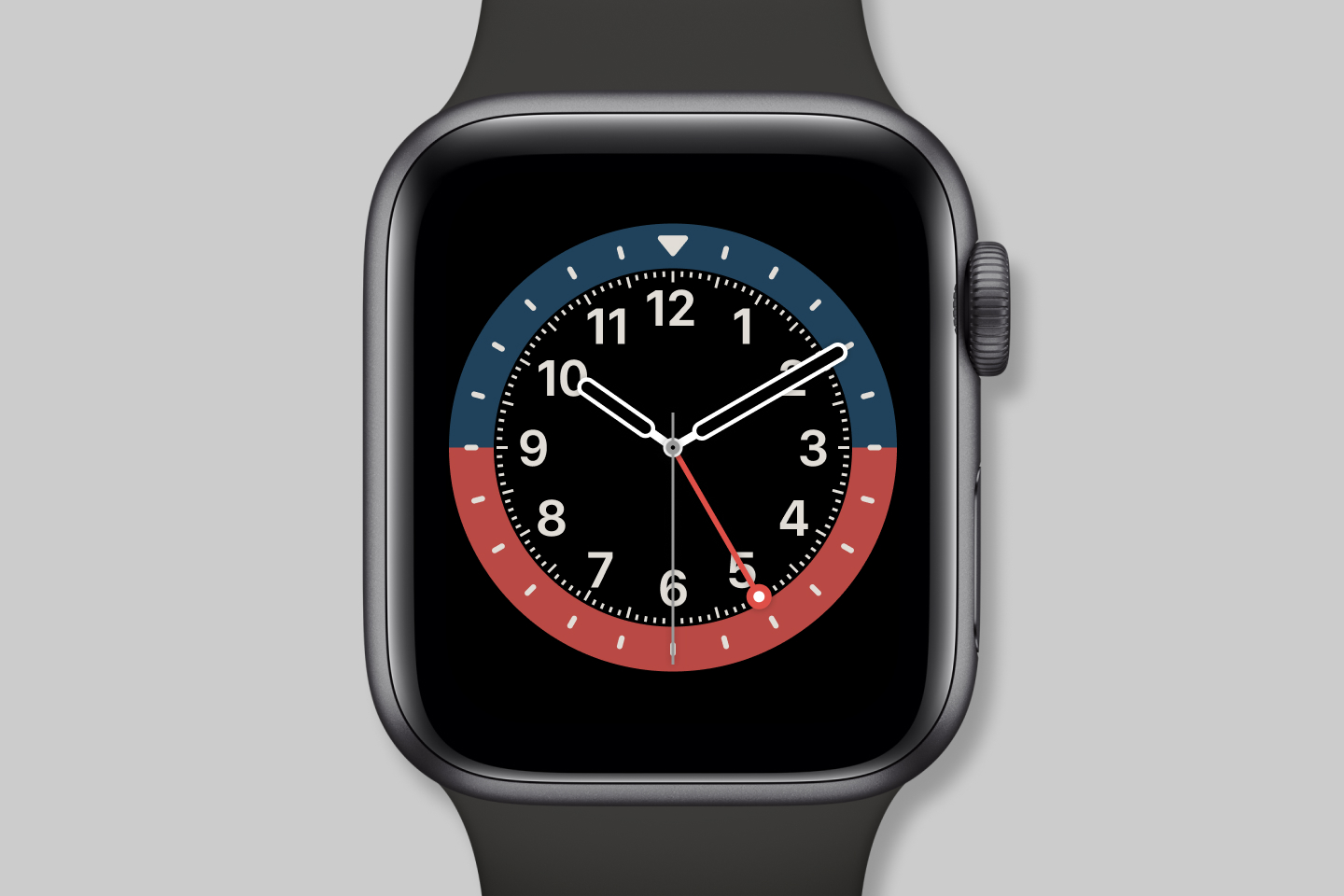
Apple Watch SE, Apple Watch Series 4, and later
The GMT face is unquestionably an homage to the GMT Master. Its navy blue / watermelon, slate / watermelon, and slate / navy blue color schemes are Apple’s interpretations of the “Pepsi”, “Coke”, and “Batman” bezels, respectively. Rolex’s triangle-tipped GMT hand is replaced with a lollipop-like red hand, which conforms to the rounded aesthetic found elsewhere. Instead of geometric indices like on the Rolex or the circular ones found on the count up face, Apple chose to go with Arabic numerals.
 navy blue / watermelon, slate /
watermelon, slate / navy blue
Apple took the bezel on the GMT Master as a starting point while simplifying it and making it dynamic. The hour indices are gone, with only one hour shown nearest to the GMT hand. Also, instead of the 50/50 split found on the physical watch, the bezel reflects the current daylight hours. This effect is most apparent when comparing times between the northern and southern hemispheres or between seasons.
 The GMT face on the
shortest and longest days here in Northern California
Tapping the face or rotating the digital crown activates the timezone interface. As you scroll through, the bezel rotates to reflect that time zone. Selecting one fixes the bezel in place and adjusts the day/night split to match.
With the inner complication set to the date, this face has been my favorite recently.

Conclusion
I already had a tremendous amount of respect for the team that made the Apple Watch. Its industrial and interface design respect centuries of watchmaking, all the while introducing something novel.
As I researched and wrote this essay, my respect only increased. With the watch faces, Apple could have taken the easy way out by merely mimicking existing watch archetypes at a surface level. Instead, they intensely studied each one’s history. When designing each face, they took into account that history and the constraints and opportunities afforded by modern technology.
These faces are digital interpretations of mechanical watches that continue a long line of evolution. Given that Apple has already made its versions of the most famous watches, a question lingers on my mind.
Which new faces could they possibly introduce in the future?
- California Love · Revolution ↩︎
- California Love · Revolution ↩︎
- California Love · Revolution ↩︎
- A Brief History of the Chronograph · Revolution ↩︎
- The Stopwatch and the Chronograph Part 1 · The Seiko Museum Ginza ↩︎
- The Stopwatch and the Chronograph Part 1 · The Seiko Museum Ginza ↩︎
- The Stopwatch and the Chronograph Part 2 · The Seiko Museum Ginza ↩︎
- Everything You Need To Know About Chronograph Watches · Mr Porter ↩︎
- Chronography 1: A History · Worn & Wound ↩︎
- A History of the Dive Watch · Revolution ↩︎
- A History of the Dive Watch · Revolution ↩︎
- A History of the Dive Watch · Revolution ↩︎
- A History of the Dive Watch · Revolution ↩︎
- 1953: The Year of the Dive Watch · Crown & Caliber ↩︎
- A History of the Dive Watch · Revolution ↩︎
- A Brief History Of World Timer And GMT Watches · Mr Porter ↩︎
- A Brief History Of World Timer And GMT Watches · Mr Porter ↩︎
- Reference Points: Understanding The Rolex GMT-Master · Hodinkee ↩︎
- Reference Points: Understanding The Rolex GMT-Master · Hodinkee ↩︎
Thanks to Q for reading drafts of this.