Three books about Sony design
10 min read Jun 18, 2024
This is the third in a series of essays about books in my library that I find particularly inspiring.
Books in my library
It is no doubt that the current world leader in design and technology is based in Cupertino, California — Apple. It pioneered the personal computer and smartphone paradigms. It showed the value in the seamless integration of hardware, software, and services. Importantly, it defined the level of polish that we have all come to expect in technology.
If we look closer at Apple and its visionary founder Steve Jobs, we’ll see that many of its core philosophies are not completely homegrown, but are from another company — Sony. In fact, Steve and Sony’s founder, Akio Morita, were friends.
Sony, by blending design and technology, set the standard for modern consumer electronics. Sony defined how we listen to music and watch television at home. It pushed the boundaries in video gaming. All along, the company has continued to reinvent itself for nearly a century. There is no other technology company that has remained a household name the way Sony has.
To better understand why, let’s take a look at three books that dive into the world of Sony Design over the last half century.
Sony Design

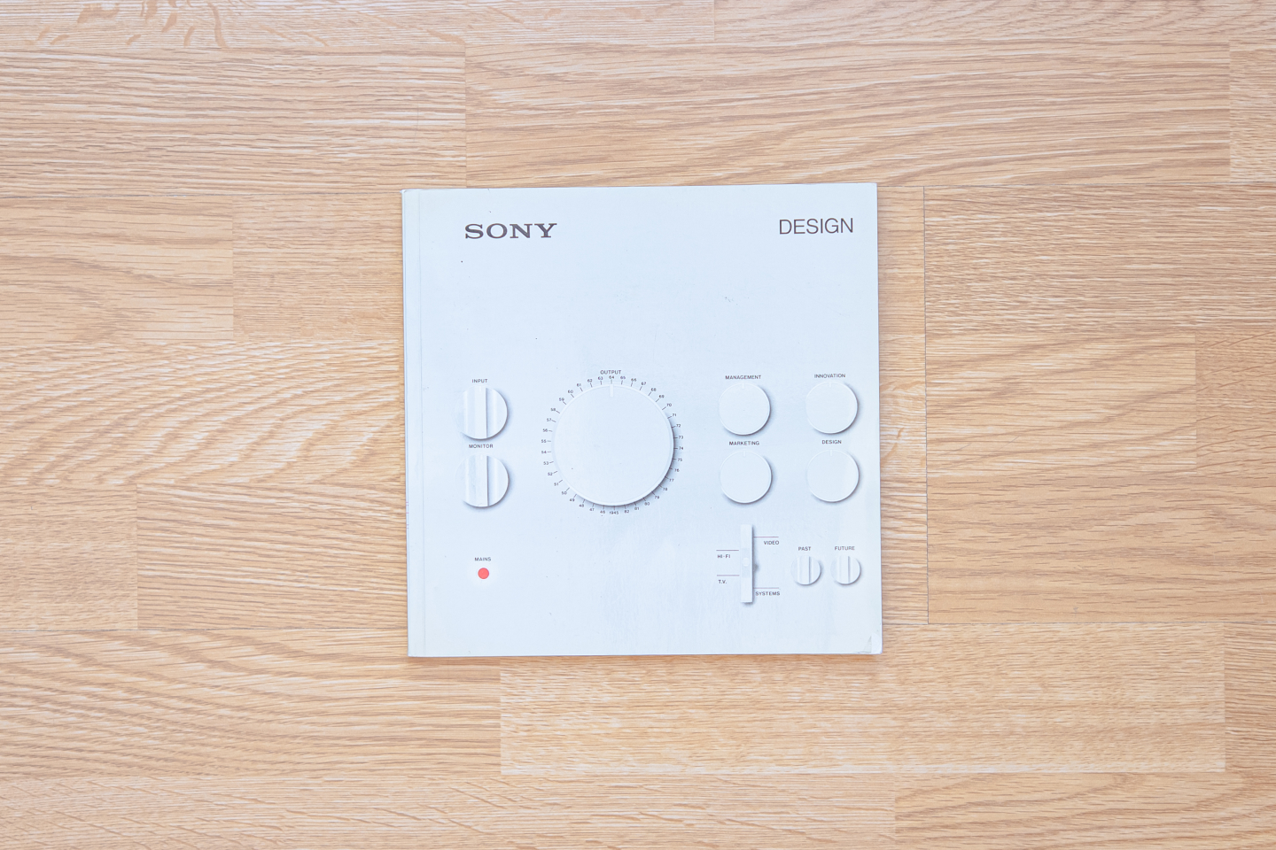
First we have the book accompanying the first exhibition of Sony products in the anglophone world. It was held in the Boilerhouse Project , the earliest iteration of what later became London’s Design Museum. As a “museum within a museum” at a previously unused basement in the V&A from 1981 to 1986, the Boilerhouse Project helped make the case for the serious study of industrial design. The project was funded by the Conran Foundation and spearheaded by Stephen Bayley.
From March to June of 1982, the aforementioned basement was home to an exhibition titled Sony Design, a retrospective of work at the still relatively young Japanese electronics company.
Some criticized the exhibit for featuring a non-British company. Others criticized this and other Boilerhouse Project exhibits for serving the commercial interests of industry.
For most attendees, this exhibition was important because of Sony’s meteoric rise into relevancy around the world. Sony, much more than any other company, changed the public perception of Japanese products from cheap knockoffs into true, quality innovations. This exhibit was just the first of what would be many across the world that would investigate the impact that Sony has had on the world of design.
Sony was 36 years old at the time of this exhibition. Another 36 years after was 2018, so every subsequent year makes this exhibition and book closer to the company’s founding than to the present. Hence, this book now functions as a time capsule. It helps us see the philosophies that formed the seed that later bloomed into Sony as well as the challenges it faced in its early years.
Design
The book does the job of conveying the exhibition’s ideas well. It is a small, dense paperback. The front cover features an illustration that is a mix of the themes inside and controls found on a hi-fi system. The back features a grille pattern, than when viewed from afar reveals a hidden symbol.

The pages inside are chock full of prose set in small type, photographs and illustrations. Each major section begins with the picture of a hand holding the main electronic component of the time starting with the vacuum tube. As the sections progress, the hand gets older and the component gets smaller. This motif helps subtly track the concurrent maturation of Sony within the world of electronics.

A few pages were printed on a matte transparency.

Content
While not an exemplar of design, this book is a marvelous storyteller. It opens to what looks like a traditional Ukiyo-e print drawn by artist Ian Archie Beck.
At a closer glance the woman is listening to a Walkman and behind the screen is a television. This illustration is based on Tenuguikake no kihan (手拭いかけの帰帆), which itself is a mitate-e parody of a 11th-century Chinese landscape painting from Eight Views of Xiaoxiang series.

The first main section, starting with the baby holding the vacuum tube, is a history of Japan’s industrial revolution. It tells the story of how Sony rose above the low reputation Japanese products had at the time.
The next section shows an adolescent hand with an early through-hole transistor. It, both using words and vintage photographs, tells the story of early Sony products.
My favorite section is next, “Quality, marketing and imagery”. It covers the shrewdness of Sony’s marketing, which is best seen in a two page spread of advertisements.

The next section, “The Future”, is all about Sony’s future (at that time) strategy. It shows many nascent Sony technologies like the Mavica disc-based digital camera. There’s also the Digital Audio Disc, which we know today by the name Compact Disc.

The last few sections of the book are excerpts from other publications. One studies the Japanese character after World War II. Another looks at Sony as the paradigm of the effective Japanese corporation.
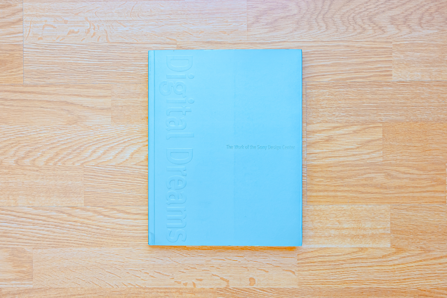
Digital Dreams: The Work of the Sony Design Center

This book from 1999 arrived right before the turn of the millennium. It was clear that personal computers and the internet were hitting their stride. In turn, they were certain to affect the electronics industry. How they would was the big question.
Digital Dreams is an overview of the work of Sony Designers, who by that time were working in numerous offices around the world. It is a look into the future at the dawn of the information age.
The focus is on more than 100 new products, concepts, and prototypes as Sony transitioned into a digital company. For an idea of how the design community received this book at the time, read the archive of Mike Gallagher’s review on core77.
For me, this book is not just a history reference, but proof of the sheer amount of creativity and iteration required to develop monumental products like the Walkman or Trinitron television.
Many of the products can today be seen as technological dead ends. Yet, the only way to find that out was for the folks at Sony to put their hearts into fully developing them.
Design
The book is clad in a pearlescent cover similar in color to many Sony products. The title and subtitle are embossed, a real world rendering of an effect popular on the web in the late 90s.
The insides of the book are dense, echoing the density of websites of the time period.
Photos are mostly high contrast shot on black or white backdrops. Each page, though following a grid system, feels thoroughly different.

The sum of aesthetic choices in this book make it a great reference for late 90s graphic design.
Content
The book begins with three photo spreads that each feature a question in the center meant to generate curiosity.

It continues into a section titled First Principles. Here a brief history is followed by a recounting of both the inspirations and frustrations of the design group. A few different concept products are shown in detail. Though they never made it to production, their influence on future products is discernible.
My favorite chapter is titled “What Time Is It?”. It lays out a concept that recurs throughout the rest of the book. At the top is a oval-shaped diagram mimicking the path the sun takes across the sky. This diagram is mapped to the lifecycle of products where sunrise is market creation, noon is market domination, and sunset is market saturation.

Many following sections feature these diagrams, mapping the life of a product line. For example, the radio has completely traveled from sunrise to sunset, becoming stagnant by the 90s. On the other hand, Sony describes the Minidisc just passing noon as it expanded in the market.

Each chapter follows a theme like a particular product or a philosophical concept. “Purple Power” is centered on PlayStation, not just recounting some of the product’s history, but also sharing unused logo concepts and prototype controllers.

My favorite sections are about software interfaces. 25 years later, I can see which visions of the futures panned out and which never saw gained traction.

Sony Design: Making Modern

I fist heard of Sony Design: Making Modern during my first trip to Japan, and knew I had to buy it once I saw the photos inside.
This book is unlike the other two. The first is a history of a young company. The second is a look forward as it transformed. This book is a retrospective on an old, respected force in the world of technology.
I see it as a visual reference, as the pages inside are almost all photos, with very little words.
Design
Published by Rizzoli, which also published MUJI, this book is of the highest quality. The slip cover features a photograph of the PlayStation 4 that looks almost like a drawing. The title of the book, rendered in red, plays off the geometry of the PlayStation.
Inside is smooth paper, perfect for high resolution photographs. The other two books were quite dense, with little whitespace. This, on the other hand, uses whitespace liberally. As a result, it’s very easy to get sucked into the book and forget all about how it is structured.

Content
Undoubtedly, the star of this book is photography, which isn’t a surprise given 90% of its pages feature little else. Each photograph is perfect technically, from the composition, the way different-sized objects are knolled, the depth of field, the color, and the lighting. It wouldn’t be a mistake to use it as a sourcebook for product photography.

Yet, there is more to this book at a closer glance. It begins with a long oral history of Sony as told by Deyan Sudjic, former director of the Design Museum. This introduction, in a way, makes this book a sequel to Sony Design.

It follows with a translated excerpt of Out of the Ashes: The Founding of Sony, a serialized Manga about Sony’s history by the late Takao Saito.
The next chapter features print collateral of the 1950s to the 1980s, making it a history of the intersection between Sony and graphic design.
The product portfolio makes up the majority of the book. It features brilliant photos of every type of product across Sony’s life.

Finally, an index at the end offers a little more detail into a subset of the products.
Three books, three points of view
What makes these three books great is that they are separated by decades and are each a product of their time. Their aesthetics reflect the trends and standards of the day. Their subject matter reflects the relative maturity and importance of Sony across time.
Reading all three, I get the sense of what has changed at Sony — the diversification of its business — and what hasn’t — the maniacal focus on usefulness.
Thanks to Q for reading drafts of this. Thanks Matt Sephton for tracking down the artist that drew the Ukiyo-e print.
