
Three books about Muji
9 min read May 4, 2023
This is the second in a series of essays about inspiring books in my library. The focus this time is on MUJI.
Books in my library
MUJI is short for 無印良品 (Mujirushi Ryōhin), meaning brandless quality goods. It’s a Japanese purveyor of household products, and one of my favorite brands.
I first started visiting MUJI soon after they opened their first US store in SoHo, New York. Going there felt much like visiting a religious site. I rarely enjoy other stores (save for Apple Stores), with their garish advertisements, bright lights, and inconsistent service. MUJI, on the other hand, felt calm and considered. Everything, from the interior surfaces, to the products themselves, feature natural finishes. Serene music sampled from around the world quietly plays throughout the space. Aroma diffusers lightly scent the air.
 One of MUJI’s stores in Shanghai,
China
Though MUJI’s approach is “brandless” products, its brand is recognizable. Products are unadorned, feeling almost “undesigned.” They sit on shelves with no packaging save for MUJI’s iconic labels.
 MUJI stationary
Go to the checkout line, and the exchange with the staff feels right out of Tokyo. A tray is used to capture payment. Items are carefully wrapped, envelopes sealed with washi tape. The staff hand back my receipt with two hands and a gentle bow.
I have visited many MUJI locations here in the US and abroad. Each visit calms my mind and reminds me of mindful consumption. MUJI doesn’t encourage me to spend arbitrarily. Instead, it nudges me to consume responsibly.
MUJI has become essential to the way I live and to my aesthetic sense. Naturally, I have collected a few books about it along the way.
MUJI
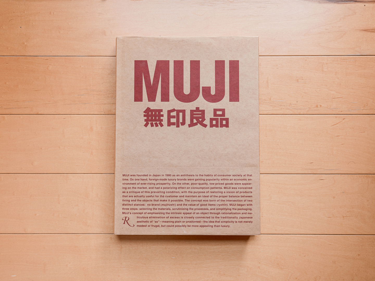
MUJI, published by Rizzoli, is MUJI’s first major book made for an audience outside Japan.
I first saw it at the SoHo store at its launch in 2010. I unfortunately passed it up since I was a student at the time. Buying coffee table books was out of the question due to cost and space.
The book is a cultural artifact. It arrived 30 years after the firm’s founding and 10 years after several years where the its future was uncertain. At the turn of the millennium, MUJI was hemorrhaging money. Fortunately, its fortunes turned for the better. The SoHo store marked a turning point, after which the firm opened many more across the US (it had been expanding in other countries for decades).
By the time I had both the money and space to buy the book, it was out of print and collectors had driven up the price on the secondhand market.
Then, one day, I was visiting the (now defunct) San Jose store after work as I regularly did. I was browsing the aisles with a basket in hand when I noticed the glint of a plastic-wrapped item on a shelf. MUJI, like many other home goods stores, would fill their book shelves with blank notebooks or dummy books. Nestled among those books was a pristine copy of the MUJI book. I immediately placed it in my basket, feeling as if I had won the lottery. I searched the rest of the store, but found nothing else. I had the last new copy in the store.
Design
The book looks like a MUJI shopping bag. MUJI, set in a condensed form of Helvetica, appears above 無印良品, both in MUJI’s instantly recognizable maroon color on a kraft brown field. Open the dust jacket and we are greeted with an enlarged version letterpressed into the cover in translucent white ink.

The pages inside are cut from silky smooth paper you’d find in any other quality coffee table book. This paper choice enables crisp text and vibrant photos.

Type and imagery are set on an unobtrusive grid, lending a natural feeling to the pages.

It all comes together like MUJI’s products to feel nearly undesigned, which is not a surprise since the book’s design was lead by MUJI’s creative director, Kenya Hara.
Content
The book begins with a brief history by then chairman Masaaki Kanai. It is followed by essays written by three creatives within MUJI’s orbit, product designer Jasper Morrison, creative director John C. Jay, and film director Bruce Mau.
The first chapter, titled “The Birth of MUJI,” is a comprehensive history of the brand written by Creative Director Kazuo Koike. It starts from the beginning, including involvement by legendary designer Ikko Tanaka, continuing to MUJI’s international expansion. Interspersed are early advertisements and photographs of original stores.

The second chapter, “Products of MUJI,” is a gallery of photographs for products old and new.
The next three chapters are my favorites, each focused on a specific aspect of what makes MUJI, written by the person responsible for it. Naoto Fukasawa writes about “Product Design,” Kenya Hara about “Identity and Communication,” and Akashi Sugimoto about “Space.”

The final chapter is a conversation between the five authors of the book about MUJI’s future, including its foray into housing and expansion abroad.
As a whole, this book does what few companies dare to — it pulls back the curtain. Each manifestation of the MUJI brand feels as if cut from the same cloth or made by one person.
Found MUJI

Most MUJI products are exclusive to the brand. Many are designed by famous designers, though no attribution is given. A few products are neither designed nor made by MUJI — articles from the Found MUJI line of products.
The Found MUJI concept began as a series of observations as the team traveled the world. They noticed and photographed everyday objects that fit into the MUJI ethos. MUJI began selling these, sometimes asking their makers to make small modifications.
In 2011, MUJI transformed their first store in Aoyama into a dedicated Found MUJI store. Found MUJI has developed into a curatorial sub brand that complements MUJI’s wholly new products.
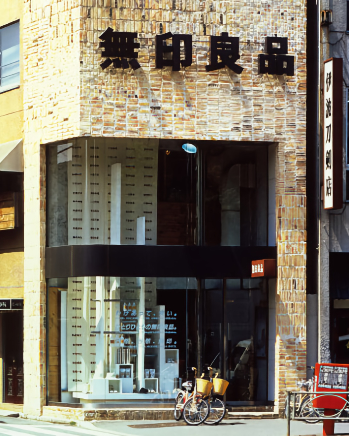
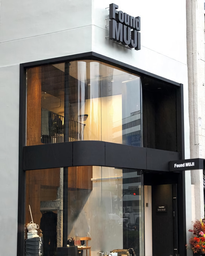
There have been several books about Found MUJI published over the years. This second volume, published in 2015, is a simple list of photographs and captions.
Design
The book is light and honest. The thin cover is blank aside from the Found MUJI logo. The pages are made from newsprint. They feel matte, but not rough, thin enough to see through, but not thin enough for ink to bleed through. The duller paper fits the images, many of which were quick snaps on travels.

Each spread is dedicated to one image, a caption in Japanese and another in English. The grid is carried over from the cover, with the Japanese caption appearing at roughly the center of the page. The captions briefly describe each item, but don’t explain why it was chosen.
Page numbers appear at the lower corners, though occasionally large images obscure them. The book’s design matches the humble nature of the content and concept.

Content
The wide range of images is what makes this book worth reading. Some are objects you could presumably find at a Found MUJI locations. Others are places, or styles of furniture. Hence, this book illustrates how the MUJI philosophy can be found outside the products or experiences that MUJI can provide.

If you get a copy of either this or the previous volume from 2012, I’d recommend sitting back in a comfortable chair and going page by page. Guessing why the Muji folks found an item interesting makes for a fun game.
Magazine B: MUJI
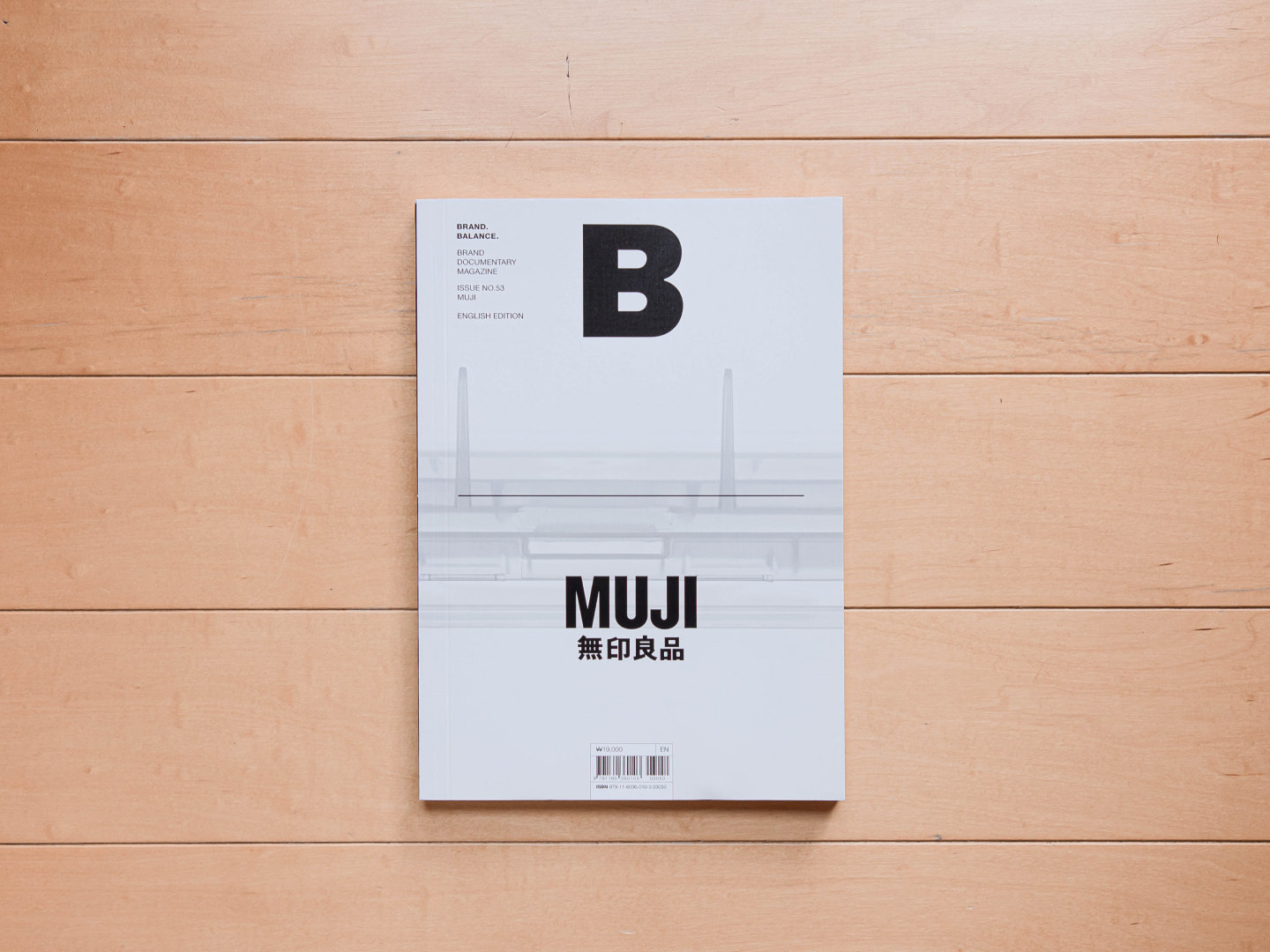
I’ve written previously about the Magazine B series in my post about my Leica books. Among the other brands covered is Muji.
Design
A striking full-bleed photograph sets the tone for the front cover of this petite publication. Dominating the top half of the cover is a grandiose “B” accompanied by supplementary text, while the bottom showcases a prominent brand logo, layered atop the image.
Crafted from satin-finished heavy stock, the cover provides a polished aesthetic. Each issue can fit snugly into a purse or tote for a weekend read at a local café.

Vibrant visuals and engaging words grace the pages within without feeling cluttered or overwhelming. Employing a two to three column layout throughout, the designers’ deft hand is evident in their judicious use of white space and the occasional breaking of the grid.

Content
B Magazine has once again succeeded in delivering a compelling read with their MUJI issue. It delves into a multitude of topics, ranging from the storied history of MUJI to insightful discussions on the essence of its signature style. Additionally, the book features interviews with key figures such as Kenya Hara and Naoto Fukasawa, offering unique perspectives from within the company’s inner sanctum.

What sets this book apart, however, is its inclusion of voices outside the MUJI universe. Thoughtful critiques and analyses from external experts provide a refreshing counterbalance, illuminating facets of MUJI that may have otherwise gone unnoticed.

For instance, the significance of MUJI’s inaugural Aoyama store opening, which was not given much emphasis in the first book in this post, is expounded upon in this book by Professor Ken Kusunoki. Kusunoki details how the Aoyama district was the epicenter of luxury foreign retailers during Japan’s economic boom, further highlighting the shrewdness of MUJI’s location choice.

Through this multifaceted approach, the book thoroughly covers a broad range of topics that may not have been considered had it been authored solely by individuals within the MUJI organization.
What I’ve learned
Through these three books, I gained an appreciation for the way in which MUJI harmoniously synthesizes disparate elements, culminating in an ethos that is nothing short of remarkable. By assembling a collective of capable individuals, united in a common purpose, MUJI manages to achieve its vision.
What’s more, these books underscore MUJI’s impressive scope. Viewing it not merely as a collection of merchandise but as a comprehensive philosophy opens up exciting avenues of possibility.
Camera setup
Thanks to Q for reading drafts of this.
