

Elements of aircraft safety card design
7 min read Apr 23, 2019
Most forms of transportation are wildly different across the world. While they may accomplish the same goal of getting a group of people from one place to another, they do it in completely different ways.
Let’s take rail travel as an example. The vehicles, the ticketing systems, the payment systems, the station designs, and even the customs surrounding them are all different. The same is true for taxis, streetcars, and ferries around the globe.
The primary source of these differences is the wide range of unique design constraints present in each location.
Air travel
Air travel, on the other hand, is actually quite uniform around the world. It operates within a narrow set of constraints.
- There are a small number of models of aircraft that all need to be able to land and be serviced at a variety of airports.
- Airports not only need to be able to accommodate a variety of aircraft, but also a variety of different airlines.
The greater number of constraints on air travel results in a mostly uniform experience, leaving just a few ways in which traveling via one airline could be different than traveling via another.
There are the seating configurations, flight attendant uniforms, in-flight food and beverage service, and of course aircraft safety cards.
The humble aircraft safety card
The safety card is an often ignored or even unnoticed part of the flight experience. However, it’s a piece of graphic design that is required on every commercial flight around the world.
It may be true that Safety cards are of questionable value. Passengers apparently have a hard time understanding them
[1]. Let’s put that aside though and marvel at how different safety cards can be between airlines. They are a great example of the diversity of solutions that can be produced within a narrow set of constraints.
In most of my travels, though I would regularly pull out and read aircraft safety cards, none were memorable. Then, on a Swiss flight from San Francisco to Zurich, I noticed the order and clarity of their safety card. Once I landed, I got on to eBay and purchased some decommissioned examples. Thus began my modest collection of modern aircraft safety cards.
Over the last few years, I’ve collected the safety cards that I believe are the exemplars of safety card design. Among the pieces in my collection, there are a few common traits that I think makes them so great.
Note: removing aircraft safety cards from aircraft is both a crime and a safety hazard. If you want to collect them, you can find plenty of retired examples on eBay.
Layout
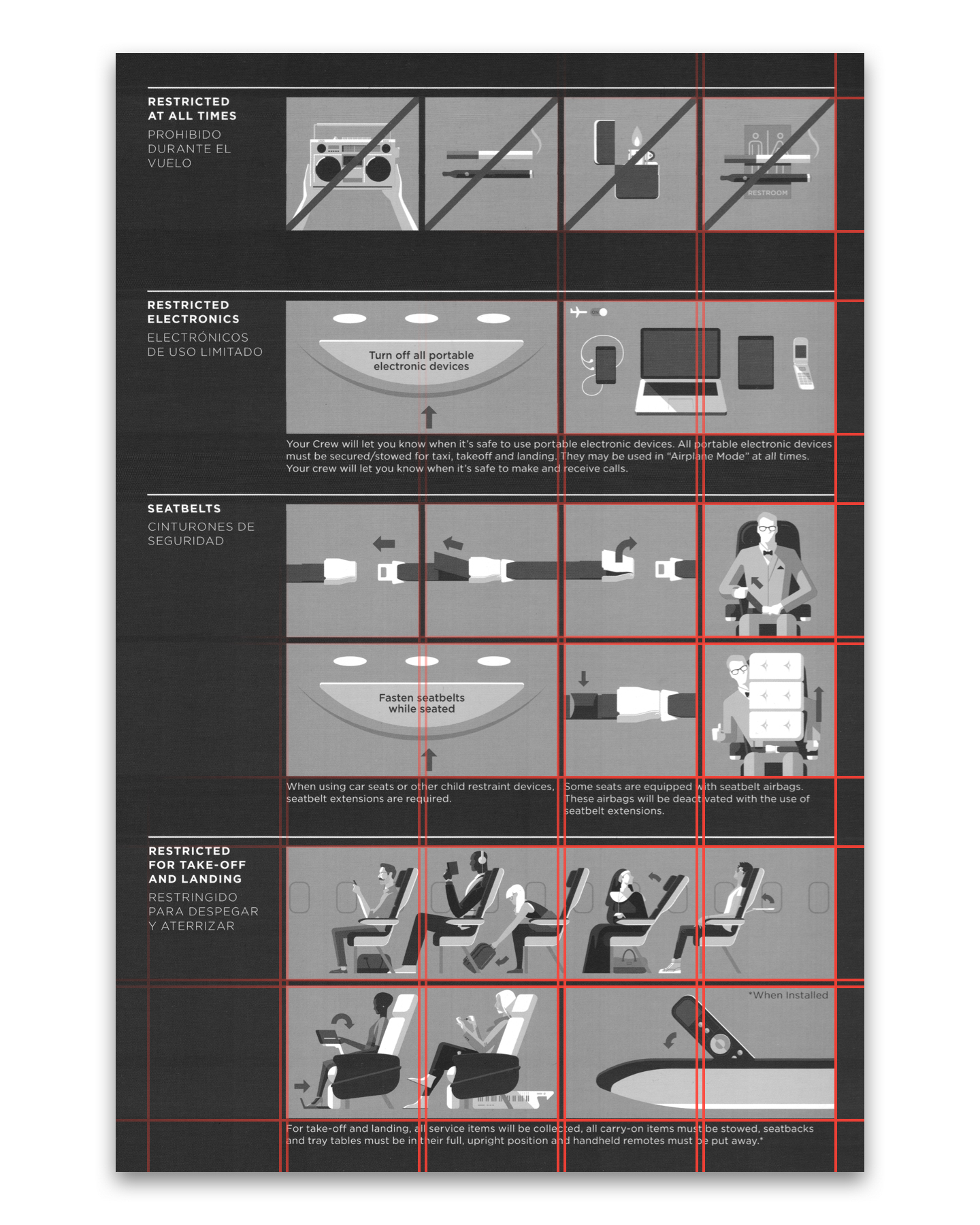
The first standout trait of a beautifully designed aircraft safety card is its layout. The card has to convey a tremendous amount of meaning but is only allotted a limited amount of space. This information density requires a carefully designed layout.
The ideal way to convey hierarchy and enable readability is to use a grid system. Grids have been used in graphic design since their mid-20th-century development by European designers, most notably, Josef Müller-Brockmann.
The reduction of the number of visual elements used and their incorporation in a grid system creates a sense of compact planning, intelligibility, and clarity, and suggests orderliness of design. This orderliness lends added credibility to the information and induces confidence.
― Josef Müller-Brockmann
[2]
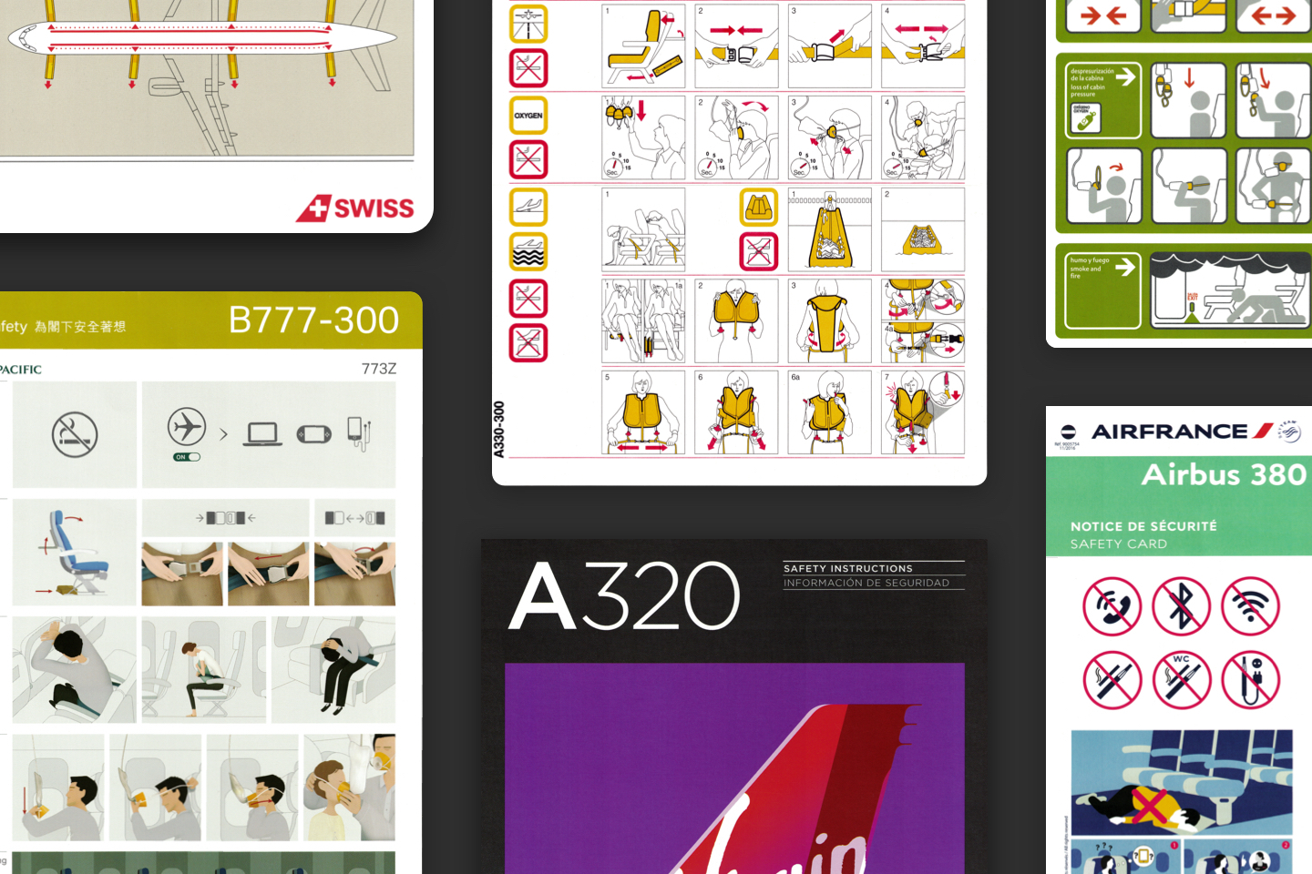
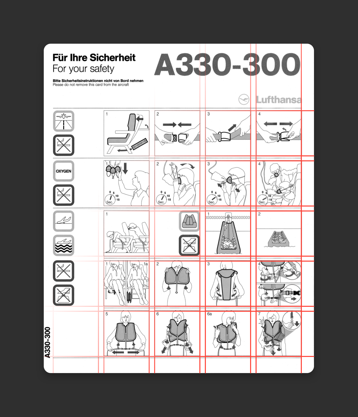
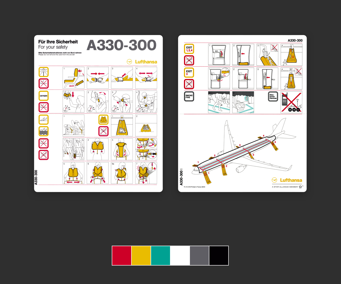
I studied cards in my collection by superimposing grids on top. Among them, there are many variations on the grid system. Some are built around a rigid grid. The rows and columns are laid out in a logical, repeating pattern. Lufthansa’s is built on a five by five grid of rectangles.
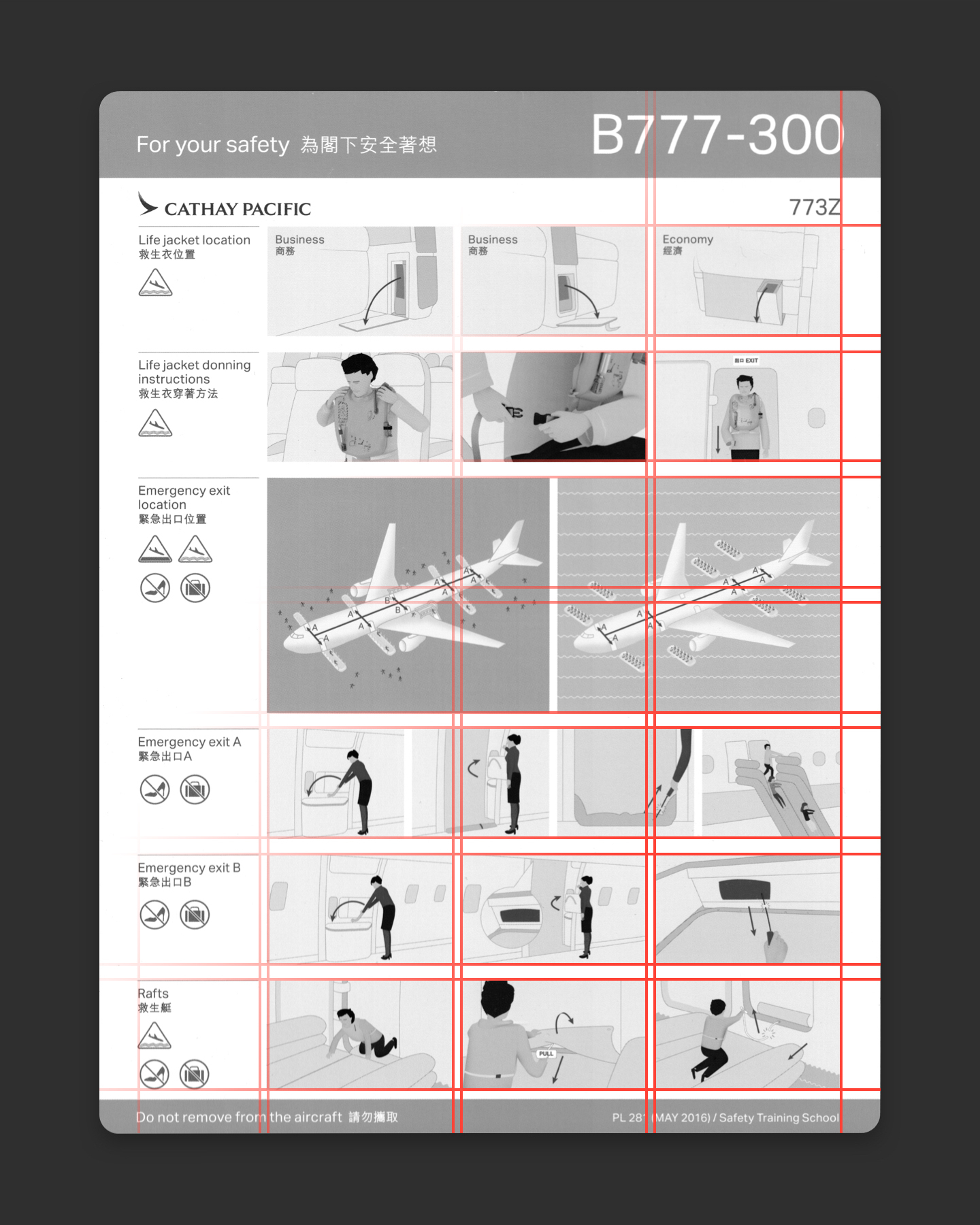
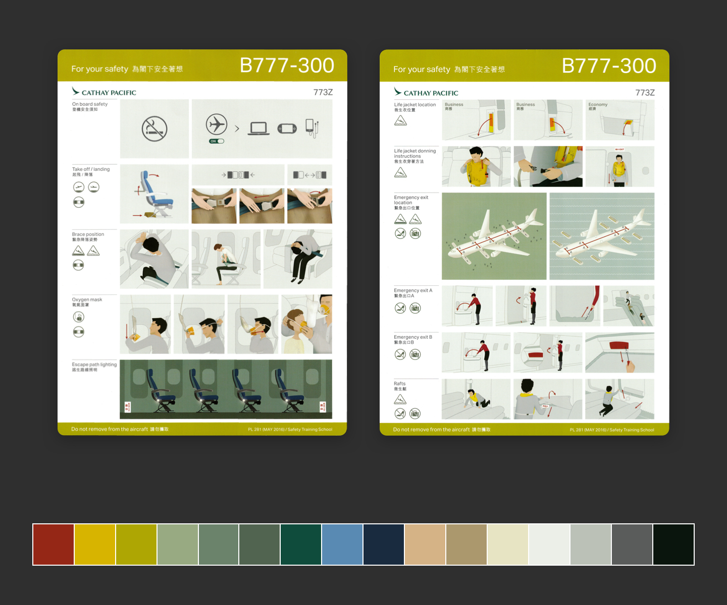
Cathay Pacific’s, on the other hand, has four columns, with the first smaller than the others and 7 rows of equal height. The small line at the top of each section is an elegant solution to the problem of associating the text with the illustrations to the right.
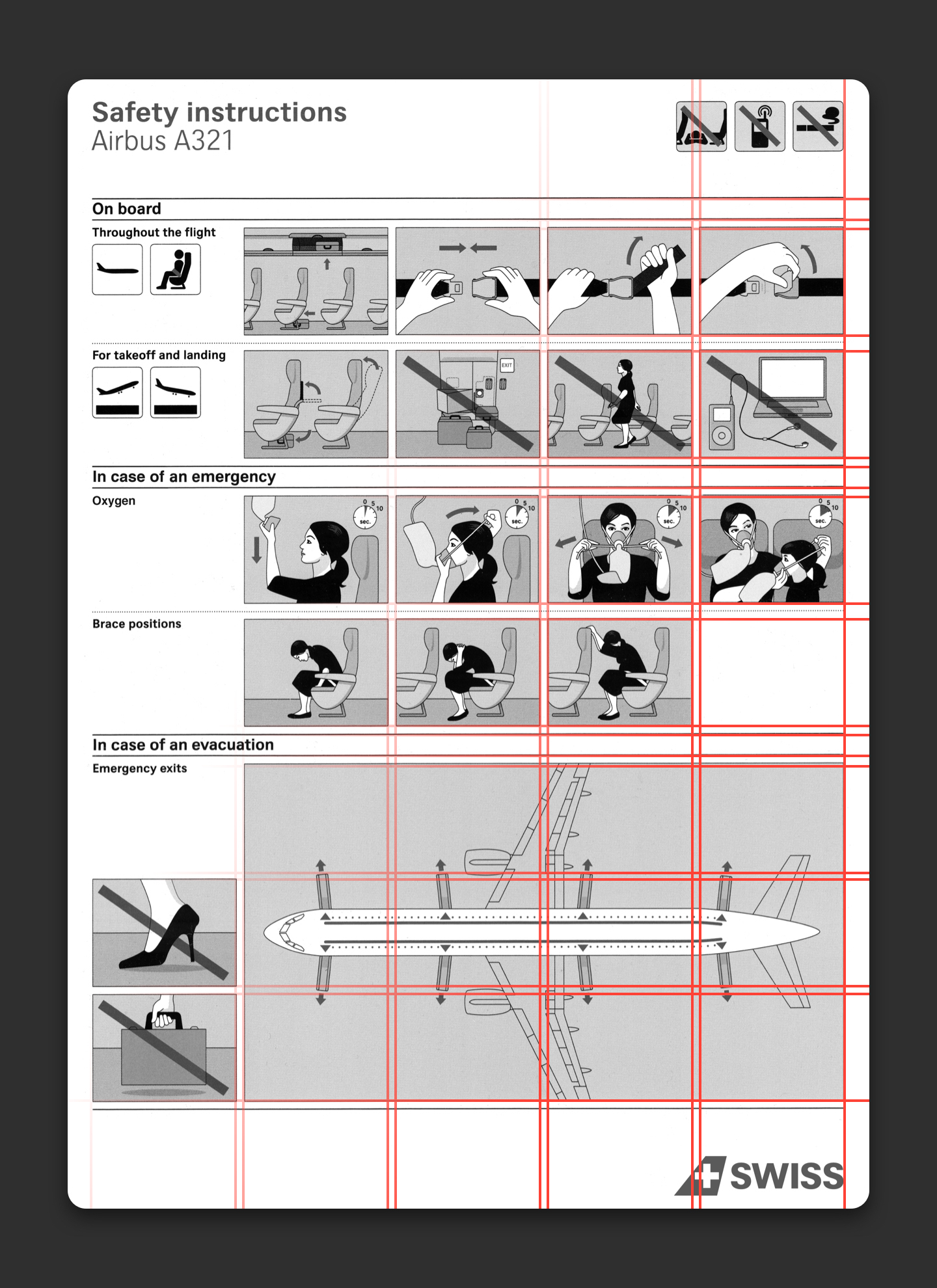
Other cards employ a modular grid. Columns remain fixed, but rows come in different heights. Each section in the card is made up of multiple larger rows and are divided by a smaller row. Both Swiss and Virgin America use this method to great success.
Note that each of the 6 sides of Virgin America’s folded card has a slightly different arrangement of rows.
On top of the grid system, the use of elements like backgrounds, lines, and borders all contribute to the composition of the card. Add too many, and they become distracting. Use too little, and the work lacks structure.
Color
The second trait of a well-designed safety card is its use of color. In my experience, using color well in graphic design requires a lot of work. Color carries so much meaning, like hierarchy, associations, emotion, and brand. Furthermore, colors are never standalone, they interact with all the colors around them.
We almost never (that is, without special devices) see a single color unconnected and unrelated to other colors. Colors present themselves in continuous flux, constantly related to changing neighbors and changing conditions.
― Josef Albers
[3]
Some of my safety cards have just a few individual colors. Lufthansa employs just 5 other than white. The illustrations are black and white. Items of interest are highlighted in yellow, while actions are denoted with red arrows. The result does feel a bit sterile, but it’s very clear and feels very Lufthansa.
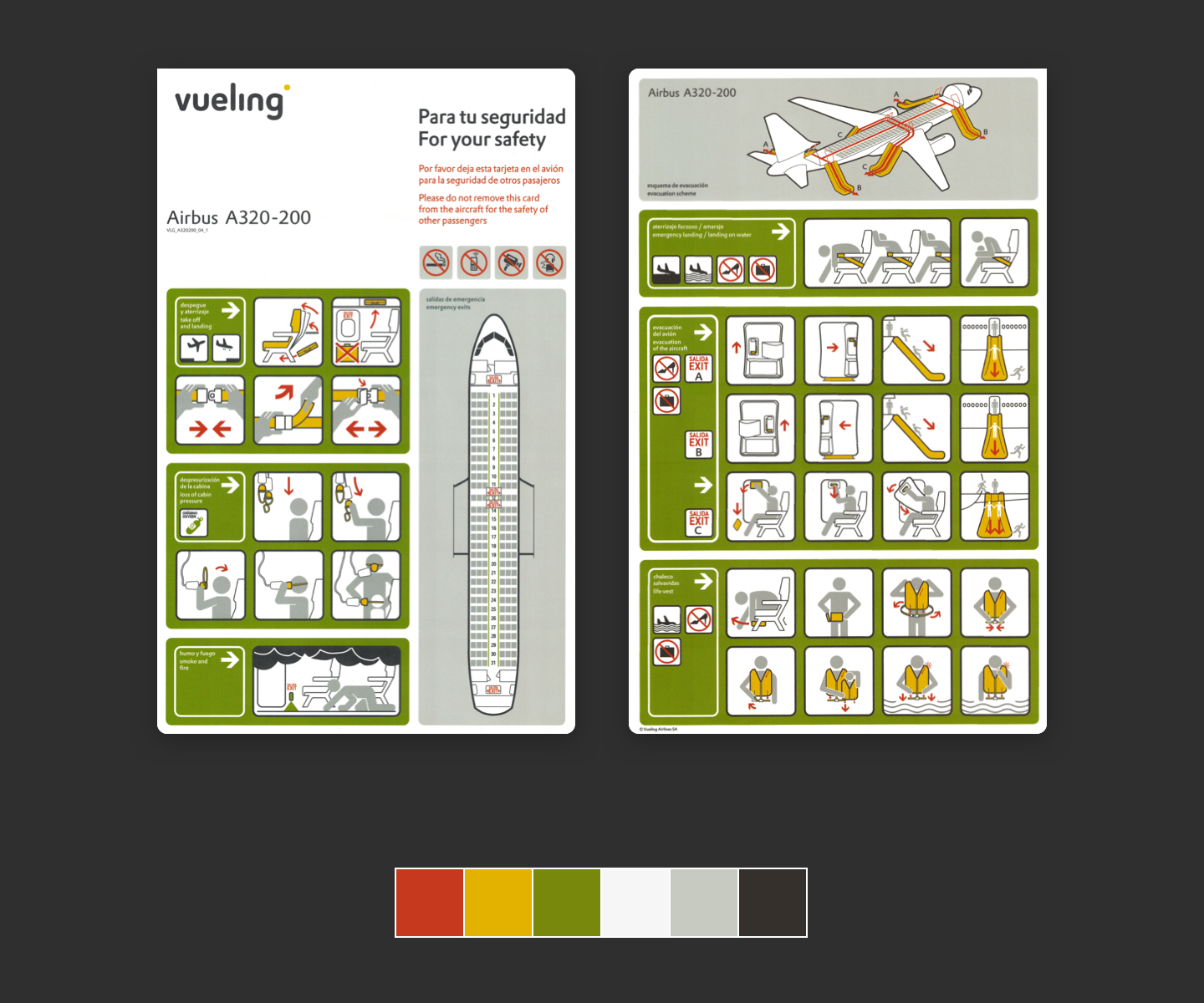
Vueling also uses 5 colors, with similar use of yellow and red. Green has been put to work purely as a part of the layout.
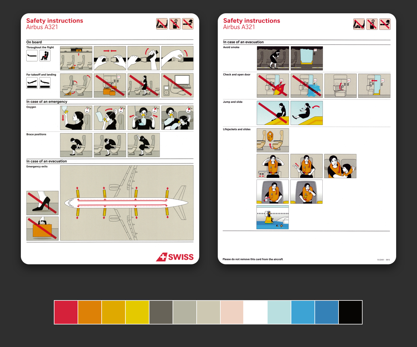
Some cards use a larger number of discrete colors, however, most are just different related shades and hues. The Swiss card feels a lot like Lufthansa’s, yet the illustrations are given a bit of life and realism with shades of brown.
Virgin America actually uses a large number of colors within a logical system. The illustrations have realism and character without feeling crowded or dissonant.
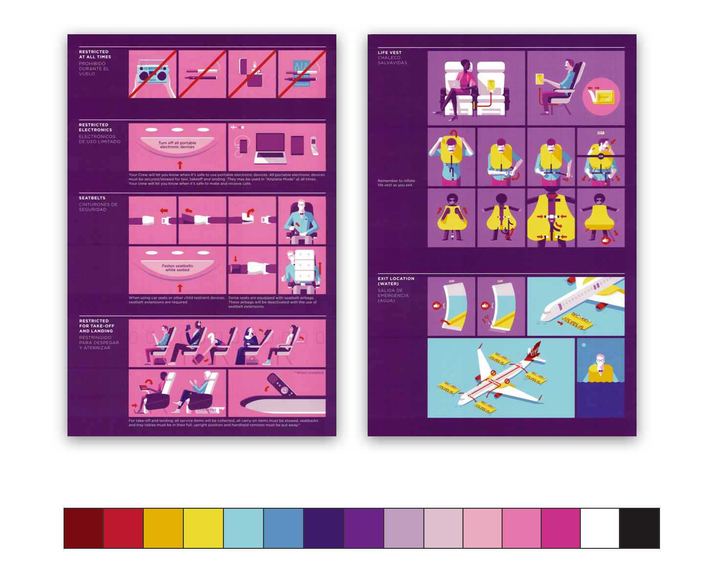
Lastly, Cathay Pacific’s card takes color even further. Illustrations have shadows and gradients, while still feeling clean. This card and its colors stand at the edge between the abstract and real.
Aircraft safety cards, not only use color to tell stories and convey meaning but use color to carry their respective brands.
Illustrations
Lastly, the attribute of safety cards that I enjoy the most is illustration. Illustrations can be infused with the brand and can be visually interesting. However, their ultimate goal is to convey meaning. A well-made illustration should be able to fulfill that goal without the need for supplemental text.
In the example below, I love Cathay Pacific’s use of color to convey the difference between daytime and nighttime. Darkness is conveyed naturally, however, the details are still decipherable.
I also like the arrow technique used throughout Virgin America’s cards. They show the directional flow between frames, allowing the designers to compress a wide image into a smaller space.
![]()
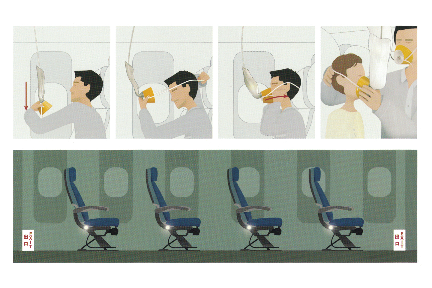
The art style in one of Air Finland’s older cards is cartoonish and fun. The style certainly makes it more visually interesting.
My absolute favorite illustrations are the cutaways of airplanes. These three-dimensional drawings are able to convey both the directional flow of passengers through exits inside the aircraft and also the inflatable ramps outside.
 Vueling’s A320
 Lufthansa’s A330
 Virgin America’s
A320
Virgin America’s
A320
Closing thoughts
And there we see the variety of different aircraft safety cards I’ve found. They must all conform to a set of universal requirements. They have to fit in a seatback pocket. They should be comprehensible by anyone regardless of their locale.
To achieve these ends, most cards in my collection share an expert use of three things: layout, color, and illustration. Even with some similarities in execution, the end results are all quite different. That’s a testament to how even a narrow set of constraints can result in a diversity of solutions.
Next time you fly on an airplane, pull the aircraft safety card out from the seatback pocket in front of you and take a look. Think about what makes it good or what makes it bad. Does it have some of the elements that I’ve discussed here? Perhaps there’s something that makes it great that I haven’t mentioned. I’d love to hear your thoughts.
- Those Safety Instructions in Your Airplane Seat Pocket? Nobody Understands Them. · Air & Space Magazine ↩︎
- Grid systems in graphic design · Josef Müller-Brockmann ↩︎
- Interaction of Color · Josef Albers ↩︎
Thanks to Q for reading drafts of this.