The best city travel guides
10 min read Aug 7, 2017
During my recent travels, I’ve become increasingly reliant on a new breed of city travel guide. They don’t fundamentally do anything different than traditional ones. What makes them different is that they forgo the broad appeal of mainstream guide books in favor of a distinct point of view. Beautiful photography, compelling stories and modern graphic design replace the age-old pages of crowded text.
While these guides certainly have a target audience — millennials short on time and long on disposable income — they are suitable for anyone with an interest in contemporary culture.
What attracted me to these guides is how they honor the roles that graphic design and physical touch play in experiencing a city while bringing a strong point of view in the watered-down world of Yelp and TripAdvisor.
In photography, I no longer care about the end result as much as the experience of holding the camera, working the shot and seeing the world through a viewfinder.
Similarly, I don’t care about visiting the top spots in a new place. I’d rather view the city from a unique point of view, perhaps by spend a morning running a loop around Amsterdam or by taking a photo of every manhole cover I see in Tokyo.
The three guides I’ve collected here give you space to do these things by replacing the never-ending list of places to visit with a set of lenses to see the city through.
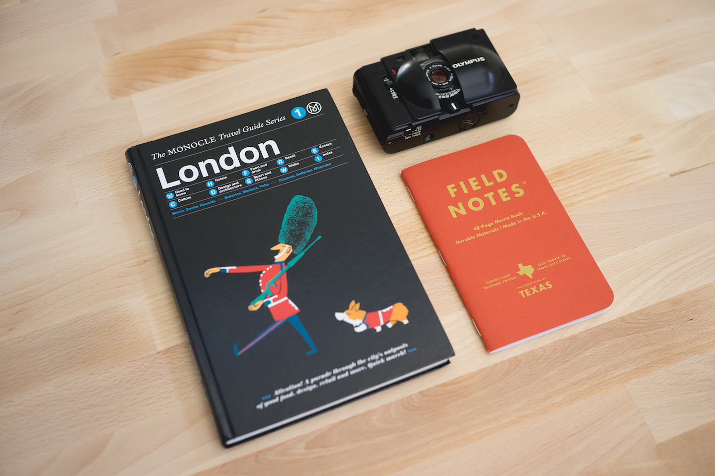
The Monocle Travel Guide Series

The Monocle Travel Guides are my absolute favorite because of how they naturally extend Monocle’s competencies. They are less for the weekend traveler who merely wants to see a city, and more for those who want to live and breathe it. The depth of experience that they provide makes them best suited for residents and repeat or long-term travelers.
History
Compared to the more than decade old Wallpaper* City Guides, the Monocle Travel Guide Series is both younger and less numerous. It arrived to Tyler Brûlé’s Monocle media empire in 2015 as the latest horse in the stable alongside the magazines, radio, books, stores, and cafés.
Taking advantage of its numerous offices around the world and the wealth of knowhow among its staff, the series started with New York, London, Tokyo and Hong Kong. It has since expanded to 22 cities.

Published by Gestalten, they are exclusively available in print, echoing Monocle’s intention for these guides to shake off the cheap, disposable character of more common travel guides. At launch, Brûlé said that “they will be taking on a more premium feel — you can spill your drink on the book and it won’t really matter.”
Design
The books themselves are very durable, and withstand being tossed in a bag yet still blends in among a shelf of design books. The covers are wrapped in a textured, cloth like material with an integrated ribbon bookmark.

The pages are served up in full color with a generous heaping of photographs and dashes of illustrations. They maintain Monocle’s signature balance between information density, brand and readability. I’m impressed simply trying to understand the process behind making something that reaches that balance.
Content
Every Monocle Guide is divided into around ten sections. Aside from a few straightforward ones like Food and drink and Retail, most are unique to the way Monocle sees the world. Things we’d buy presents a photograph of knolled artifacts from all around the city with a listing of where to find them. Essays brings together cultural experts and Monocle’s own editors to paint a deeper picture that only narrative can convey. My favorites were the Sport and fitness and Walks sections. These play the role of your friend the fitness enthusiast who knows in detail the best places to walk, run, cycle and more in the city.

Unsurprisingly there is a bias towards the neighborhoods that Monocle has a presence in, but that’s just a vote of confidence for those places. If Monocle located its office there, it must be good.
In short
The Monocle Travel Guides are my absolute favorite because of how they naturally extend Monocle’s competencies. They are less for the weekend traveler who merely wants to see a city, and more for those who want to live and breathe it. The depth of experience that they provide makes them best suited for residents and repeat or long-term travelers.
Wallpaper* City Guides

With around 100 cities covered, The Wallpaper* City Guides are the best option for those traveling to cities off the beaten path. Further, they are the most versatile guides among the set, because they are regularly updated and simply list attractions broken down by type.
History
Here we have yet another set of guides under Tyler Brûlé’s sphere of influence. Though they are published by Phaidon, they are written by venerable design and culture magazine Wallpaper*, the magazine Brûlé started before he left to found the Monocle empire.
This series started with 20 cities in 2006, expanded to 60 by 2007 and now apparently totals more than 100 (though I could only find 95 for sale on Wallpaper*‘s website). The guides are updated annually and each has a companion iOS app.
Design
Slightly larger than a passport in every dimension, each book is bound in a different colored Pantone cover adorned only with the name of the city, a language if it’s not printed in English and Wallpaper* City Guide and Phaidon logos.
I think the colored cover is a brilliant way of establishing strong branding while also making different editions discernible from each other, a boon on multi-city trips.

The front cover opens to a panoramic photograph of the city with a selection of recognizable landmarks highlighted. The back cover has a corresponding fold out featuring a color-coded map of major neighborhoods. Within, the pages are step cut like a telephone book or directory, making it easy to thumb between sections. In the back are pages of ruled and grid paper for notes.

Content
Aside from a 24 Hours section that lists a detailed itinerary with the aim of seeing “the best of the city in just one day”, the book is divided into sections by interest like landmarks, hotels, urban life, art/design, etc. Each opens with an introduction that briefly describes the subject and the attractions listed within that section.
The introductions helped me quickly build some intuition about that particular aspect of the city while also giving me an idea of which particular attractions I want to further read about.

In the remaining pages of every section, each museum, restaurant, or other attraction is illustrated in prose and beautiful photography.
I found myself first leafing through the pages to flag the items that look interesting and then reading the descriptions to form a list of places I’d like to visit.
While some of the other guides here have essays, walking guides, etc. the Wallpaper* Guides are limited to these lists of attractions broken down by section. This organization is well suited for those looking for a simple, curated list of places to see.
In short
With around 100 cities covered, The Wallpaper* City Guides are the best option for those traveling to cities off the beaten path. Further, they are the most versatile guides among the set, because they are regularly updated and simply list attractions broken down by type
LOST iN · Curated City Guides by Locals

Modern design, brevity and attention to current culture make these guides perfect for today’s traveller making a short trip to a city. As a bonus, lovers of contemporary graphic design will appreciate the use of color and typography. Be warned, LOST iN guides are the most opinionated here because they take a strong stance in what they include and what they leave out.
History
LOST iN builds around a central motto. “Getting lost in the city is not about throwing away the map. Getting lost is diving headfirst into what makes each city its own.”
It’s the brainchild of a trio out of Berlin. Despite their wide ranging backgrounds, they agreed that they wanted “to recreate — in a print product — the type of travel experience you get when visiting a friend in an unknown city”. Graphic design and layout were done by NODE Berlin Oslo while publishing is handled by Gestalten. LOST iN focuses on and recommends their print editions, but they have also created a free companion iOS app. In the future, they plan on expanding the LOST iN business to services that can make travel better.
Design
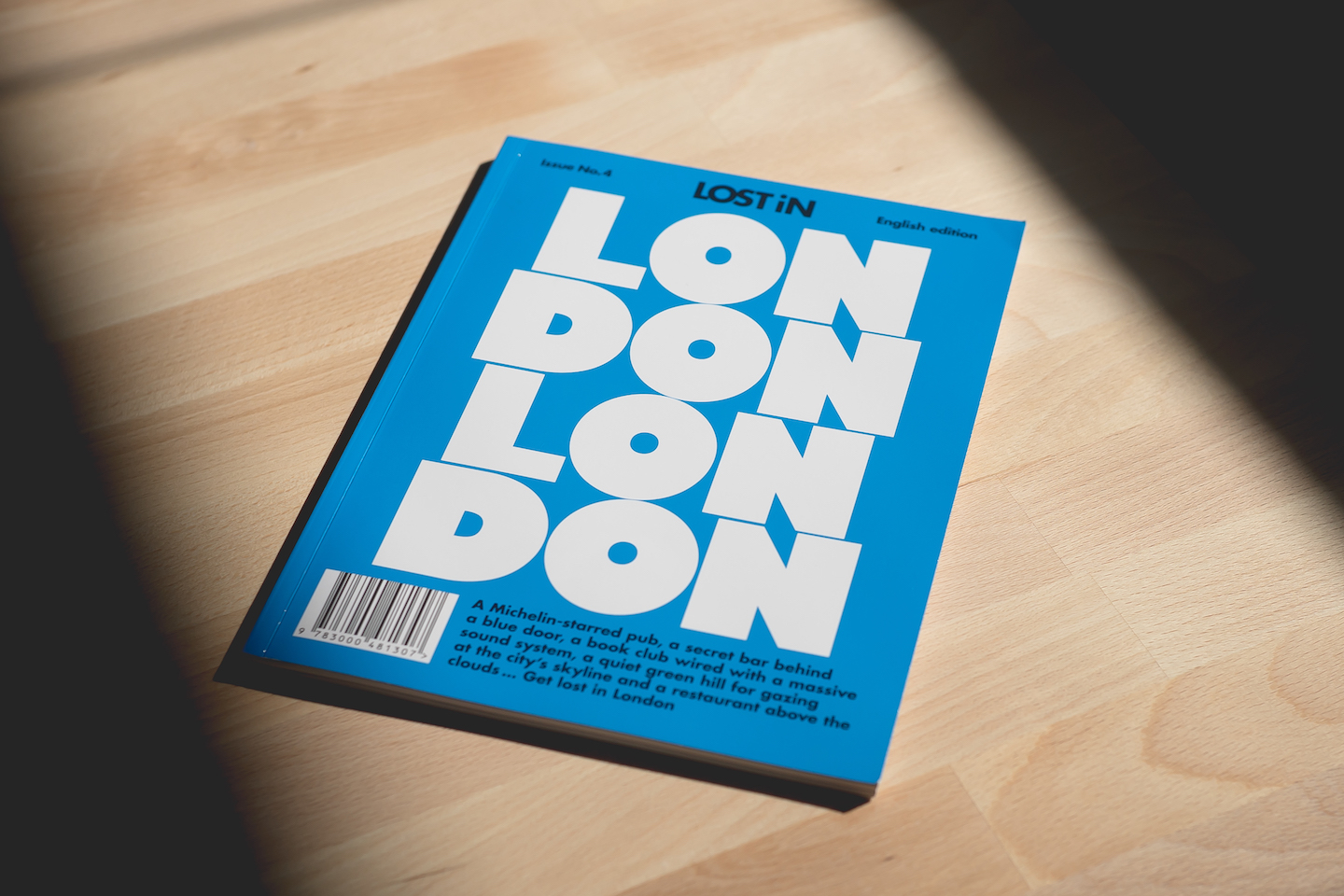
The thing I noticed when first I held a LOST iN book in my hands is its size. It’s both tall and wide, yet very thin. The perfect bound, glossy cover contrasts the matte pages inside.
The second thing I noticed is the typography. Each guide’s cover is emblazoned with a repeating, typographic treatment of the city’s name overlaid on a solid color. Both typeface and color are chosen to echo the history and aesthetics of the city. For example, New York’s cover features “NYC” in white set in a grotesque typeface on a black background. It clearly mimics Vignelli’s MTA signage, an inextricable part of New York’s identity.

If you are pleased by the cover, then the pages inside will be a treat. LOST iN takes a very modern approach to typography, using few typefaces, but a wide array of sizes and weights. Titles are large and heavy. Layouts, while on a grid, change substantially from page to page. Each section is subtly identified by a different accent color applied to some of the text, obviating the need for titles at the top of each page.

Content
The guide’s compact size is a clue to the content inside. The LOST iN guides are perfect specimens of reductive design. It doesn’t contain nearly as much content as any other guide I’ve seen.
Most guides in this post are organized by the type of content, i.e. lists of attractions are together in one section as are essays in their own. LOST iN throws out that structured style, interspersing different parts throughout the book.

Every Story paints a vivid picture of one aspect of the city’s culture. The Made in section mirror’s Monocle’s Things we’d buy, but expands from just a list of objects to books, films and music. There’s even a wordless photoessay called Showcase and two tear-out postcards in the back. My favorite are the Testimonial pieces, interviews with local cultural icons centered around places.
In short
Considering their contemporary design, brevity and attention to current culture, the LOST iN books probably won’t stand the test of time. 10 years from now, they will be relics of how we travel today.
However, their modern design, brevity and attention to current culture are precisely what make these guides perfect for today’s traveller making a short trip to a city. As a bonus, lovers of contemporary graphic design will appreciate the use of color and typography.
Be warned that LOST iN guides are the most opinionated ones here because they take a strong stance in what they include and what they leave out.
Final thoughts
These city guides have changed the way I travel and I hope they do the same for you. If you buy your own city guides and take them on your travels, I’d like to hear what your thoughts are. Perhaps you’ll see them in a completely different light.
Also, as a side note, keep a look out for another post with the guides that didn’t quite make the cut for the best, yet are still worth a mention.
Thanks to Dustin Ho, Jeffrey Lin and Chuan Shi for reading drafts of this.