When an architect designs a train
7 min read Oct 24, 2019 Updated Sep 11, 2021
Recently, the Seibu Railway introduced a new train type to its service between Tokyo and Chichibu in Saitama prefecture. Its model designation is the Seibu 001 series, but it’s better known as the Laview. What makes this train unique is that it’s designed by Pritzker Prize-winning architect Kazuyo Sejima.

She is most well-known for co-founding the architecture firm SANAA. Some of SANAA’s most recognizable works include the New Museum in New York, the 2009 Serpentine Gallery Pavilion, and the Rolex Learning Center at the EPFL in Lausanne, Switzerland.
Interestingly, Kazuyo was chosen for this project precisely because of her complete lack of experience with transportation design.
When designing the Laview train, Kazuyo viewed it not merely as a vehicle, but as an architectural space.
I was approached to develop a train car concept, as never seen before. This is my first time to design a train and the most obvious difference with building design is that the train can move to different places. This train moves through Tokyo to the mountains of Chichibu and I thought it would be nice for the train to be able to respond and blend into the surroundings in a soft way. Also, I wanted to make a train which feels like a living room where passengers can freely relax and feel motivated to ride the train every day. ― Kazuyo Sejima [1]
The intention of blending into the surroundings is most evident on the outside. The cross-section of the train is a rounded rectangle, while the ends are nearly spherical. The exterior is covered in custom paint designed to gently reflect the passing scenery.

The living room idea Kazuyo mentions begins with the enormous windows in the passenger compartment. Unlike most trains, they start much lower near the floor, invoking the feeling of an architectural space. They also help to dissolve the separation between the inside and outside.

This living room concept continues on the inside. The color palette throughout the interior is subdued, composed mostly of yellow and shades of light gray.
Most chairs in public transportation, with their exposed fasteners and hard plastic construction, are clearly made for durability. The chairs in the Laview, designed in collaboration with textile designer Yoko Ando, have the shape and texture of a lounge chair that one could easily find in a living room. They are a pleasure to behold and must be a pleasure to sit in.

The soft lighting within the passenger cabin was designed by lighting designer Shozo Toyohisa to gradually change throughout the day to imbue passengers with a feeling of relaxation.

The walls and ceiling of the passenger compartment are white or light gray. However, the bathroom and corridors between compartments are bathed in a shade of yellow. This, at an intuitive level, separates the “public” spaces from the more private “living” spaces. Using color like this to separate zones by context is common in architecture, but quite rare in transportation.

By looking closely at the Laview train, we see how the project was envisioned through the eyes of an architect. Careful attention was paid to all the elements that define an architectural space such as geometry, light, color, and texture.
At first glance of the Laview’s predecessor, the Seibu 10000 series (西武 10000 系), it’s obvious how different something as mundane as public transportation can be. What it takes is someone with the right point of view and the proper support, resources, and time.
 The exterior of the Seibu 10000
series
 The interior of the Seibu 10000
series
When two industrial designers design a tram
When I first saw photos of the completed Laview trains, I was reminded of another example of when designers outside the field of transportation design were tasked with designing a train.
To see that case, we have to travel from Japan to far-away Hanover, Germany. The year was 1990, and the small city had just won the bid to host Expo 2000. It realized that in order to play host to the millions of visitors it would receive in the first world expo of the new millennium, it would need to vastly upgrade its transportation systems. The city tasked engineers and designers from Germany and beyond to create the next generation of transportation for Hanover.
British designer James Irvine designed a custom body for the Mercedes-Benz Citaro bus. The beautifully rounded corners and pill shapes still to this day strike a perfect balance between being aesthetically pleasing, yet inconspicuous.
 Hanover’s Mercedes-Benz
Citaro
The project that is better known is the light rail, specifically the TW 2000 Stadtbahn. It was jointly designed by a duo of industrial designers. The first of whom is Herbert Lindinger. He studied at and later taught at the Ulm School of Design (Hochschule für Gestaltung Ulm or HfG), the spiritual successor to the Bauhaus.
Herbert Lindinger already had a history with Hanover, having designed the outgoing TW 6000 rolling stock used at the time and a previously-used logo for üstra, Hanover’s public transit authority.
 Düwag TW 6000
The other member of the duo is Jasper Morrison. Even if you don’t recognize his name, you’ve undoubtedly seen his work for Muji, Samsung, Alessi, Flos, Magis, and others.
Like Herbert, Jasper had a link with Hanover as well. While he was mostly known for furniture at the time, he had designed the bus shelters for Hanover a few years earlier.
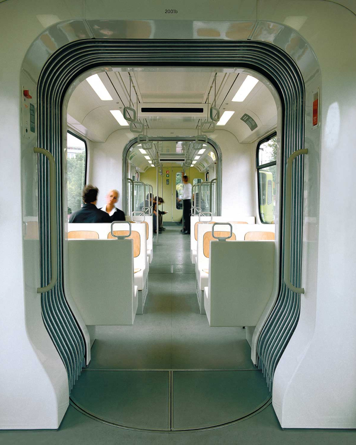
The TW 2000 is figuratively covered in Herbert’s and Jasper’s fingerprints. The exterior of the tram looks modern and clean, yet still maintains a relationship with its predecessor. The arrangement of windows is the same, yet they are now rectilinear with larger curved corners. The overall shape of the tram is more straightforward, as well. Most corners have been replaced with soft curves.

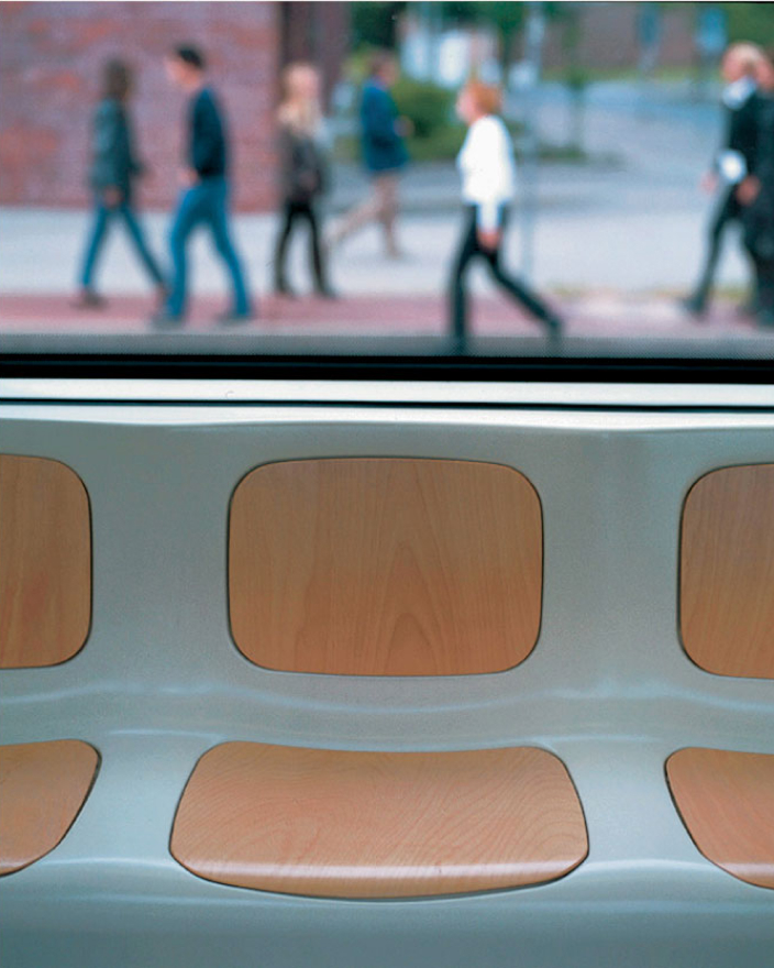
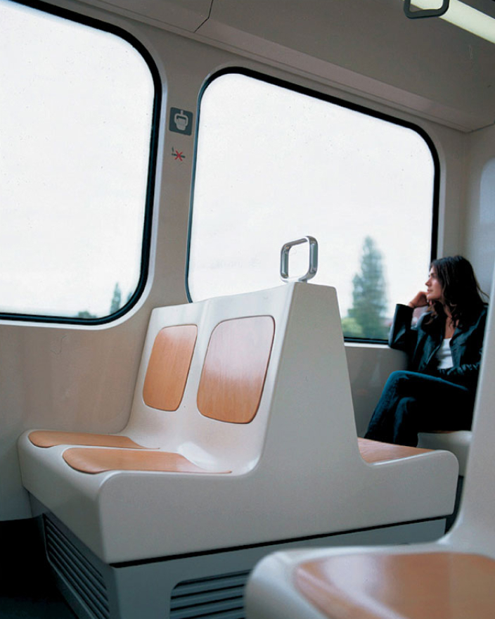
The interior is utilitarian and understated without feeling cold or lifeless. The seats are made from molded fiberglass with contoured inserts made from wood. They strike a balance between cost, ease of maintenance, and quality, making them feel more like modernist wooden furniture.


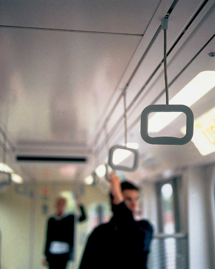
The handles are where Herbert and Jasper’s way of looking at the world genuinely shine. They gave them the same care they would have given a doorknob or a spoon’s handle.
You see, anything the human hand touches is an opportunity to provide a tactile experience. The best handles are shaped and finished in a way to communicate their purpose. All the while, they should blend into the background when not in use.

In hand, knobs and handles should feel friendly. This means they should be curved and properly sized to fit the human hand. Yet, they should instill trust through texture and material choice. A good handle feels solid, with no flex or wiggling.


Herbert and Jasper didn’t only focus on mechanical or budget requirements. Instead, by concentrating on the tactile aspects, they made something usually cold and sterile into something calm.
The effect of the creative lens
In the Laview train and the Hanover TW 2000 tram, we see how much of an effect a designer’s point of view has on what they create. Yes, both projects unquestionably answer the same need, taking people from one place to another.
The Laview train, by being designed by an architect, is an exercise in how light, color, and texture can define the use and feel of spaces. The TW 2000, by being designed by industrial designers, is centered on how materials define the tactile experience.
We see how the lens used to envision each is what leads to such a difference in the end-product.
Photos courtesy Dezeen, Metalocus, the Wikimedia Foundation, and Jasper Morrison. Video footage courtesy のんびり電車に揺られまして and sobanotanuki on YouTube.
Thanks to Q for reading drafts of this.
