
Four books about Apple design
10 min read Oct 11, 2024
In this ongoing series, I share some of my favorite books from my personal library.
Given the sheer number of posts I have written about Apple, this post is long overdue. I have written previously about Make Something Wonderful, a compilation of the words of Steve Jobs. It’s well worth reading for anyone in creative or technology fields.
The following books are all about Apple’s products and their design. Apple is usually tight-lipped about what happens within its corporate offices, especially within the design studio. Yet, it has, on occasion, pulled back the proverbial curtain in the form of books.
These books span decades, from the time the Cupertino-based company’s founding to recent time.
Apple Design: The Work of the Apple Industrial Design Group
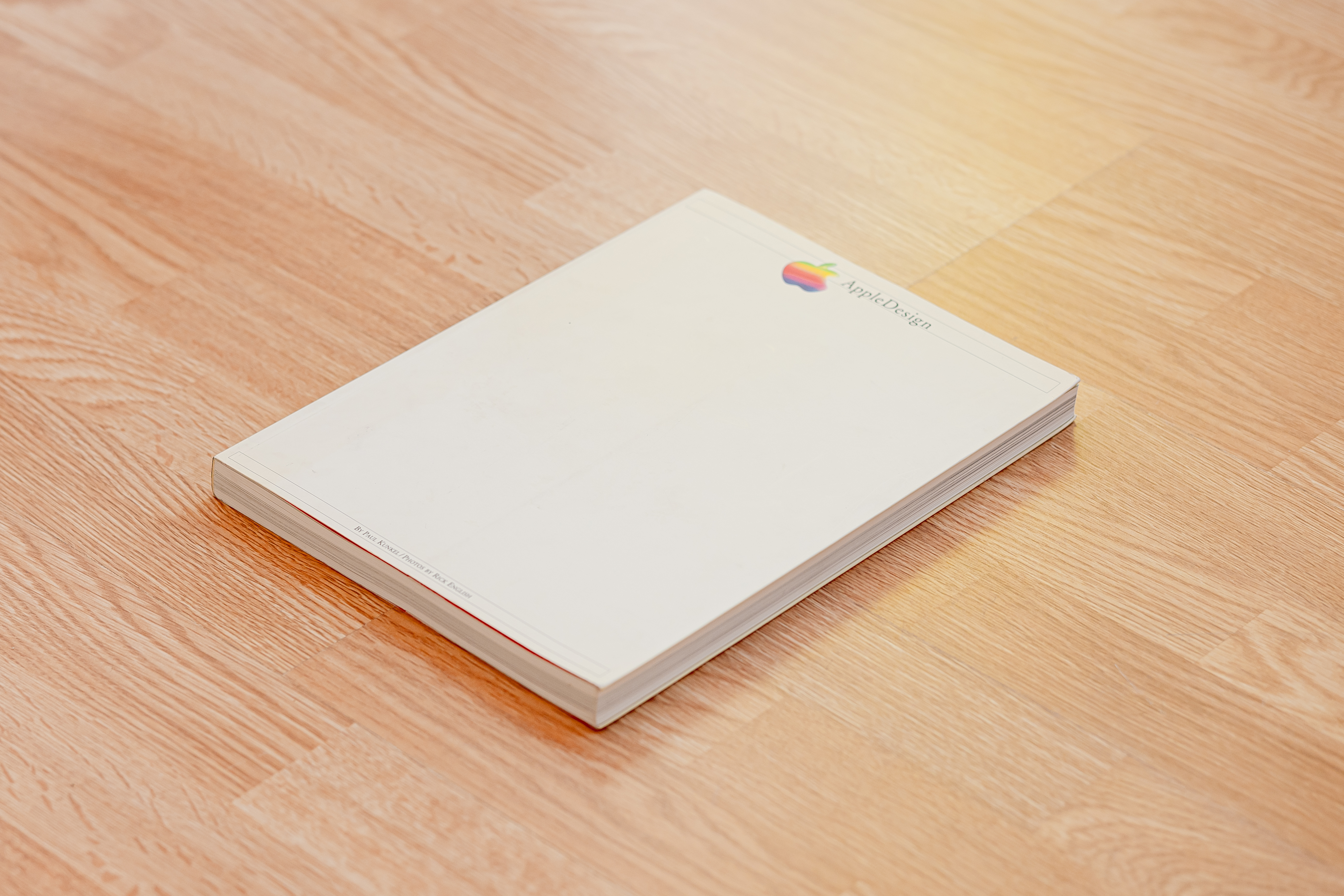
This first book is another by Paul Kunkel, who you may remember wrote Digital Dreams: The Work of the Sony Design Center. Photographs, of which the book is flush with, are by Rick English who has long photographed products for companies in Silicon Valley. Just like the Sony book, this is as much a book by people within Apple as by those without. It arrived on the scene in 1997, just as Steve Jobs retook the helm.
Design
Like many other books from the period, it’s a product of the 90s. The text-heavy pages are laid out in two columns with headings in a red sans serif and body text in a serif.

The photographs use shallow depth of field, soft focus, and colored, high contrast lighting. Backgrounds often feature projections, gel lighting, texture, and props.

The bottoms of the pages feature page numbers, while the edges feature numbers identifying each of the photographs within.
Content
It covers the time before Apple became the vertically-integrated monster it is today. As such, much of the industrial design work was performed by external partners like frog design, IDEO, Giugiaro, and Lunar Design. Of particular note is one Jonathan (Jony) Ive, who had just joined the company 5 years before after showing tremendous creativity as an external contractor.

The first chapter is Beginnings, covering the Apple II up to the SnowWhite project. The third, The Middle Years details the time leading up to when Bob Brunner, who was working as an external consultant, joined Apple. That moment marks the beginning for the next section, which makes up the majority of the book. The last few pages make up the last section, Looking Forward, with a few photographs hinting at future products that likely evolved into the iMac, and iBook.

I especially loved the list of bios that goes through all prominent figures who had an effect on Apple design.

This, of all the books in my collection, may provide the most hints as to the course taken by Apple design before Steve’s return in 1997.
Keep it Simple: The Early Design Years of Apple
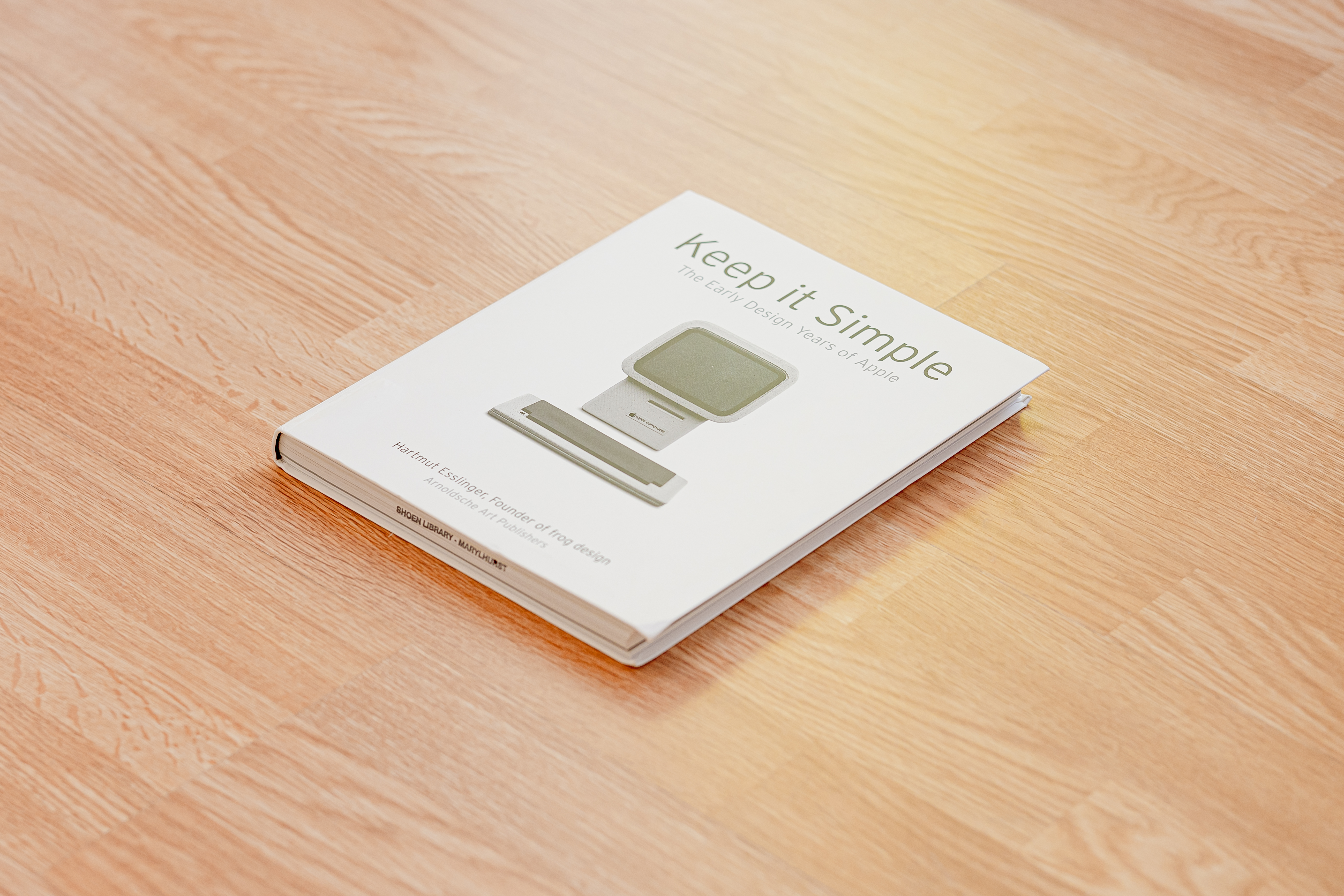
This second book is by far the most personal of the bunch. It’s written mostly in first person by Hartmust Esslinger, founder of frog design and longtime collaborator of Steve Jobs. It chronicles his work as Apple’s design partner in the several years leading up to Steve Jobs’ firing by the board of directors.
Design
The soft covers of the book have a satin-like sheen. The flexibility of this book makes it feel a bit like a diary or notebook. The paper matches the texture of the cover, balancing soft touch with brilliant, deep colors.

Text, appearing in wide, single columns, is set in what appears to be Hit the Road.

Photographs are displayed either full bleed or in a six-square grid system.

Either the stories or the photographs by themselves would be enough for a great book. With both, this book becomes a gem. The photos are extremely detailed and cover nearly every sketch and prototype made over the years.
Content
Hartmut opens the book with how his wife, Patricia, found a briefing for a contest that led to him to working with Apple. He quickly goes on to state his frustration with many of the countless other books about Apple and Steve Jobs. They treat design as some hobby or “add-on” and not one of Steve’s core focuses. Furthermore, they parrot many popular semi-truths.

The book goes on from there, telling story after story of how Hartmut met Steve and then how they worked together on some of the most influential products of the last century. The first chapter, iNsanely Great lays out the structure of the book, painting a picture of all the detail you will see (and some that you won’t due to Apple’s lawyers) in the coming pages.

As the story continues, Hartmut writes of both the most broad, abstract topics and the most specific design details for every prototype. In the middle there is even a short essay by Marc, Hartmut’s son, about his father’s work.
The final 20% of the book is dedicated to Steve’s ouster, his time away at NeXT and then his triumphant return.

This book, alongside Creative Selection is among very few books that actually paint a picture of how the people at Apple created the world’s most magical computing experiences.
Designed by Apple in California

This book is a rare treat from the current iteration of the design team. It was released globally through Apple’s retail channels in late 2016 and remained on sale for three years. It originally started as a small private project for the industrial design team as they often make bespoke products for themselves. Then, the book grew into this public version we see here.
The moment I saw the announcement, I preordered it and picked it up on the day of release. It was available in two sizes and I chose the smaller one (which is still quite large even by coffee table book standards).
Design
For a company obsessed with pushing the sheer level of polish in everything like their website, retail stores, and products, Apple’s book about design checks all the boxes.

Every single element, from the linen on the cover, to the paper, to the inks are unique to this book. It was designed in conjunction with Pentagram under the direction of Luke Hayman.
The book arrived in a form-fit paper wrap just like the kind used on Apple Watch. Inside are beautiful drawings of Apple’s products from the last few decades.
Words are, of course, set in Apple’s own San Francisco typeface. The texture of the pages is perfect, rendering the tiniest detail and deepest contrast without looking gaudy or shiny.

The linen cover is similarly polished with an even texture interrupted only by a pressed Apple logo on the front and “Designed by Apple in California” on the spine.
The photographs are in Andrew Zuckerman’s signature style — perfectly lit on a white background. They look ethereal, almost like renderings.

Content
The book begins with the title on one page, then the words “Dedicated to Steve Jobs”. What follows is a short introduction by Jony Ive, which he begins with “This is a book with very few words.” Indeed, the book has very few words. The foreword spans just the right-hand columns of a two column grid.
An index with a listing of products in chronological order is the final set of words before the rest of the book — beautiful photograph after beautiful photograph. At the end are credits and a listing of design details.

Some photographs are much like the product shots and renderings you may see in Apple’s own marketing materials. Others show tools used in production such CNC cutting tools and injection molds. I especially love seeing the many intermediate stages of a single part through the production process.

This book may not reveal much in terms of how the folks at Apple think about how they design. Yet, it makes me appreciate the incredible care they take in designing and building products that today are ubiquitous.
Jony and Marc’s (RED) Auction
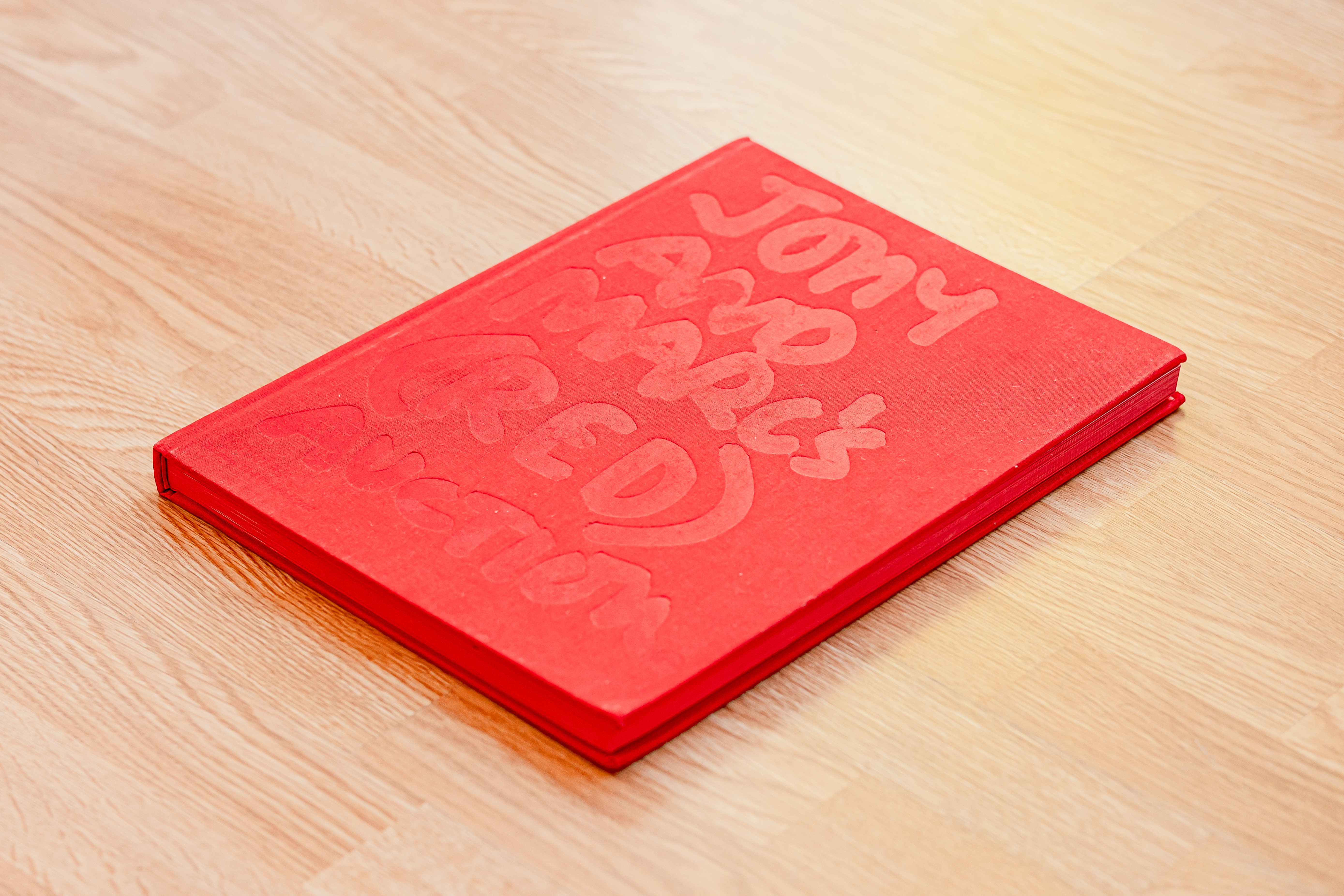
This last book is a bit of a bonus. It isn’t directly related to Apple. Yet, the two protagonists, Jony Ive and Marc Newson are near and dear to Apple design. They had just converted their long-time friendship into a professional one. That collaboration would eventually produce the Apple Watch, with its sport band bearing a clear resemblance to Marc’s Ikepod watches.
However, all of that was yet to be known to the public. In 2013, when Jony and Marc held an auction with Sotheby’s to benefit (RED), their collaboration was in curating, and sometimes redesigning, products made by others.
Design
Unsurprisingly, this book is clad in red — from the fabric cover to the edges of every page. This fabric is adorned with the title of the auction in large hand-written marker, the words lightly pressed and glossy. At some angles, the words are imperceptible.
Yet, in the hand, it is impossible not to notice either the shine of the letters or the pleasant texture of the fabric. On the back cover are two cartoonish marker drawings of both Jony and Marc’s heads. These words and illustrations are the work of Richard Allan.
The pages inside, by SAPPI fine paper, are soft to touch, but glossy enough to render the vibrant photographs taken by Andrew Zuckerman.

Every lot starts with a lot number written by Richard Allan. It’s followed by details set in Helvetica. The opposing page features one of Andrew Zuckerman’s photos of the complete piece. Some lots feature close-ups and other angles in the following pages.

Content
The book begins with a brief description of how (RED) was founded and its philanthropic goals. The next page is a foreword by Bono, who has been the public face of the project since its inception. He speaks of (RED), the first auction with Sotheby’s in 2008, and the story of how this one came to be.
The following pages are another foreword, this time by Stephen Fry. He describes both Jony and Marc’s personal histories and many details about some of the most notable lots from the auction.
Then the rest of the book (aside from a small section in the end with terms and conditions and thank yous) is dedicated to the lots themselves.
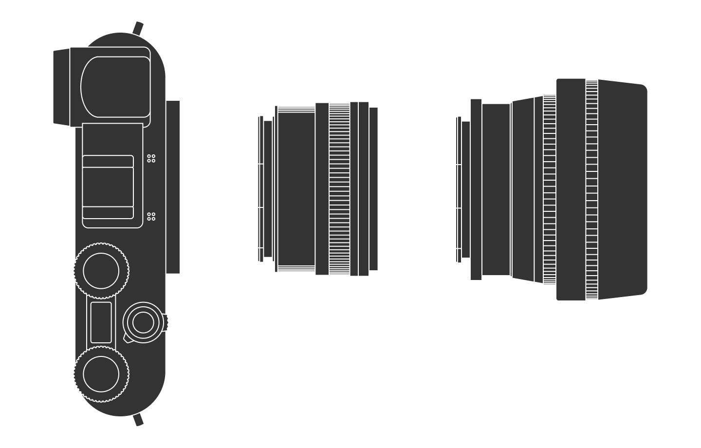
Some of the items modified versions of readily available consumer products, often with red finishes where other colors are standard. Others are completely unique items made exclusively for the auction. My favorite item is Lot 14, a one of a kind Leica camera entirely designed by Jony and Marc. I’ll have to write more about this one later.

Of note to Apple lovers are Lot 5, rose gold EarPods and Lot 27, a red anodized 2013 Mac Pro, both of which were purchased by former Apple employee and “father of the iPod” Tony Fadell. See all the lots here on the Sotheby’s site.

If there is one idea that this book brings up, it’s the blurred line between design and art. At times, Apple has been criticized for sacrificing usability in the name of aesthetics. One-of-a-kind Apple products could be used as fuel for that line of criticism.

Apple’s design philosophy evolves
These books chart Apple design across many decades, from its humble startup roots to global cultural superpower. We see the ebb and flow of their product line. In the early days, the sheer number of products Apple made kept growing. The result was fragmentation and a lack of cohesive design language.
With Steve’s return, the product line was shrunken down to a small number of products. From there, the product line has begun to grow again, but in an integrated manner.
All along, one thing has been true. Design is core to Apple’s business strategy. It isn’t just one of many differentiators, but a piece of its identity. Each book shows how design wasn’t merely about aesthetics, but instead affects every part of how the company functions.
Camera setup
Thanks to Q for reading drafts of this.