Rediscovering Apple's 1987 identity guidelines
8 min read May 28, 2018
My obsession with standards manuals
Identity guidelines and graphics standards manuals are documents used to define a brand. They describe details like which colors and typefaces to use on signage or how much space to leave between elements on a page.
My interest in them started with the 1970 New York City Transit Authority Graphics Standards Manual made by famed designer Massimo Vignelli. You don’t need to be a designer to recognize the work of Massimo and his wife Lella. Aside from the current identity of the New York City Subway, they also designed the American Airlines identity that lasted from 1967 until 2013 and the Bloomingdale’s brand, including their popular Big Brown Bags. The Vignelli’s influence didn’t stop with graphics though. Massimo believed that “if you can design one thing, you can design everything”. Hence they designed furniture, dinnerware and even a church.
 Some of the Vignellis’ work
In 1967 the New York City Transit Authority hired Massimo Vignelli and Bob Noorda from Unimark to design a system of signage for the subway. As part of that job, they provided a graphics standards manual to describe the precise details involved in implementing that system.
In 2012, two designers at Pentagram discovered a rare copy of that manual in their office’s basement. They first created a website with scans of that book to stand as a digital archive. Then, in 2015, with the MTA’s blessing, they republished the manual on Kickstarter.
When I received my copy, I became hooked.
As I first opened up the standards manual, I felt like I was reading the secret recipe for something I’ve eaten many times at a favorite restaurant. It gave me what was until then an extremely rare glimpse into the making of something I had so much contact with when I lived in New York.
Naturally, I immediately started scouring eBay for copies of other standards manuals.
The discovery
A few years later, among my eBay alerts, I noticed a poster version of Apple’s Corporate Identity Guidelines. I bought it without a second thought.
If you know me, then you know I love Apple. I’ve been using and evangelizing their products for most of my life. Apple’s brand, the experience of buying and using their products and the physical qualities of the things they make have deeply shaped the way I look at products. Hence, any internal design artifact from Apple is a holy item for me.
Apple in 1987
My copy of Apple’s Identity Guidelines was made in 1987, a year notable for Reagan’s “Mr. Gorbachev, tear down this wall!” speech in Berlin and the release of Bad by Michael Jackson. Only two years earlier, Steve Jobs had been ousted from Apple. A year before that in 1984, the first Macintosh was released. Another 7 years earlier in 1977 was when the now famous 6 color rainbow Apple logo first appeared.
Apple was very different back then. It distantly trailed its competitors in sales, marketshare, revenue and market capitalization. It was still a decade away from its shift towards the multimedia market that ultimately culminated in Apple’s transition into the household brand it is today.
Being able to peek into that Apple is what makes this poster so interesting.
The Apple Corporate Identity Guidelines
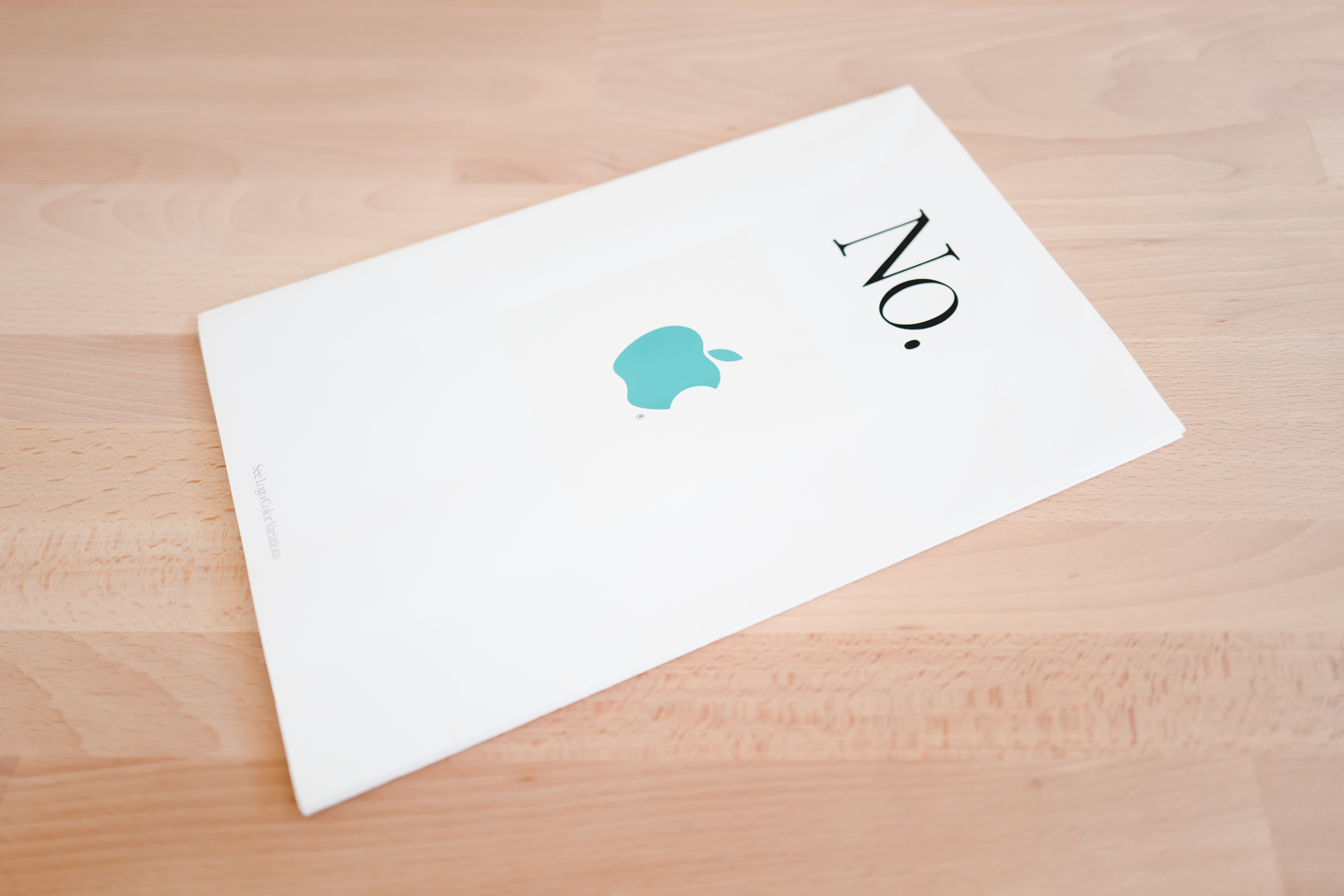
When it’s folded up, all we see on top is the phrase “No.” in large black letters above a teal Apple logo.
As we start to unfold it, we to notice that each fold presents a different translation of “No.” above an incorrect use of Apple’s identity.
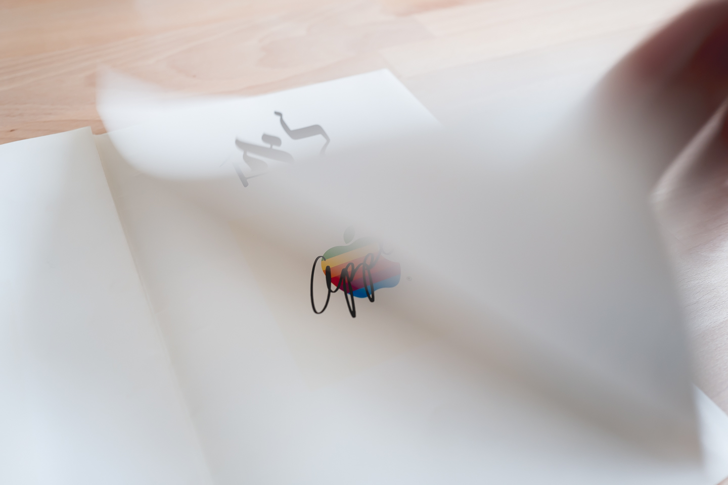
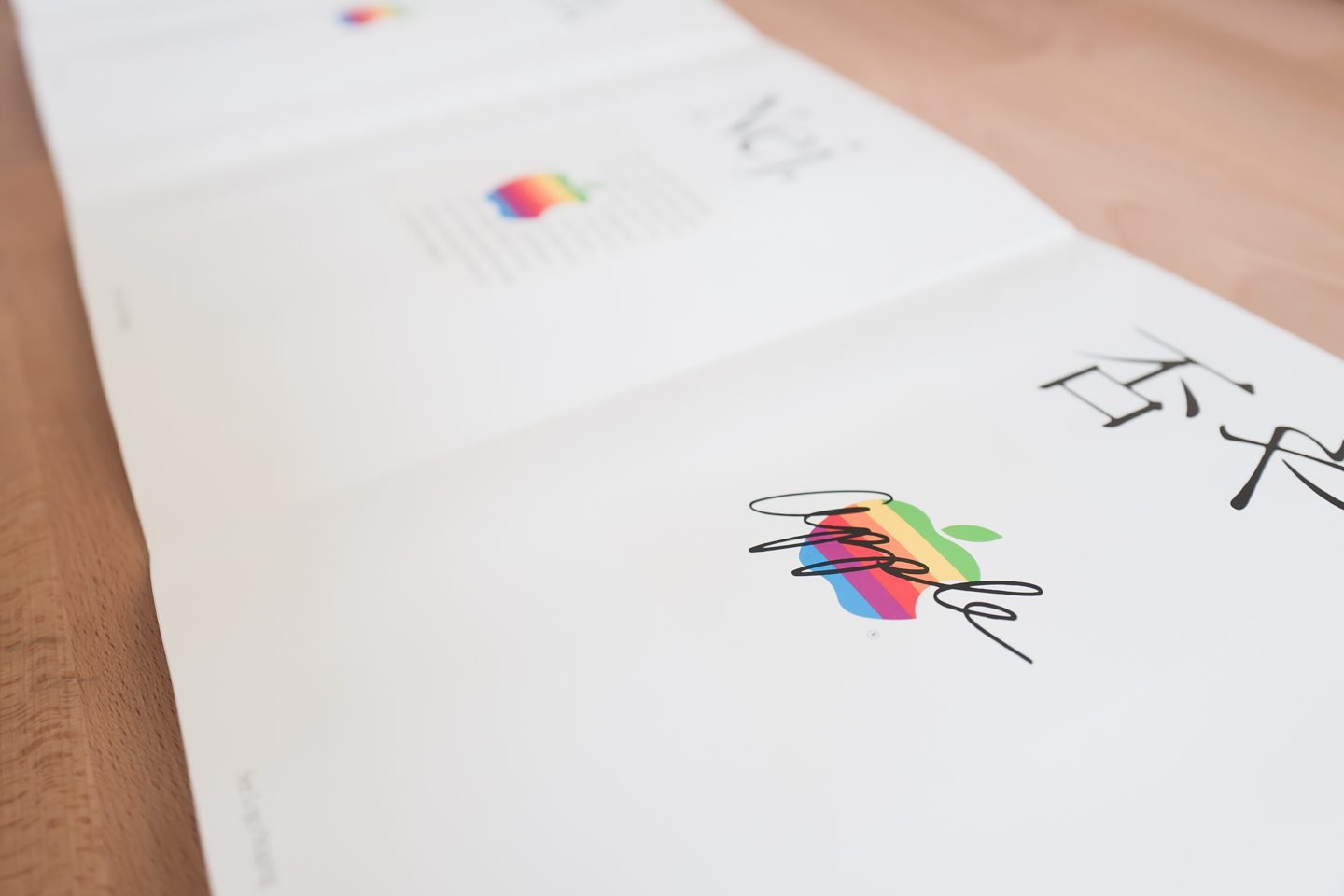
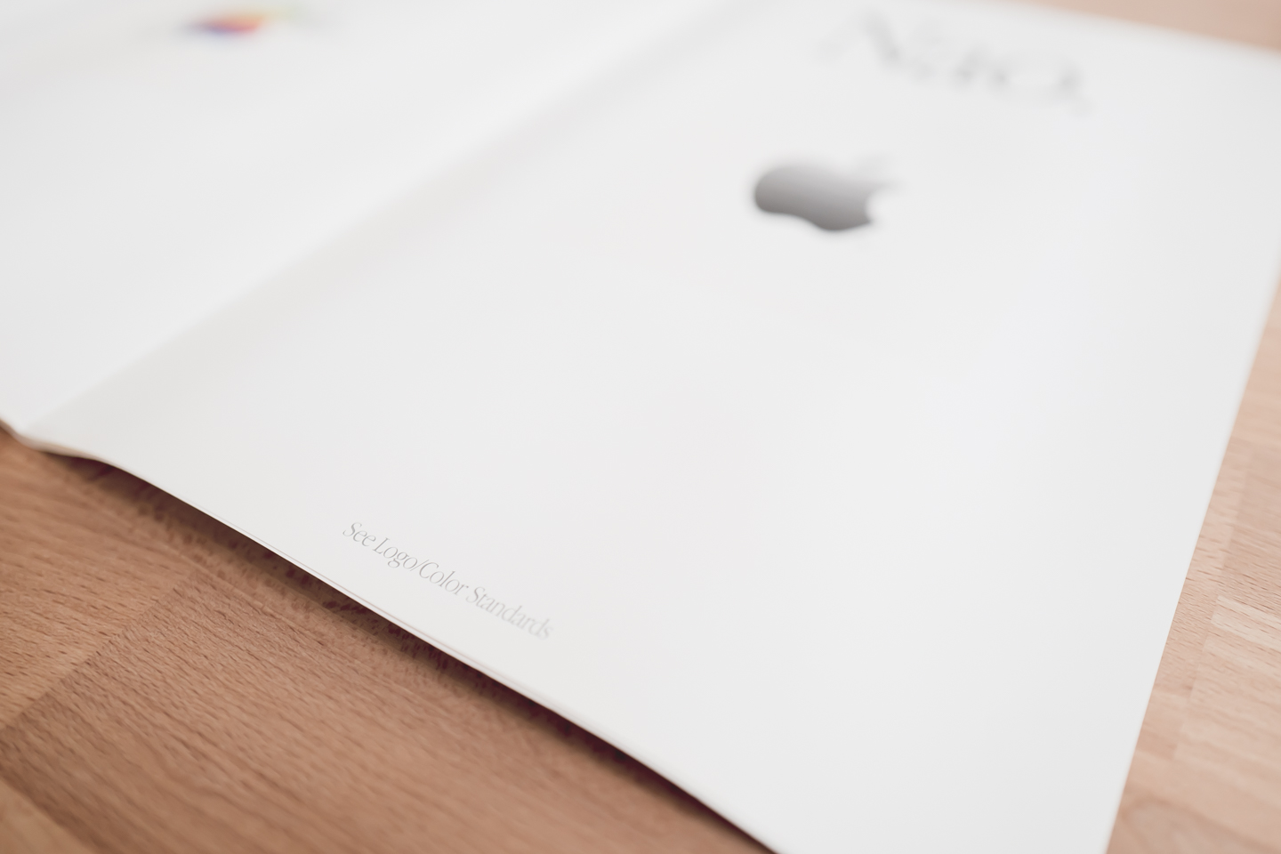
A smaller caption at the bottom of each panel directs the reader to the section of the guidelines that addresses that particular mistake.
Fully unfolded
When we fully unfold it, we are presented with a tightly packed field of text and figures. It’s a bit cramped and doesn’t have an easily discernible hierarchy. I can only imagine all the constraints that led to this final product.
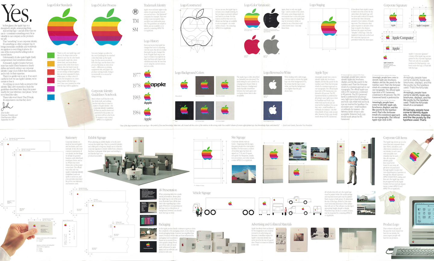
By the level of detail and the clear amount of work that Apple’s designers put into this poster, we can see that they cared deeply about Apple’s identity.
If I were to redesign it, I would start with a rectangular grid system to prioritize legibility. Then, I would strip out as much as possible to highlight just the highest level points.
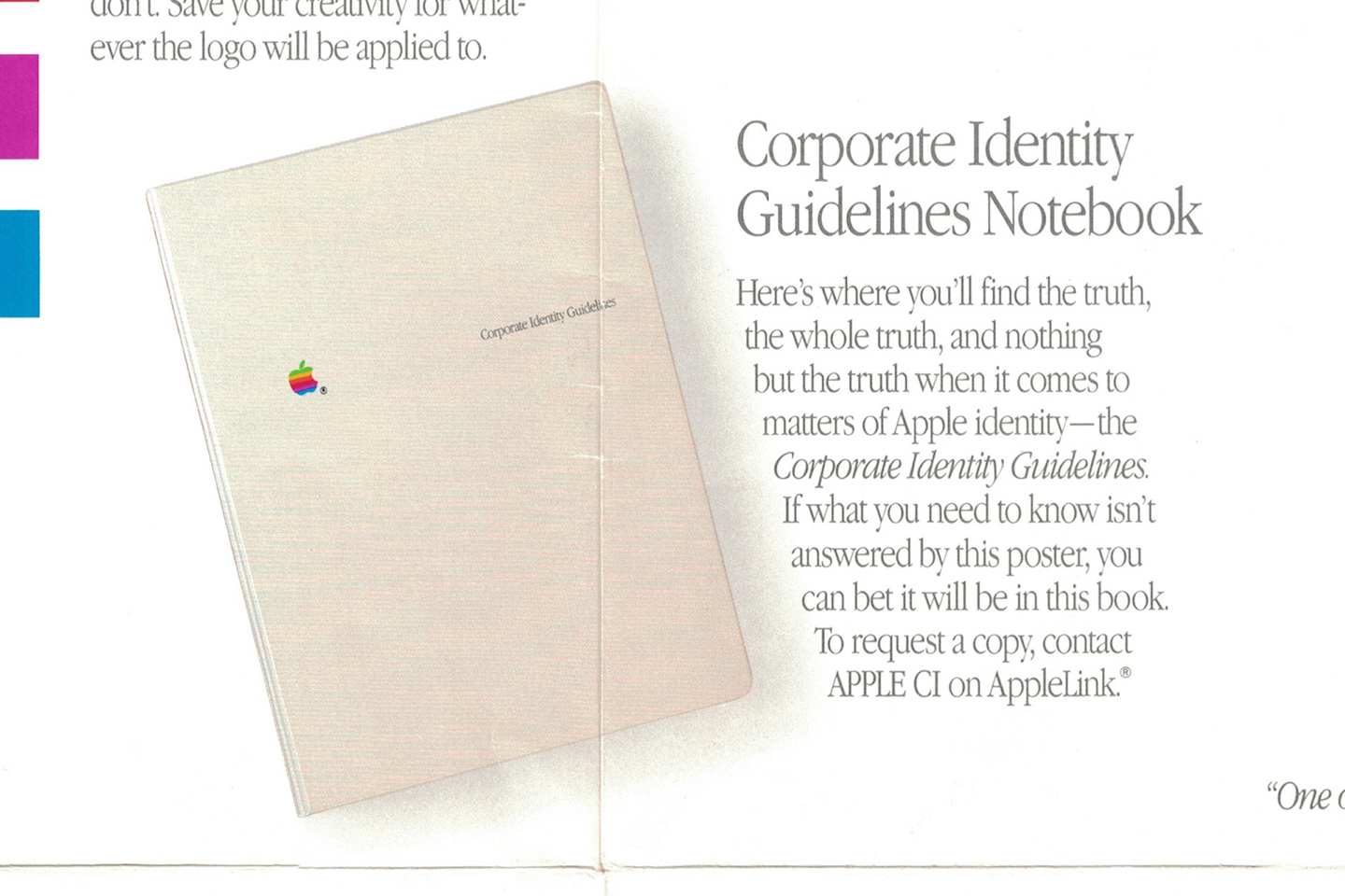
The poster actually mentions a Corporate Identity Guidelines Notebook that is a perfect place for everything that doesn’t fit. Limit the poster to the most important aspects and put everything else in the book.
I’ll admit it is easy for me to be critical considering I’m not aware of the real world constraints the original designers had to work with. Yet, I believe the skill of balancing and navigating real world constraints is the art that sets the best design teams above the rest.
A historical document
Once we look past the overall structural problems, many individual pieces of this poster start to shine as historical artifacts.
Wireframe illustration
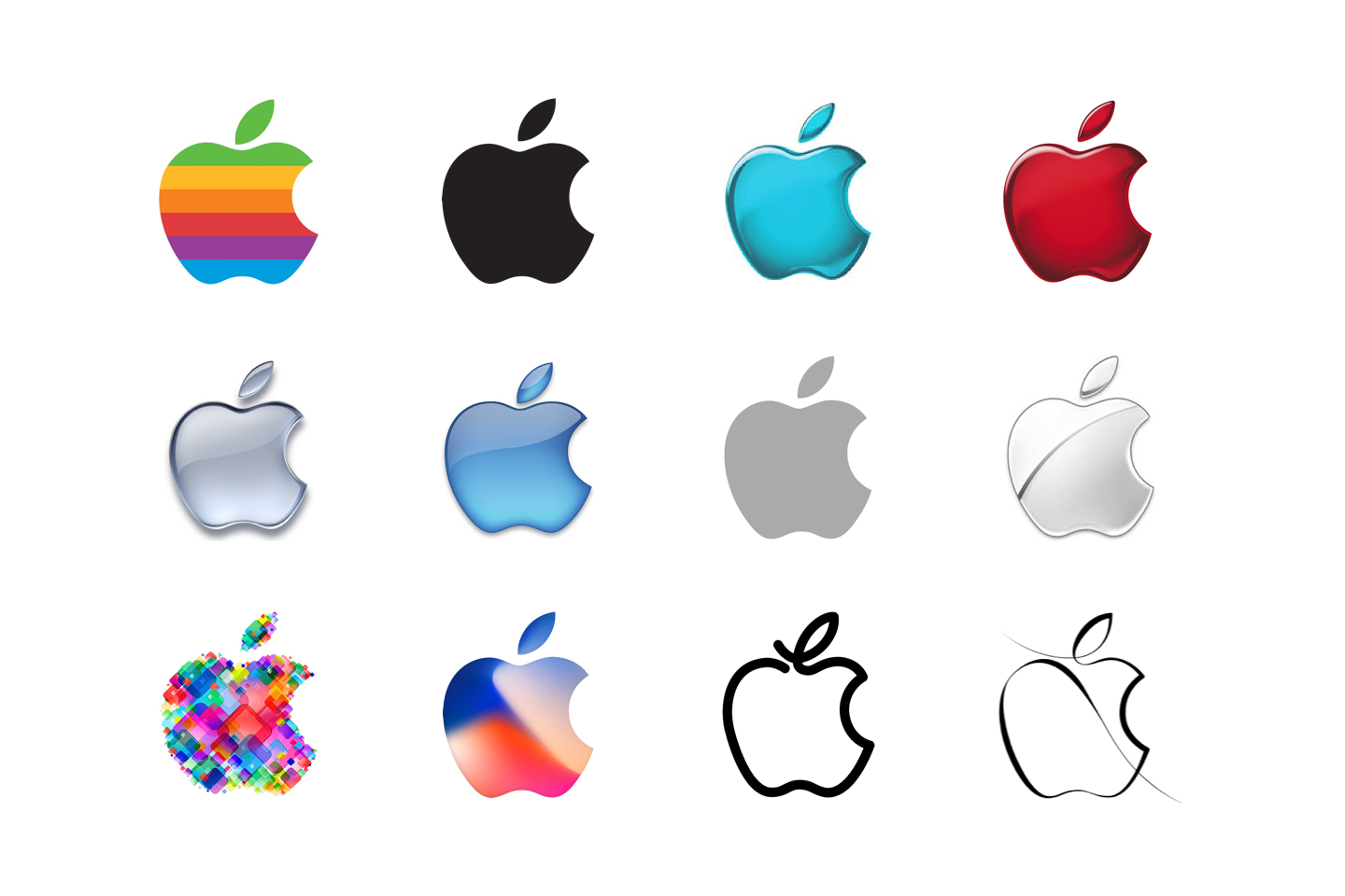
Apple’s logo is a foundational piece of its brand. While it has seen many visual treatments over the years, its silhouette has remained mostly unchanged for more than 40 years.
When I first examined the poster, my eyes were drawn to the wireframe illustration. While it likely isn’t an accurate representation of how the logo was originally constructed, it does highlight some clear differences between the logo’s silhouette in 1987 and now.
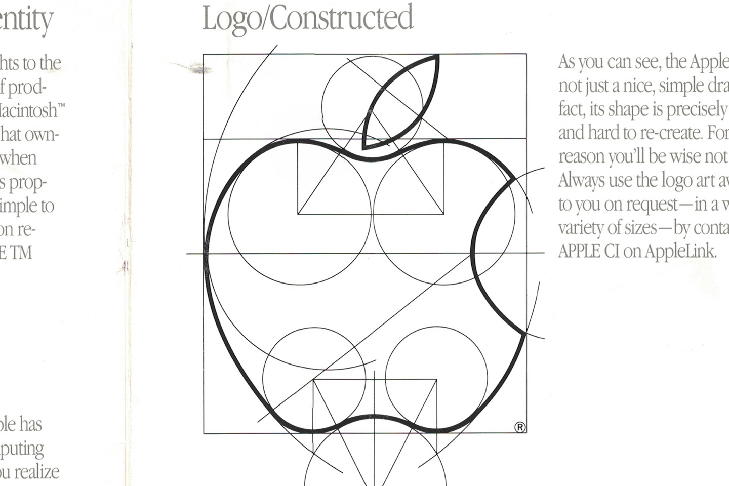
The dimple on the stem side of the Apple is drawn with the arc of a circle, while today it has a sharp kink in it. The proportions of the logo have changed subtly as well. If this file history on Wikipedia is to be believed, Apple still makes tiny changes to the shape of its logo.
Logo lockups
Another fascinating aspect of the logo’s evolution is the logo lockup. The six color logo lasted mostly unchanged all the way until 1998, the year after Steve’s return to Apple by way of the NeXT acquisition. However, the wordmark it was paired has changed drastically. This poster shows some variations.
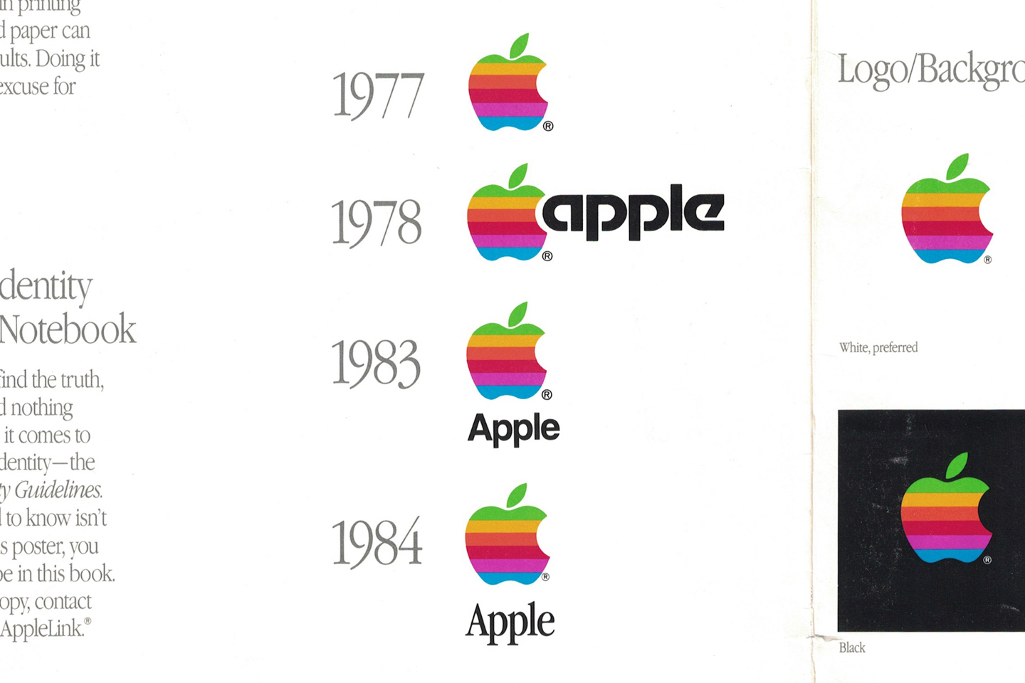
I quite like the futuristic typeface in the 1978 logo, but I want to know why Apple’s designers decided to jam the A into the bite of the Apple. Also, how come 1983’s Helvetica wordmark only lasted one year? It actually looks pretty good.
Corporate signage
If you have driven around Cupertino or Sunnyvale, you will recognize the signs in front of Apple’s offices like this one in front of Apple’s Infinite Loop campus.
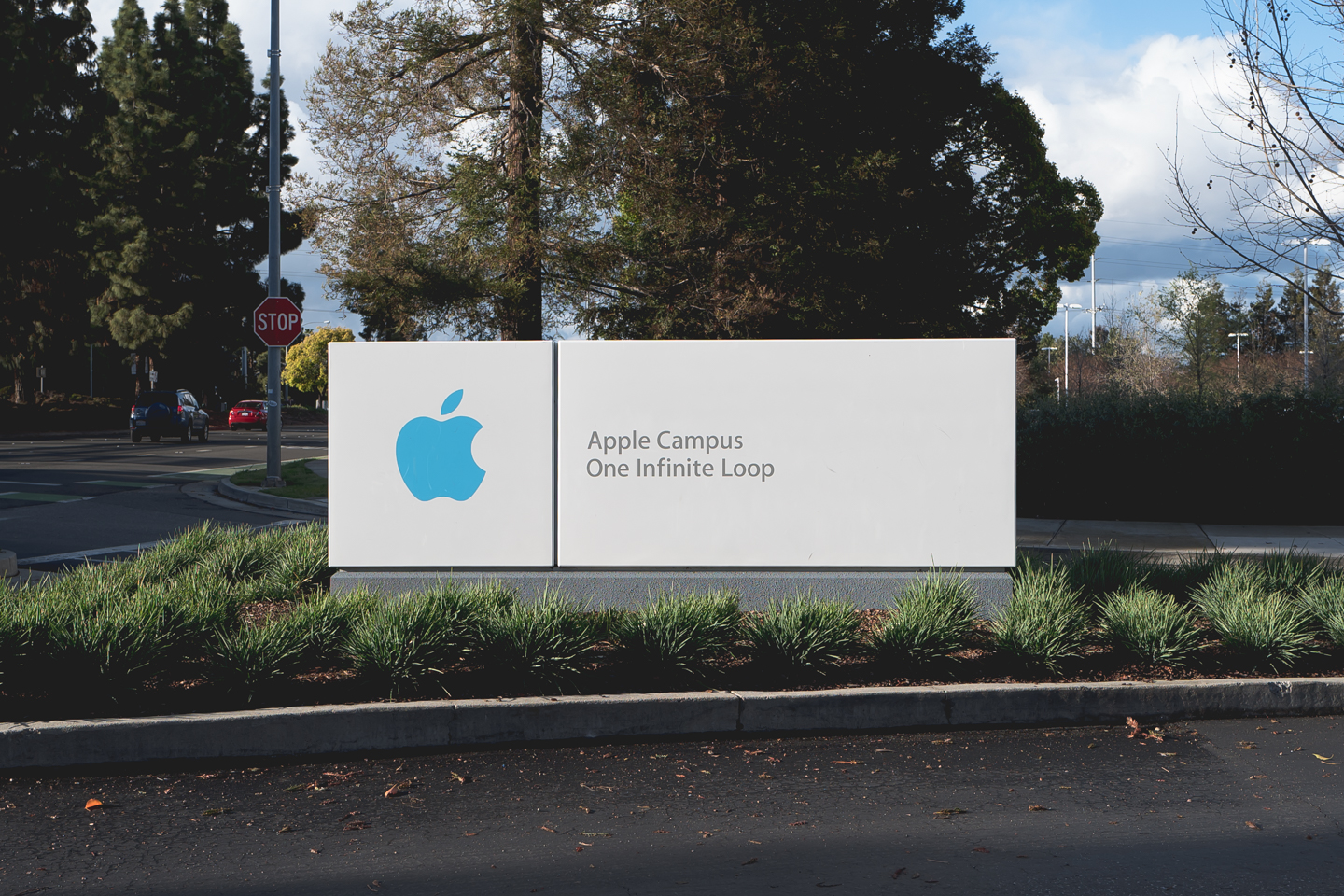
Compare that sign with Apple’s signs in 1987.
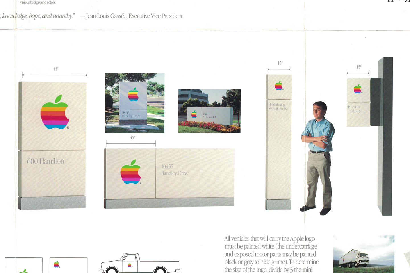
The basic structure of these signs, the square section for the logo and rectangular section for text, has stayed the same almost continuously all the way up to last year and the opening of Apple Park. Of course, the typefaces have changed, the treatment of the logo has changed and even the color of the sign has changed over time from a warm grey to a cooler near white.
There were some years that the entrance to Infinite Loop had a wacky sign out front. While that main sign is gone, the colorful signs in front of the individual buildings remain.
Product packaging
Industrial designers and architects use the same techniques when designing cars, buildings and consumer electronics. However, while cars and buildings are purchased and experienced on their own, there is something that sets smaller objects apart — packaging.
Product packaging serves multiple purposes. It must protect an object while it gets shipped from place to place. It must also communicate its contents and serve as another surface for the brand.
For decades, Apple has given packaging the same careful consideration that it gives to the products within. Take a look at this pile of packages from 1987.
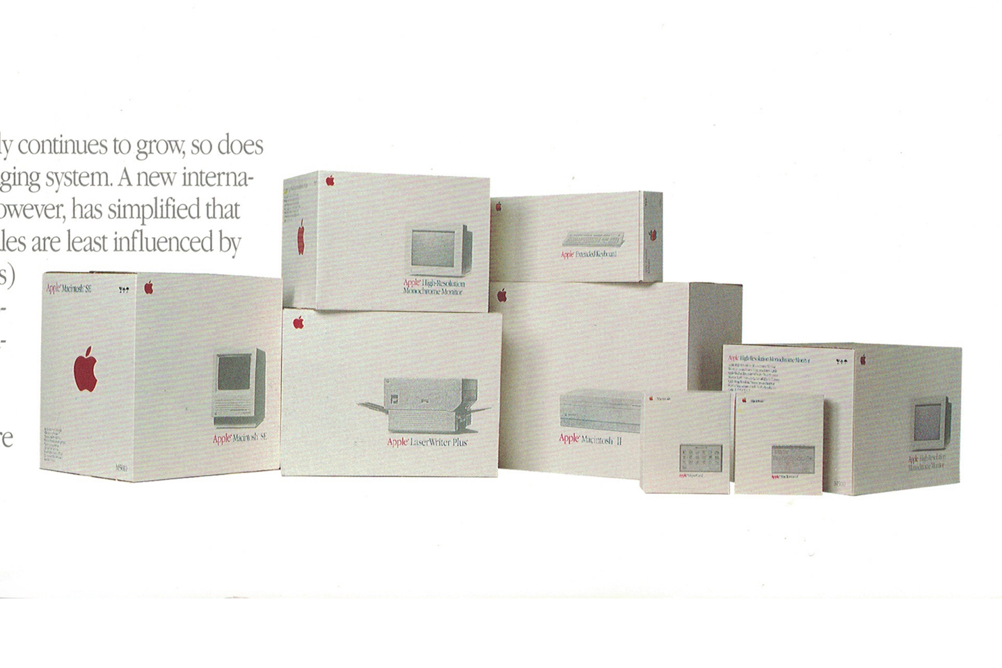
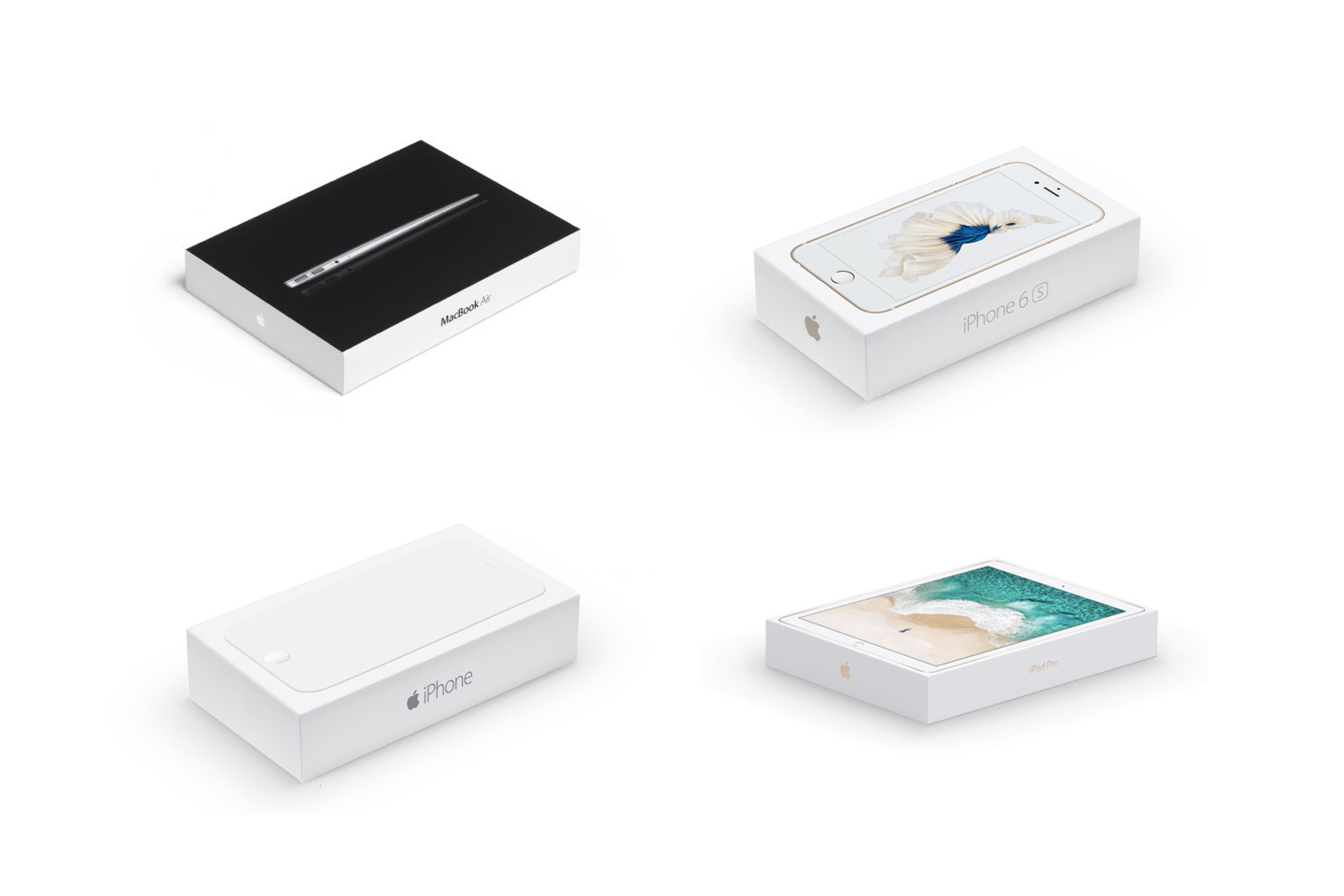
More recent boxes obviously trace back to the same lineage.
More imagery
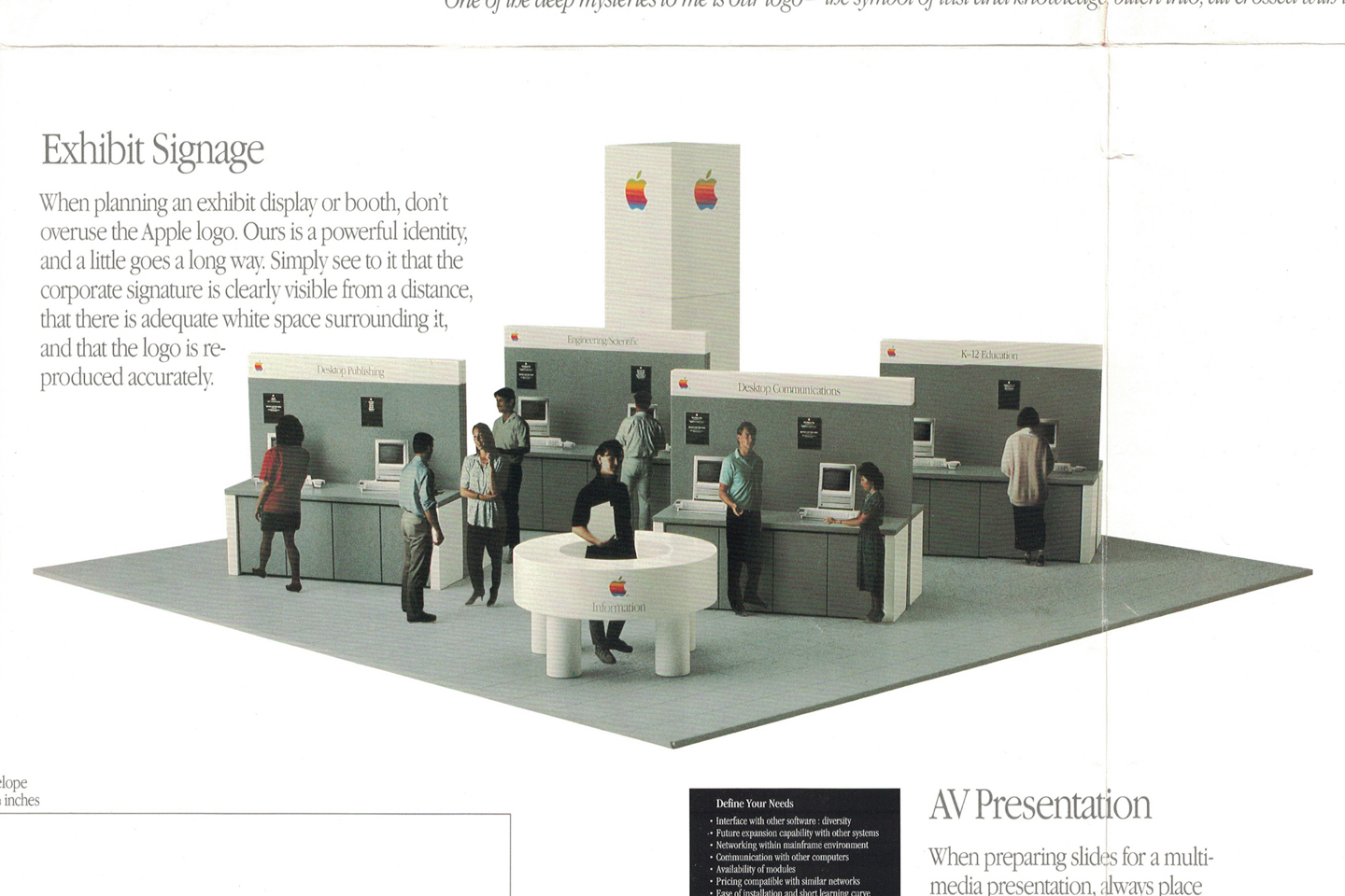
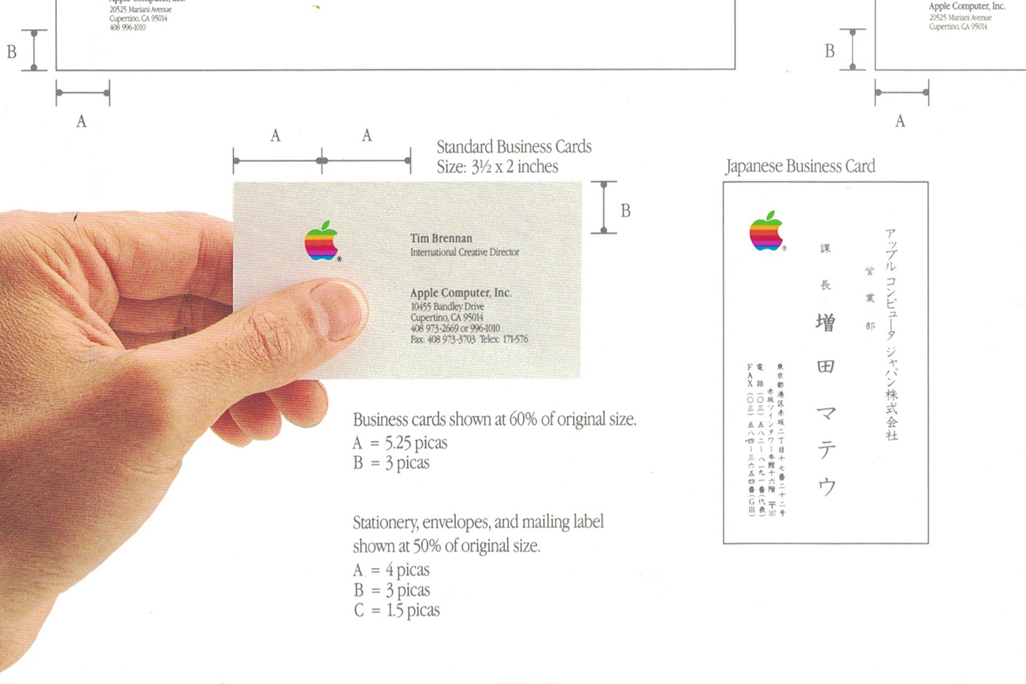
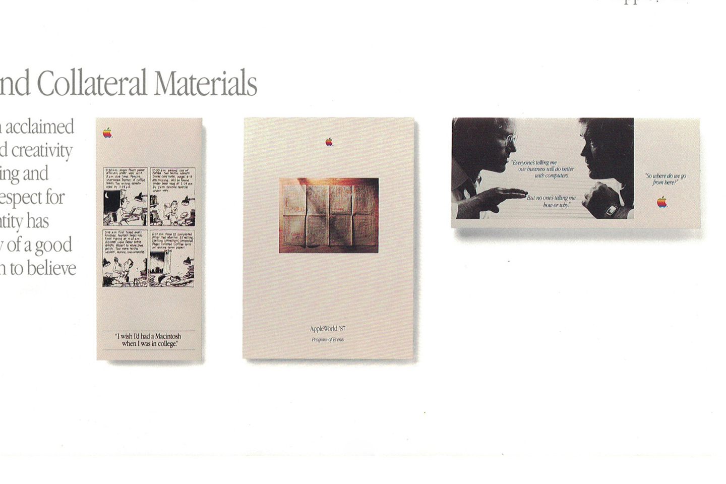
Here are some more images, presented without commentary.

Final thoughts
It’s remarkable just how much Apple has continuously iterated on and refined its identity over the years. The DNA of Apple in 1987 very obviously still exists today in its logo, corporate signage and product packaging. This is in stark contrast to companies like Microsoft, whose redesigns have suddenly and completely broken any relation to its past identity.
While I’m glad to to see that Apple has improved its graphic design over the years — it certainly wouldn’t release a poster like this today — I’m sad it has largely abandoned print materials. It’s undeniable that digital versions are cheaper to make, easier to distribute and quicker to refine or rework. Hence, they are in most ways strict improvements over print versions of old. However, what they lack is tactility. There is nothing like thumbing through a book or seeing a logo alongside real world objects. I’m happy to own this tangible piece of technology history.
Thanks to Jack Wang for reading drafts of this.